Tammaramma Door Slammer
Thursday, November 16, 2006
You go into something like this with good intentions. You want to like something and with so many people around you clearly having such a great time, you end up feeling like utter bastards for hating it so much. Yet you can’t stop – one thing after another is not just an assault on good taste but an attack on common sense. Surely, no one can like this can they? They can and they do and they prance on the cliffs like tattooed mountain goats. We are of course talking about Sculpture By The Sea, the annual sculpture extravaganza that finishes this weekend. This is the exhibition’s 10th year. Over the last decade it has continued to grow as it attracted some heavy hitters to the ranks of its patrons including sundry Shermans, Balnaves, Belgiorno-Nettis and Penfolds, corporate sponsors - take a bow NAB - not to mention offering a range of prizes from the top Sculpture By The Sea Prize of $30,000 to the NAB Kid’s Choice Prize of $1000 – and all up, there’s $62,500 in prizes to be won. You’d have to be a mug not to enter.
And therein lays the problem. For all its good intentions Sculpture By The Sea is at the mercy of its entrants. Anyone can enter and by the looks of the finalists everybody does. This year’s show is by far the worst we have seen in many years, and this despite the efforts of the organisation to raise the tone by inviting overseas sculptors, creating a celebratory invited artists program – Philip King, Ken Unsworth, Guy Warren, Ron Robertson-Swann and others – and a few half decent winners of the 11 individual prizes. Sebastian Smee in The Australian suggested that there should be a prize for the worst sculpture and then went on to nominate a bunch of very deserving candidates, but there is also a guilty pleasure in being so outraged by unrelenting mediocrity, fun at first, grinding about halfway through, then wrist-slittingly bad at the end. It’s not just a question of what is bad and what is good – the whole damn set up is rotten.
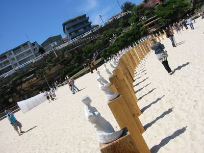
Big day out... Klas Sundkvist's Trans Circulus [latin: beyond the horizon]
'Looking out to the horizon what will one experience? Curiosity, joy, or perhaps astonishment? Beyond the horizon there are possibilities, the continuation of the world and an uncertain future.' $250 each, many still available.
The exhibition is over crowded by ‘garden sculpture’ – the kind of stuff you find in parks and the front gardens of the tasteless rich - nudes arching their backs, bits of geometric abstraction looking for a friendly atrium, distressed and prematurely aged bronzes, all of it a three dimensional version of a suburban art contest where crap paintings come alive and spoil a perfectly good view of the ocean. Then there are the art school graduates, some with gallery representation, who really should know better but who are locked into their horrible practices making grim, determined stuff that attempts to be playful but which is lost behind a patina of envy and disgust that so much attention is paid to painting. Mixed into all of these artists and their works fighting for space are the professional invitees like Unsworth and Robertson-Swann, whose work must likewise fight for space and a clear sight line on Bondi’s South Head. The whole place is like a sculpture dumping ground. If there was ever a time we truly wished we had air support it was as we looked at the crowded field of weilded metal – we’d just call the boys in the air force and wait for the jets to scream over and napalm the whole lot into the sea. Get your people back and get your heads down – this is gonna be a big one!
Many of the artists in the exhibition seemed to have the same ideas too, either they were staggeringly literal in their concept of putting a sculpture next to the ocean, or they just ignored the location altogether. Some artists did however take an obvious idea – there must be half a dozen works about Australia’s treatment of, and relationship to refugees – and still manage to make a worthwhile piece. Our favourite work of the whole show is Emma Wise’s Cut To Fit, a dotted line on a cliff edge that says everything about Australia’s random exclusion of bits of its sovereign territory as can be said, and Wise does it simply and elegantly. Made of flour, paper and water, this human made line will disappear as the elements wash it away. Graeme Pattison and Enrique Esquivel’s The Big Red Traffic Light tackled a similar idea. Their construction is a gigantic array of traffic lights. Located nearby is a button of the kind you press when you want to cross the road. When you press it, the lights – which are pointing out to sea – go green. But only for as long as you keep the button pressed. It’s obvious and not very subtle and although it conveys the message ok, the viewer feels like they’re being run over by the artists’ good intentions.
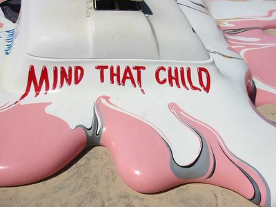
The Glue Society's Hot With A Chance of A Late Storm [detail].
The winner of the big $30K prize was Orest Keywan whose steel, stainless steel, limestone and sandstone work …And With A Name To Come is unique for a three dimensional object in that it only looks good from one angle. The work is deeply and profoundly mediocre with very little to suggest it should win a big prize, especially since the whole piece, with its variety of materials blackened and dead, looks as though it might have been rescued from the sea rather than set thoughtfully next to it. Comparatively Keywan looks very good next to an array of metal ribbons, metal arabesques, jittering poles and lovingly sited minimal geometric shapes. In this company of sculptures that appear not to have been made anytime in the last 30 years something with a bit more quotidian good humour wins the day - Bjorn Godwin’s Pavilion/The Daily Double – a quotation of the classic Aussie dunny with all mod cons – was a crowd pleaser as was The Glue Society’s Hot With A Chance of A Late Storm, a melted Mr. Whippy van made of goopy urethane. The only metal sculpture we saw with any life was Angus Adameitis’s Traceur, a massive collision of crushed and crumpled industrial boilers, rusted armatures and huge right angles. We never thought we could use the word ‘playful’ to describe something that looks like it could kill you, but it is a magnificent work that is both humorous and lively.
Two works in the show are excellent. They show a real understanding of site and materials and they are both easy to miss. They are the kinds of works that may or may not be popular but they point to a direction Sculpture By The Sea should pursue. It’s serious art in a playful mood that may not be as popular with the muscle boys and their girlfriends or the old folks on their Zimmer frames, but they have real substance. One of these artists is Richard Tipping whose works are spread around the length of the exhibition. Tipping, the conceptual joker, has made a work called Free Art! Before It Frees You and takes the form of crash barriers, bollards and safety tape with the title printed on their sides. Tipping has set them up in genuine concern for safety, bits of ground cordoned off, bare ground made into art. The other artist is Guy Warren whose work we did not see but read about in the $8 catalogue. A ‘distinguished invited artist’ Warren is not a sculptor per se, but a painter and it’s perhaps because of this he decided to stay above the mess below. His work was called Icarus, a drawing of a bird executed by a skywriter over Sydney one sunny day. Look up, see the bird, watch the white vapor trail blow slowly away. Lovely.
And therein lays the problem. For all its good intentions Sculpture By The Sea is at the mercy of its entrants. Anyone can enter and by the looks of the finalists everybody does. This year’s show is by far the worst we have seen in many years, and this despite the efforts of the organisation to raise the tone by inviting overseas sculptors, creating a celebratory invited artists program – Philip King, Ken Unsworth, Guy Warren, Ron Robertson-Swann and others – and a few half decent winners of the 11 individual prizes. Sebastian Smee in The Australian suggested that there should be a prize for the worst sculpture and then went on to nominate a bunch of very deserving candidates, but there is also a guilty pleasure in being so outraged by unrelenting mediocrity, fun at first, grinding about halfway through, then wrist-slittingly bad at the end. It’s not just a question of what is bad and what is good – the whole damn set up is rotten.
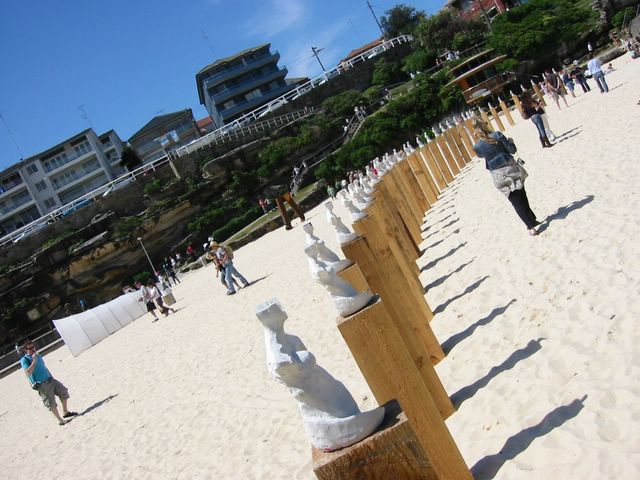
Big day out... Klas Sundkvist's Trans Circulus [latin: beyond the horizon]
'Looking out to the horizon what will one experience? Curiosity, joy, or perhaps astonishment? Beyond the horizon there are possibilities, the continuation of the world and an uncertain future.' $250 each, many still available.
The exhibition is over crowded by ‘garden sculpture’ – the kind of stuff you find in parks and the front gardens of the tasteless rich - nudes arching their backs, bits of geometric abstraction looking for a friendly atrium, distressed and prematurely aged bronzes, all of it a three dimensional version of a suburban art contest where crap paintings come alive and spoil a perfectly good view of the ocean. Then there are the art school graduates, some with gallery representation, who really should know better but who are locked into their horrible practices making grim, determined stuff that attempts to be playful but which is lost behind a patina of envy and disgust that so much attention is paid to painting. Mixed into all of these artists and their works fighting for space are the professional invitees like Unsworth and Robertson-Swann, whose work must likewise fight for space and a clear sight line on Bondi’s South Head. The whole place is like a sculpture dumping ground. If there was ever a time we truly wished we had air support it was as we looked at the crowded field of weilded metal – we’d just call the boys in the air force and wait for the jets to scream over and napalm the whole lot into the sea. Get your people back and get your heads down – this is gonna be a big one!
Many of the artists in the exhibition seemed to have the same ideas too, either they were staggeringly literal in their concept of putting a sculpture next to the ocean, or they just ignored the location altogether. Some artists did however take an obvious idea – there must be half a dozen works about Australia’s treatment of, and relationship to refugees – and still manage to make a worthwhile piece. Our favourite work of the whole show is Emma Wise’s Cut To Fit, a dotted line on a cliff edge that says everything about Australia’s random exclusion of bits of its sovereign territory as can be said, and Wise does it simply and elegantly. Made of flour, paper and water, this human made line will disappear as the elements wash it away. Graeme Pattison and Enrique Esquivel’s The Big Red Traffic Light tackled a similar idea. Their construction is a gigantic array of traffic lights. Located nearby is a button of the kind you press when you want to cross the road. When you press it, the lights – which are pointing out to sea – go green. But only for as long as you keep the button pressed. It’s obvious and not very subtle and although it conveys the message ok, the viewer feels like they’re being run over by the artists’ good intentions.
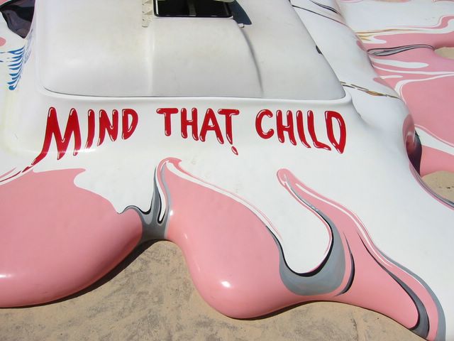
The Glue Society's Hot With A Chance of A Late Storm [detail].
The winner of the big $30K prize was Orest Keywan whose steel, stainless steel, limestone and sandstone work …And With A Name To Come is unique for a three dimensional object in that it only looks good from one angle. The work is deeply and profoundly mediocre with very little to suggest it should win a big prize, especially since the whole piece, with its variety of materials blackened and dead, looks as though it might have been rescued from the sea rather than set thoughtfully next to it. Comparatively Keywan looks very good next to an array of metal ribbons, metal arabesques, jittering poles and lovingly sited minimal geometric shapes. In this company of sculptures that appear not to have been made anytime in the last 30 years something with a bit more quotidian good humour wins the day - Bjorn Godwin’s Pavilion/The Daily Double – a quotation of the classic Aussie dunny with all mod cons – was a crowd pleaser as was The Glue Society’s Hot With A Chance of A Late Storm, a melted Mr. Whippy van made of goopy urethane. The only metal sculpture we saw with any life was Angus Adameitis’s Traceur, a massive collision of crushed and crumpled industrial boilers, rusted armatures and huge right angles. We never thought we could use the word ‘playful’ to describe something that looks like it could kill you, but it is a magnificent work that is both humorous and lively.
Two works in the show are excellent. They show a real understanding of site and materials and they are both easy to miss. They are the kinds of works that may or may not be popular but they point to a direction Sculpture By The Sea should pursue. It’s serious art in a playful mood that may not be as popular with the muscle boys and their girlfriends or the old folks on their Zimmer frames, but they have real substance. One of these artists is Richard Tipping whose works are spread around the length of the exhibition. Tipping, the conceptual joker, has made a work called Free Art! Before It Frees You and takes the form of crash barriers, bollards and safety tape with the title printed on their sides. Tipping has set them up in genuine concern for safety, bits of ground cordoned off, bare ground made into art. The other artist is Guy Warren whose work we did not see but read about in the $8 catalogue. A ‘distinguished invited artist’ Warren is not a sculptor per se, but a painter and it’s perhaps because of this he decided to stay above the mess below. His work was called Icarus, a drawing of a bird executed by a skywriter over Sydney one sunny day. Look up, see the bird, watch the white vapor trail blow slowly away. Lovely.
Labels: outdoor art, reviews, sculpture


