<body><script type="text/javascript"> function setAttributeOnload(object, attribute, val) { if(window.addEventListener) { window.addEventListener('load', function(){ object[attribute] = val; }, false); } else { window.attachEvent('onload', function(){ object[attribute] = val; }); } } </script> <div id="navbar-iframe-container"></div> <script type="text/javascript" src="https://apis.google.com/js/platform.js"></script> <script type="text/javascript"> gapi.load("gapi.iframes:gapi.iframes.style.bubble", function() { if (gapi.iframes && gapi.iframes.getContext) { gapi.iframes.getContext().openChild({ url: 'https://www.blogger.com/navbar/6466083?origin\x3dhttp://artlife.blogspot.com', where: document.getElementById("navbar-iframe-container"), id: "navbar-iframe" }); } }); </script>

the art life

"...it's just like saying 'the good life'".

Invisible Music

Thursday, March 30, 2006
Our project for last week was to visit every artist run gallery in town. We defined ‘artist run’ as galleries not attached to art schools or funded like Artspace or Performance Space, aren’t hire spaces like Blank Space or Blender. What we were looking for were galleries run on good faith and over-extended credit cards, run by a harrassed board and doing a lot with almost nothing. We consulted Art Almanac and when we looked at our list we realised just how few there really are. So we added the hire galleries back in, decided Firstdraft is artist-run because of its regularly changing board of young artists, and then added Esa Jaske Gallery in as well because although it’s actually a commercial gallery we couldn’t find Sydney’s newest artist run space G&A [located somewhere inside a labyrinthine building on Elizabeth Street]. It’s a hit and miss process, we know, but that’s the fun of artist run spaces…

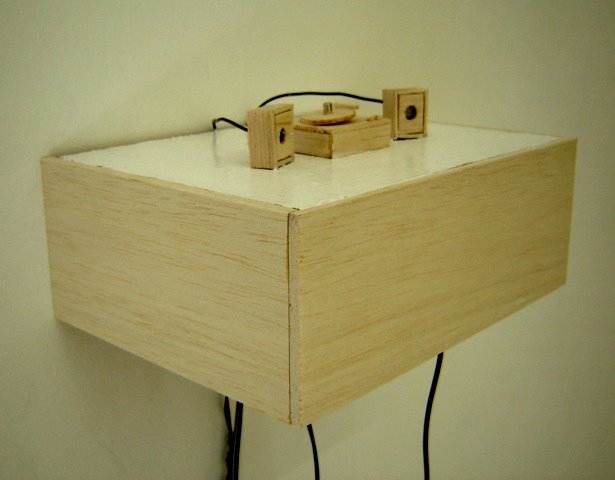
Our first stop was PELT, the gallery in Chippendale that does a huge amount on few resources. With lots of exhibitions and music performances on Sundays, it’s a small if under-lit gem. Vicky Browne’s show Timetable [until April 2nd] is exceptionally good too. Browne uses clapped out audio equipment to make sculptures and installations – old turntables, photo albums, transistor radios, handmade turntables and ceramic iPods. The works sit in three rough categories – ready-mades that the artist uses to create a commentary on the materials and their associations; completely fabricated objects that are facsimiles of other objects [tiny turntables]; and more abstract works that are either literally abstract – weird fur shapes that hiss – or are ambiguous objects in a new context. An installation in Timetable is a trio of turntables that play recordings etched on to the surfaces of copper and aluminum discs and inscribed CDs. Night Music is an aluminum record that plays a crackly recording of owls while the copper disc Morning Music plays kookaburras. The CDs are recordings of the artist singing ‘hits’.
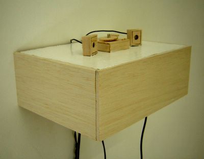

Vicky Browne, Natural Progression, 2006. Mixed media, various dimensions.
Courtesy PELT.

Thirteen was a photo album filled with drawings. On each sleeve there is a magnetic strip that contains a 10 second sound recording activated by pressing a tiny button. This odd little feature was probably intended for users to say something like “This is me on holiday last year” but which Browne has used to record a line from a song. The drawings – scribbly, loose almost doodle-like images of deserted suburban landscapes, houses with open windows, a backyard with some rabbits – is accompanied by a plaintive voice warbling unintelligibly. The childishness of the images, the sorrowful song and the title Thirteen is so heavy with association, it is absolutely enthralling. Using technology that is on the way out – and going right back to the start with her own record etching – Browne has rediscovered the spirit of the recent past when yesterday’s technology seemed a little bit more humane than today’s digital empire. Browne inscribes the personal into the gaps of the commercial.

Around the corner from PELT is the Sydney College of the Arts-related gallery Peloton. Vicki Wilkes has a show there called Encoded, a modest exhibition of 5 canvases. A formalist experiment in arranging lozenge shapes of various colours on single colour backgrounds, the gallery handout explains that “the artist derives pleasure from counting, balance, and simply adding and subtracting colour.” We’re not sure if the viewer gets the same amount of pleasure from the paintings as the artist does but if you like multi-coloured lozenge shapes, this is a show for you. Recently we realised that while we are interested in the formal qualities of art - the sorts of aesthetic choices made by artists - we’re not particularly interested in formalism. Like the work of John Nixon, for example, we get the idea and respect the project, but on the other hand, it does nothing for us.
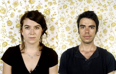

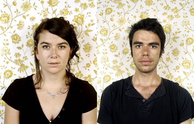
Sarah Mosca, Lovers 2002, 2006.
C type photographs, two panels, 90x75cms each. Courtesy Esa Jaske Gallery


When you walk into Esa Jaske Gallery, Mr. Jaske usually has some nice ambient music playing in the background, which is as it should be seeing as how he’s from Finland. Pretty much everything we know about that part of the world comes from Aki Kaurismaki movies and ambient blip hop and Sarah Mosca’s show Lovers [until April 15] is in much the same style. Mosca’s show is a series of life-size head and shoulder shots of couples, arranged in pairs around three walls. The titles clue you into how long the people in the images have been together Lovers 2003, Lovers 1973 etc. On the facing wall are large images of a bed with careful arrangements of pillows. There are a number of reactions to this arrangement – the most obvious is that there is one less bed than there are couples, which might suggest a race to claim a spot, or perhaps these people are not all still couples? We would have thought they are, since Mosca’s show also seems to prove the adage that people in long term relationships look alike.
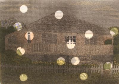


Isobel Johnston, House with picket fence, 2006.
Fabric paint on wool tapestry, 26 x 38 cm. Courtesy Esa Jaske Gallery.


In EJG’s front room is a show called Nothing Really Matters by Isobel Johnston and Jude Crawford. Johnston has a series of found fabric tapestries which she has treated by darkening their surfaces with dye, leaving circles of un-dyed fabric shining out. Crawford’s works are large cut paper stencils of swirling shapes that reminiscent of plant forms. The title is an absolute winner – nothing [absence] really [does] matter[s]. It’s all in what’s left out. We must admit to an instant attraction to Johnston’s work as it fits so nicely into our emerging mega-theory of everything that’s going on in the art world [in general], but to be perfectly honest, some pieces work better than others. One work – a large two panel screen almost overwhelms the rest of the show, but you get the general idea. We thought for awhile that Crawford’s work was actually by Jacqueline Belcher, the artist whose cut paper works we admired in Slowly, Slowly at Kudos in February, but we were mistaken. It seems there’s a seething underworld of artists quietly getting RSI from all the scissor work.

One of the great opportunities for artist run spaces is for younger artists to get their work seen alongside work by older and better known artists. It’s part of the “leg up” theory that ARI’s can help an artist find a larger audience for their work, to get the crucial word of mouth happening that might just land them a spot in a curated museum show or entry into a commercial gallery. ARIs can also offer space to established artists to do projects that might not suit their commercial gallery careers or who are for those sick of waiting 18 months for the next spot – and then it’s all money making paying the mortgage and fuck the risky shit.

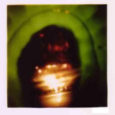
At MOP Projects until April 2 Gianni Wise has his work Who’s (looking at) who? sitting next to an installation by Adam Cullen and Cash Brown and it’s an interesting mix. Wise’s work is an elaborate installation that riffs on the form of the photo booth. You enter the gallery space through a heavy curtain and facing you is big black TARDIS-like box with a tiny screen recessed into the surface. The screen plays video footage of people on the street. The footage is crapped out greenish video and there are ominous sounds coming from a speaker behind the scenes. Around the walls are strips of images like photo booth prints, except they are taken from TV – Margaret Thatcher, David Lynch and a bald guy who might be Martin Heidegger or Pik Botha. There is a quote from John McDonald on the gallery handout – “Politics is an embarrassment in much contemporary art – an exercise in selling prepackaged opinions to the converted”. Aside from the pot-calling-kettle-black absurdity of that statement, the key here is the ‘prepackaged’ concept. Wise’s installation is both demonstrative and yet oddly ambiguous. He says his work is a “private space of instant gratification and voyeurism where we may begin to ask who [is looking at] who? in a world of otherness” but it does not offer voyeuristic pleasure – the gaze is directed by the artist, edited by the artist, authored by the artist. The form may derive from a photo-booth, but the audience has no control here, we can only to act as receptors. Is that the point?
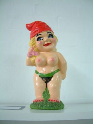

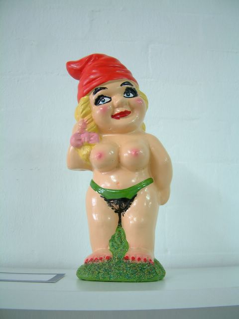
Adam Cullen and Cash Brown, Garden Slut, 2006.
Limited ed.
Courtesy of the artists.


Next to Cullen and Brown’s installation, Wise’s work seems more ambiguous than it probably really is. That’s because Cash and Brown’s show Wholesale Therapy is so blunt it’s like being hitting over the head with a 4x2. The show, an installation that takes up the big gallery space, offers brutally effective gag products, somewhere between a joke shop and an art tourist trap. Some of the objects relate to the art world – the Funding Body Hard Ball for example – whereas others come straight from the menagerie of monstrosities that populate Cullen’s paintings – the Garden Slut for example would look right at home in a big acidic canvas. Other products are just as furious – Skanky Ho Barbie [with condom, syringe, bad make up], a soft home for pigs and a Satanic Doll Kit which is presumably meant for sticking pins in, or letting loose Chucky style. There are some other eye-watering products, a hair candle for instance, and some surprises; it’s not a well known fact but Cullen is a dab hand with pot pouri and jams, but there’s a “smell bag” on offer. Brown, an artist who is not as well known as Cullen, seems to have brought a lot of pathos to the work - her tiny livestock dioramas are heart rending little scenarios of calves taken from their mothers, cows run over by tractors, and lots of other blood-soaked situations. We wondered if this exhibition by Cullen and Brown was a “good thing”. Did we need to see this work? Was the idea of it enough? One piece, some ready made road-side crosses with fake flowers attached, made us feel decidedly uncomfortable, yet the easy garden gnomes were pretty darn funny. We decided, eventually, that we liked the show because it was so effectively rude, so hard edged, so cruel. There has to be value in that.
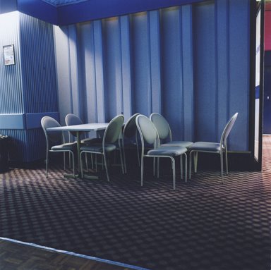

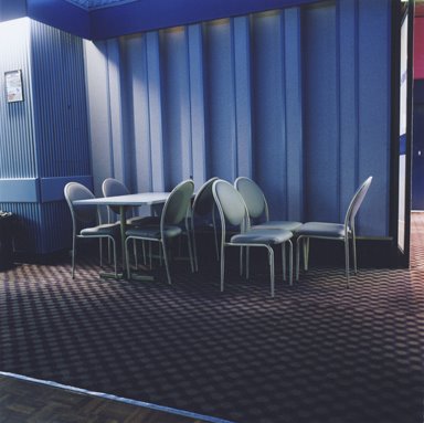
Benison Kilby, Bankstown RSL No.2, 2005.
C type photograph, 90x90cms. Courtesy of the artist.


When we posted the press release for Benison Kilby’s RSLs show at First Draft [until April 1] a reader speculated on the need for the accompanying text arguing that Kilby’s work speaks for itself. We have to agree. Kilby’s work is magnificently plain interiors of RSL clubs she photographed on what must have been a very grand tour and the large scale images capture the incredible spaces that are so peculiar to club interiors, with their arctic wastes of air conditioned carpeting, lonely islands of disused desks and tables, the clusters of chairs awaiting a bingo night. When art is at its best, there really is no need for accompanying text. These images put you in the space, capturing the ineffable oddness of the ordinary.
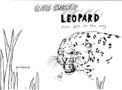

Bethnay J Fellows, Lone Hissing Leopard, 2006. AO Photocopy.
Courtesy of the artist.


We have been told by Firstdraft management that the artist Bethnay J Fellows was very specific that we include the ‘J’ in her name in any review. It makes a certain kind of sense that the artist should be so specific because her suite of 8 large-scale, photocopied drawings are also very detailed in their information. The show, called Beasts of Prey and other Deadly Creatures, presents the viewer with some very attractive images of animals including the Tusked Narwhal, the Polar Bear, the Wolf and a Black Bear. Each drawing also contains some text - the narwhal uses its tusks for fighting, fore example, and the surprising note that Polar Bears can detect magnetic fields. It is not often that we can say that an exhibition – aside from being visually attractive – is also educational and informative. We can say that about Beasts of Prey. We can also say that we enjoyed it in a way that we have enjoyed few shows lately, leaving Firstdraft in an upbeat mood, and considering the artist’s declaration that “I can draw your pets or portraits.” We might get Bethnay J Fellows to do the official Art Life portrait.
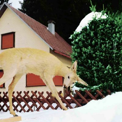

Sandra Scheffknecht, Doubledeath 05A, 2006.
C type photograph, 90x90cms. Courtesy of the artist
.


Our second last port of call was to Blank_Space on Crown Street in Surry Hills. With the COFA student space Kudos Gallery looking like it’ll close down without financial assistance, Blank_Space is there to lease out its premises to all the students who need to have shows as part of their course assessment. We were very lucky to discover that the show by Sandra Scheffknecht, an MA student at COFA, was very good. Blank_Space is so hit and miss you have no idea what you are going to see and the shows are on for such a short period they are very easy to miss. Scheffknecht’s exhibition, Doubledeaths 2005-2006, was on for just six days and closed yesterday. Trading in an aesthetic not dissimilar to Mosca’s show at EJG, Scheffknecht had recent works hung next to older material, large scale images using that we took to be twins but turned out to be artfully placed prints of the one model. The idea was that the works were meant to question the reality of the photographic image, a well worn theme in much recent contemporary art. Where Scheffknecht’s older works were a little too obvious, her recent material taken on a trip back home to Austria show enormous promise. There’s something eerily Blade Runner-esque about this stuffed deer with the tiny serial number on its hoof – but then, as we said, we’re suckers for pathos.
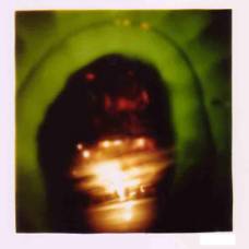

Klaus Major, Sensorium, 2005.
Type c photograph, 10.2x10cms. Ed of 5.
Courtesy of Blender Gallery.

We finished up our mini-tour at Blender Gallery in Paddington for Klaus Major’s show Sensorium, a collection of his pin hole camera work. We like the idea of using a pin-hole camera in the same way we like Vicky Browne’s use of old audio technology. It suggests a back-to-basics approach that is magical and evocative and all the more amazing because it reveals the physics behind the process. But there is a million miles between Major and Browne – where Browne lets the material do its thing and presents it very casually, Major’s work seems restricted and pent up, like they need to be bigger, freer and not constrained by consumer friendly framing. Someone once asked us why we don’t like it when artists sign their names on their paintings and we couldn’t articulate why. We can now say that signing your photograph really detracts from the image and we just want to marvel at the fuzzy world of light captured on the paper, not to notice that the artist has a tiny cramped hand or that it is an edition of 5.

Business as Unusual

Tuesday, March 28, 2006
Uplands Gallery will reopen on Saturday 1st of April with its new program for 2006. We invite you to attend the opening to also pay respect to the passing away of Blair Trethowan on March 3rd 2006. Business as Unusual is an Uplands Team Show.

Opening: 2:00 - 5:00 pm this Saturday.
Refreshments will be served. The exhibition will run until Thursday April 13.

More announcements regarding our revised 2006 calendar soon...

We look forward to seeing everybody.

Kind regards,

Jarrod & Tara Rawlins
Directors
Uplands Gallery
Level 1, 12 Waratah Place, Melbourne

Eyes Are Hard To Paint

Was it only last Friday? It seems like an eternity since the Archibald, Wynne, Sulman and Photographic prizes were announced at the Art Gallery of NSW. By now you’ll know that Melbourne painter Marcus Wills won the $35,000 Archibald Prize for The Paul Juarszek Monolith [After Marcus Greenaerts] an unfathomable portrait which takes for its major form a ginormous head taken from an etching by the 17th Century Flemish master Greenaerts. The painting is obscure, highly detailed, painstakingly executed and completely without peer in the rest of the comp. The painting has craft and skill and it’s conceptually odd. As AGNSW trustee Imants Tiller’s told The Australian’s Rosalie Higson, “It was surprisingly easy to agree on the work.” For the captains of industry, media celebrities, doctors and artists on the gallery’s board, it had a little something for everyone.


Vanila Netto's The magnanimous beige wrap - Part 1 (contraption), winner of the 2006 Photographic Portrait prize. Courtesy Art Gallery of NSW.


Again, we came so close to picking the winner, narrowing the field to three – Will’s painting, Ben Quilty’s architecturally-inspired slab construction of Adam Cullen and Craig Waddell’s portrait of his girlfriend Jesse Cachillo [not the other JC]. Although we felt confident the inscrutable decision making process of the trustees would be a little easier to pick in 2006 with a great Quilty painting shining out among a decidedly drab field, they went and surprised nearly everyone, including the first-time entrant who won the damn thing. As former publicist at the gallery Jan Batten once chastised us, no one can pick the Archibald. We’re happy to advise that one Art Life reader known only as ‘G. Marx” wrote in to tell us: “Hey, congratulations Art Life and punters! What a form Guide! I won fifty bucks on your hot favourite!” If we do nothing else this year, we can be happy that we made someone some money.


John Beard's Wynne Prize painting The Gap.
Courtesy Art Gallery of NSW


The Archibald and associated prizes generate huge amounts of media – print, television, radio and blogs – but before we discuss the other winners and the art critics reactions to the prizes, we should get our own house in order. Last week we stated that Jason Benjamin had painted John Olsen for the 2005 prize. Andrea Candiani, who works at Metro 5 Gallery, which represents Benjamin in Melbourne, left a comment pointing out that he painted the actor Bill Hunter in 2005 and Olsen in 2004. For some reason the Archibald finalists are starting to blend together in our minds, but apologies to all concerned. We also made the claim last week that McLean Edwards had put himself into the portrait of Cate Blanchett. However, Georgina Bredun was having none of it:

Whoa up there! Exactly HOW has McLean Edwards painted himself into his portrait of Cate Blanchett and her husband, Andrew Upton and their two kiddies, Dashiel and Roman? Last time we looked McLean didn't have long blonde hair - so it's not THAT figure. And last time we saw McLean and Upton on the same page (try the current edition of Harpers Bazaar), McLean looked like, well, McLean, and Andrew Upton looked astonishingly like the figure standing behind Cate Blanchett in McLean's work. Don't know what's going on here, but you (Art Life) got it wrong. Big time.

We wrote to Georgina to explain that it was just a joke and that no one would ever seriously accuse Edwards of putting himself in the painting, that it was just a gag. But Bredun did also perhaps inadvertently mention one very salient point – the current issue of Harper’s Bazaar spread featuring photos of Edward’s painting Blanchett. As everyone would know, getting yourself coverage in the media before the judging is curse upon your entry – you simply cannot win. We call it The Curse of Peter Harvey.

And so to the critics. Over at The Australian, Sebastian Smee got two shots at reviewing the Archibald show – one bit in the news section, the other in Inquirer. Like many journalists required to fill a lot of space – and perhaps cut in two by the editors – there was a lot of repetition between the stories.

It was somewhat startling to see that Smee had actually gone to the show. In recent months, he has done just about everything he can to avoid reviewing Australian art. His beat is to travel the world reviewing whatever takes his fancy. His latest piece in Saturday’s Review was posted from London where he wrote about the Martin Kippenberger retrospective at Tate Modern. Since January, he has written ‘think’ prices about Biennales, reviews of the old masters in the Renaissance to Contemporary self portrait show at the AGNSW, the Turkish artist Kutlug Ataman’s show at Sherman Galleries in Sydney, an unforgettable piece on Rembrandt’s drawings and last week the John Constable show at the NGA. The only time Smee has come close to Australian art was a piece on an Indigenous show at the Ian Potter Centre in Melbourne.

If you were only reading The Australian’s chief art critic you would be forgiven for thinking that the commercial and public galleries in this country show nothing but imported exhibitions of overseas artists, most of them dead. No wonder The Australian has to look to Nicholas Rothwell and Ted Snell to take up the slack – Smee wanders the country in search of old masters to eulogise before hitting the books and Google to fill up space with waffle. You can imagine our surprise then when we opened the paper to see that Smee wasn’t much impressed by Wills’s painting:

[The painting] is an elaborate allegory, the meanings of which remain far from clear. The image itself, a giant skull populated by small figures engaged in various activities, is certainly striking, and well painted too. But it is not Wills’s own. He has borrowed it from 16th-century etching and I don’t feel he has done enough with it to convince us that the exercise is worthwhile. Though it can be worthwhile to have one’s idea of portraiture stretched, Wills’s painting does so in a way that affords little insight.

Portraiture can easily grow stale, but it benefits from being the most direct and humanly interesting of genres – to dilute in allegory – and a confusing allegory at that – seems to me to work against its strengths. For what it’s worth, I would have given the prize to John Beard, with Ben Quilty and Tom Carment as runners up.


Reading Smee is like taking a valium and having a lie down. The prose is so leaden and wordy, so long in getting to very modest points, so many fearful qualifications, we now just try to skim over it. Portraiture can grow stale – but perhaps not. I don’t feel he has done enough – but you might disagree. Then there are the mile-wide suppositions – that allegory has to be explicit, that portraiture is humanly interesting, that the artist has to convince us of something. That is just two paragraphs in and already we’re sinking into mud…


The Sun Herald finds four regular people to interview...


At least Smee doesn’t have a huge axe to grind - his head is up his own art and that’s where it’s going to stay. The Esteemed Critic at the Sydney Morning Herald however used his three articles on the Archibald to settle a few scores, take a few pot shots and vent spleen. His main piece on the Archibald was written before the announcement, so in place of a discussion of the winner he attacked Cullen – a now annual event – and decry what he sees as the double standards and conflict of interests of the trustees. You’re no doubt saying, 'what else is new, he does this every year', and you’d be right. But what was remarkable about John McDonald’s article was the way it revealed the deep contradictions of his reasoning and the hateful invective at the heart of his writing. The title of Quilty’s portrait of Cullen was a launching pad for his interpretation of what Cullen – before and after might mean:

[Quilty's] subject is a shrewd choice as well. He paints Adam Cullen, the 2000 Archibald winner, as a Jekyll-and-Hyde character. The dark, grinning mug shot on the left is Cullen at his most diabolical, when he was painting pictures of deliberate awfulness, meant to shock and offend viewers and titillate the curators. The right-hand panel shows a more composed character: the respected portraitist, the celebrity. Which is the mask and which is reality?

I suspect both pictures are masks. Cullen strikes me as an artist who is no longer able to draw the line between the self-conscious pose and the inner life. Not even he could say whether his paintings are deliberately bad or simply bad, or simply bad through a lack of competence,

Look, for instance, at his portrait of gallery director Edmund Capon hanging close to the Quilty portrait. Capon resembles a cartoon zombie on a decorator's backdrop of duck-egg blue-grey. This is, of course, meant to be a shocking image of someone we know as worldly and sophisticated. The blank eye sockets are the real key; eyes are hard to paint, so it’s easier to leave them out. If this makes the image even weirder, well that’s a bonus.

Where McDonald perceives an artist who he thinks is celebrated for the wrong reasons, it must therefore be because they can’t paint. This is ridiculous. Cullen doesn’t paint any buttons on Capon’s shirt – so he mustn’t be able to paint them either. Or hands. Or hair. If McDonald likes an artist it is invariably because they have demonstrable craft skill, be it traditionalists like Jiawei Shen or contemporary artists like Ricky Swallow. The whole idea of artists making choices seem to be an alien concept to McDonald. This non logic suggests that abstract painters can’t paint figures, photographers can’t draw, video artists can’t sculpt, performance artists can’t make ceramics - yes, we know - those are probably just statements of fact - but it has no bearing on their practice and besides, maybe they made a choice to make art in a certain way?


Jiawei Shen's Sulman winner Peking treaty 1901, judged by Janet Laurence.
Courtesy Art Gallery of NSW

It’s a little hard to tell whether McDonald is seriously arguing this position or is just taking a cheap sarcastic shot, but it soon became apparent that Cullen’s portrait of Capon was a finalist was becauset there is a conspiracy:

When Jiawei Shen painted Edmund two years ago, the painting was omitted from the Archibald, presumably because of the possible conflict of interests. (Capon is one of the judges.) No one could credibly claim that Cullen’s portrait is superior to Shen's effort, so it seems that times and policies have changed. This year, not only do we have a portrait of Capon, but one of Lindy Lee, a recent appointment to the Board of Trustees. If this painting were a masterpiece there might be some excuse, but it is a very ordinary likeness by Bin Xie, one of the subject's former students from Sydney College of the Arts. The right-hand panel is a gooey little note telling us what a lovely person Lindy is and what a nice smile she has. We all know that the gallery sees the Archibald as pure showbiz, a bit of a laugh at Easter time, but it's pathetic when the trustees are cluttering the exhibition with second-rate images of themselves, perhaps at the expense of more significant work. A lot of artists take this exhibition very seriously; putting heart and soul into their entries. One can imagine how they feel to see their paintings tossed out, while the trustees have their fun putting together a piece of popular entertainment.

It should no doubt make McDonald happy that Jiawei Shen won the Sulman prize for his lugubriously demonstrative and allegorical painting Peaking Treaty 1901. As to the rest of his argument, McDonald makes some mighty big suppositions – for example, that presumably Shen’s portrait of Capon wasn’t a finalist because of conflict of interest issues – or that no one could credibly claim that Cullen’s portrait was better than Shen’s. Well, maybe the reason Shen's portrait didn’t get in was because it wasn’t very good? And that Cullen’s was hung because it was? McDonald is right to say that Bin Xie’s portrait is horrible, but there’s no evidence that more significant work was excluded, as the Salon des Refuses inevitably proves every year. McDonald's syle is to throw enough mud and see what sticks - appeal to the artists who were excluded, suggest corruption and self interest, mock the finalists. He really ought to start his own blog.

There Can Only Be One

Monday, March 20, 2006
Last year we vowed we would get in ahead of the game for this year’s Archibald Prize for Portraiture. We had made our frankly ridiculous claim that Jason Benjamin was a lock on the 2005 prize with his portrait of John Olsen based entirely on Benjamin’s peek-a-boo-cut-out-image style from an image on the Art Gallery of NSW’s website. We had not counted on two crucial factors: one was the massive sentimental vote for Olsen’s own self portrait and the other was the groundswell of support for Ben Quilty. Had we gone along and seen the actual paintings we were sure that we could have picked it had our heads been clear and functioning properly. This year would be different, so we went along to the unveiling of the finalists at the AGNSW last Thursday.


Ben Quilty, Cullen - Before and After.
Courtesy Art Gallery of NSW.

Actually, the event last week had little to do with the rest of the finalists and more to kick off the Gallery’s concerted media campaign with the announcement of the Packing Room Prize. We were completely confused when the prize went to Michael Mucci for his portrait of some bloke in a blue work shirt and stubbies in a laundry. We had to get someone to explain that the subject was Scott Cam who appears on Backyard Blitz. Or did. Whatever. The media scrum at the announcement were very excited as Cam already had a high recognition value among viewers in a certain demographic – presumably people who watch Nine – and got super excited when he stood next to the portrait. Photo op! The excitement quickly turned to distress, however, as the AGNSW’s speaker system malfunctioned with ear shattering bursts of interference and feedback…


Craig Waddell, Portrait of JC.
Courtesy Art Gallery of NSW.

Little regard was shown for the rest of the Archibald finalists but we can give you a simple preview of this year’s exhibition – it’s exactly the same as last year, right down to the layout of the paintings, with many of last year’s artists in virtually the same spots on the walls. First room – drawing style paintings [featuring a not bad Craig Ruddy], second room – the perpetual also-rans [Joe Furlonger, Kerry Lester, etc] – last room – impasto acres and the smooth and shiny traditionalists. As The Esteemed Critic grudgingly admitted on Friday in the Sydney Morning Herald, there is only one serious contender for the prize and that’s Quilty’s portrait of Adam Cullen called Cullen, Before and After, a masterfully composed diptych of ice cream paint slabs and sculpted mass. We predict a Quilty win as an almost dead cert. The only thing that could stop it would be some sort of upset victory for a painting of demonstrably lesser quality - but that's never happened before!

We are not so cynical as to claim that every year at the Archibald is a bad year, but the 2006 finalists are exceptionally drab. The only other contenders as far as we could see were McLean Edward’s portrait of Cate Blanchett and Cullen’s vampire like image of Edmund Capon. Neither are particularly great examples of either painter’s work and Edwards’s picture is just too weird to win – although it’s called Cate Blanchett and Family, Edwards has painted himself into the picture, and the actresses’s two kids as rag dolls, like he's trying to take over the family by putting himself in the picture. The rest of the field is very dull indeed, with what at first appears to be four entries by Nicholas Harding but were actually a portrait of Joe Furlonger by Jun Chen in Harding’s style, and a couple of other impasto knife jobs trying to get in on the paint-equals-value equation. Michael Zavros has entered a self portrait called Michael Zavros Can’t Paint/The Wind Is Whistling Through The House, which is a fair enough comment on the whole exhibition. Craig Waddell’s Portrait of JC is loosey goosey, free flowing and practically flying off the wall. The strangest picture in the whole show, however, is Marcus Wills’s very odd portrait called The Paul Juraszek Monolith [After Marcus Gheeraerts] - a seething landscape of replicated Paul Juraszeks clambering over a mud head. The painting is just so outrageously unfashionable, unique and brave it should win its own award.


Marcus Wills, The Paul Juraszek Monolith [After Marcus Gheeraerts].
Courtesy Art Gallery of NSW.


The rest of the show – the competitions for the Wynne, Sulman and Photographic Prize – weren’t open for inspection, but a perusal of the finalists makes for interesting reading. These prizes are usually far more compelling than the Archibald, actually reflecting what artists are doing rather than chancers trying to win the accursed prize. In this trio of exhibitions there is a good round up of the usual suspects – the ageless Vince Vozzo with another non-winning sculpture – and Aida Tomescu going the Ildiko Kovacs route of entering both Wynne and Sulman. John Beard is also in both, but the work of some younger artists such as Cash Brown and Monika Behrens are hung next Victor Rubin and Noel McKenna in the Sulman. So much for Mike Parr’s completely out there 2005 Sulman – it’s back to basics with the respectable artists. The list of Photographic Prize finalists is notable for the inclusion of a works by Hossein Valamanesh, Brook Andrew, Gordon Bennett and Vanila Neto. If there’s one section of this annual festival du arts that's actuallu receptive to the work of contemporary artists, it’s the Photographic Prize. We look forward to seeing the actual work with feverish anticipation.

Site Life

A few weeks back we announced that The Art Life is taking donations to help with the costs of running the blog. Of course, making a donation is optional, you are under no obligation, although you can if you feel so disposed. It's up to you and your conscience . Like sponsoring a child in a faraway country with a hungry belly and wet, hopeful eyes, we look to our readers and ask "Won't you help us?"

There are two ways you support The Art Life. One is to click on the Make A Donation button under the poll and follow the instructions. All you need is a credit card. The other, and more popular way, is to help yourselves while helping us. We have started including carefully selected links to products on Amazon. We incorrectly stated when we started the Amazon Associates links that just by clicking through you will help us. Sadly that is false. You need to buy something. We'd like to thank those generous readers who have already done so - whoever it was who bought Extra Extraordinary Chickens [a book of photos of dressed poultry], you've made us very happy...


We have been in the process of updating our long list of artist, web site and publication links and we're always on the look out for new sites, either by artists or about art. Send links to our email address theartlife[at]hotmail.com. A recent new addition is a brand new artist run initiative - International Noise - the group who recently staged an exhibition complete with opening under a bridge in Paddington. The group have also just launched a web site. Meanwhile, a blog that announced its own demise has suddenly sprung back to life, Sydney Art Seen Society, the blog by Gail Hastings. A recent post is a tribute to Blair Trethowen and Mutlu Cerkez.

We've also updated our publications links to include Broadsheet, an inexplicable oversight on our part. Uniquely for a pro Australian art magazine, the site includes downloadable verisons of articles in the current issue - something that magazines like Un Magazine and Natural Selection have been doing but rare for the rest. Speaking of Un, they have a new issue out, Number 7, available as a PDF. Our attention was also drawn to a collaborative article in the recent Natural Selection by Ann Stephen in which a number of artists and writers responded to a quote from Ian Burn about originality in art. The article caan be downloaded seperately. Incidentally, Stephen is the author of a recently published book on Burn called Looking at Looking, which comes highly recommended. We recently browsed the book and found some very amusing and revealing anecdotes about our good friend Ian Milliss. Finally, a rather good artist site new to our list is that of photographer Eva Marosy-Weide, which is cool, clean and very attractive. Check it out.

We Are [The Physical Act of Love]


Ben Goss, Sashswach's Dangerous Career, 2006.
Oil on canvas, 122x122 cm.


Ben Goss
temporary possession > paintings & drawings > 02.04.06 - 18.04.06
Opening 6-8pm tues 04.04.06


Ben Goss’s sophisticated paintings are a tribute in part to his experience and expertise as an illustrator. Goss graduated from Curtin University in Perth, with a Bachelors degree in Art and Design. Goss established his career as an illustrator in Sydney, the UK and USA. His Illustrations have appeared in The New York Times, The Guardian and Taschen books. He continues to work for a broad range of clients in the print media from corporate to editorial andhas fulfilled a number of painting commissions, including Qantas’ in flight catering artwork. His paintings are indicative of his exploration within a consistent method of composition. The final work is the result of an instinctive process whereby an initial image is completed and then painted over in a process that “reveals and conceals”.

The result is a dynamic contrast and richly textured surfaces that glow from the canvas. Goss explores the transient nature of events and structures, as they recede and are retrieved via memory. The images are rendered distorted, softened by elements of nostalgia. There is a sense of wistfulness, as images from childhood are examined and reproduced; fragmented glimpses of fiercely felt emotions. Tangible feelings and actions become blurred; a narrative is formed as time contributes to the process of imperfect recollection. The physical act of applying paint builds layers to form an image defined by obliteration and by exposure. Reinforced by Goss’s technique, the element of loss is always present.


*


PELT

Vicky Browne
Time Table

Opening: Wednesday 22 March, 6-8pm
Exhibition Runs: Thursday 23 March - Sunday 2 April

Opening hours: Thu - Sun, 12am-6pm

Unit 2, 46 Balfour Street
Chippendale
Sydney, NSW 2008


When it comes to music technology smaller is better, its smarter, cleaner, fits into a neat compact case with ease, it goes with your house, your car, your dog, fits onto your arm when jogging and of course it doesn’t skip, scratch, jump, click, or buckle. There’s no messy art work, no 24 tracks, no 10 songs per side, no annoying A or B, no laborious cleaning, glove wearing or pedantic cataloguing. When you have a party no one can dance on your music wearing stilettos, isn’t that great.

Vicky Browne has been messing with old turntables, walkmans, records, tapes and cds for a while, recently moving into the domain of ipods and music mashing. She works in a messy garage, kind of like an uncle you may have had, that made picture frames out of baked bean cans. Utalising cheap china town materials, she forces them into situations they would rather not be in.

Vicky Browne is a New Zealand born, Sydney based artist who since graduating from Sydney College of the Arts has shown at Performance Space, Mop gallery and recently in ‘El Dorado’ at Downtown Artspace Adelaide.

*


*


Art2Muse

ART EXHIBITION
Exhibition Launch 6-9pm 15th June 2006
MEDIA RELEASE


ART2MUSE BRINGS AFFORDABLE ART TO THE PUBLIC

Art2Muse is holding an exhibition to showcase ten established artists. The launch features guest speaker, internationally acclaimed graphic designer, Vince Frost, who is currently showing at the Opera House. Vince Frost will speak on making art accessible to the public.


Art2Muse is an online gallery which showcases established Australian artists at an affordable price. Art2Muse has been operating for four years holding six exhibitions a year at various Sydney venues. With low overheads Art2Muse is able to add only 15% commission ensuring a fairer price for artists and art-buyers (galleries normally add 40%). The venue is Simmer on the Bay, a beautiful new gallery space with magnificent water views near Sydney Theatre Company on Walsh Bay.

• Exhibition Launch 6-9pm 15th June 2006.
• Guest Speaker: Graphic Designer - Vince Frost.
• Music: DJ Mistry with live percussion.
• Venue: Simmer on the Bay at Walsh Bay.
• 10 high profile artists selected from Art2use.
• Painting; photography; sculptures & print works.
• Shore 2/3 13 Hickson Road, Walsh Bay, Sydney.
• Exhibition extends until 21st June 2006 10 - 6pm daily.
• Guests RSVP for their invitations to the launch at www.art2muse.com.au
• Meet the Artists 1-3pm Sunday 18th June 2006 – everyone welcome

Artists: Brendon Mogg - Georgie Gall - Berit Zetterman - Jan Stapleton - Meredith Gaston - Sam Bienstock - Renata Pari - Saffron Drew - Margaret Adamczak - Gareth Graham.

*


The Parking Gods Have Spoken

Thursday, March 16, 2006
If there has ever been any doubt in our minds as to the rightness of our cause, it is dispelled by the repeated favours of the Parking Gods. We go to Ray Hughes Gallery and there is a parking spot right outside. At the Art Gallery of NSW, there is a vacant slot just near the steps… and there is still an hour left on the meter when we go to pay. The streets are clear and we merge from one lane to the next without bother. We raise our hands to the cloudy skies and thank the cruel and vengeful deities for smiling upon us, their servants, The Art Life! Some may say our belief in such gods is a sign of insanity, but we ask you, have you ever tried parking at Christie’s in Edgecliff? There is no parking there, there is never a space, no matter what, and the auction house management clearly angered the Gods by having private off-street parking. This could not go unpunished, certainly, but it still comes as something of a shock to learn that Christie’s Australia is to close.


Roger McIlroy, the silk-tie wearing bon viveur and chairman of the Australian company, made an appearance on ABC Radio this morning and explained that the auction house’s parent company had decided that Australian sales, while healthy, didn’t compare to the figures from New York and London and therefore local operations would cease [rumoured to be in May after their last sale on April 10]. As to why this would happen now, following on from the recent successful WR Burge sale of Australian and international art which included a number of rare pieces by Robert Klippel which raised $5.3 million, is unclear. The company has shown a profit every year for the past 11 years and recent combined turnovers of Christie’s, Sotheby’s and Deutscher-Menzies-Lawson has been in excess of $100 million. However, this is all small potatoes compared to international figures. As The Australian noted, a recent mixed sale in London took in the equivalent of $302 million AUD and more than 30 pieces went for more than £1 million each. A record at the recent Australian sale was a Klippel piece that went for a measly $558,580. Christie’s international have claimed that resources deployed in Australia will be relocated to emerging markets such as Asia and China where auction sales regularly fetch more than a $1 million per picture.

The closure of Christie’s in Australia will hand the reaming fine art market to Sotheby’s and Deutscher-Menzies-Lawson, who will also now be under greater pressure if and when the Federal Government gets around to introducing a resale royalty. It’s interesting to note that McIlroy was last in the media claiming that a royalty to living artists [for the sale of their work at auction] would be a “bad thing” – and goes some way to explaining the real resistance to the idea in the auction houses. Although turnovers are handsome, actual profits are small. Back in 2004, Christie’s upped their buyer’s fee to nearly 20 per cent for works sold under $200,000. As Geoff Maslin explained in a piece for
The Age
:

Not only is saleroom turnover hitting new heights - so are the charges the companies impose on buyers of art. Christie's, for example, now adds almost 20 per cent to the hammer price for any artwork that gets knocked down for $200,000 or less. That is, if a collector bids $200,000 for a picture, he or she can add another $39,000 to the bill. And it is even higher with GST.


Labor’s Bob McMullan has a private member’s bill due to go before Parliament at the end of March. His proposal, based on studies of overseas systems, proposes a sliding scale of 4 per cent for sales up to $100,000 to 0.25% for sales in excess of $1 million with a maximum royalty of $25,000 per sale. McMullan is under no illusion that the Liberal’s will allow another private members bill, and it is simply designed to get Attorney-General Philip Ruddock to wake up and do something, but there’s no prize for guessing who would actually have to shoulder the burden of the royalty – the buyer. With fees and charges already at 30 per cent on top of actual hammer price, who wants to add another 4 per cent? Auction houses have done - and will continue to do - everything they can to keep their buyers even with an onerous 30 per cent.

The Week Week

Wednesday, March 15, 2006
Adelaide is a beautiful town. Straight clean roads, wide boulevards, and happy looking people. For our three days there last week as guests of Artist’s Week at the Adelaide Festival, the weather was cool and dry and there were blue skies everyday. With our half-price drink vouchers we were in heaven. In fact, as we found ourselves walking around the city from one event to the next, we began to think of it as kind of notional city, as though we were inside someone’s idea of what a city should be, or more precisely, how you mentally map out a place. You do it by thinking of places that you know and then picture going from one to the other, blacking out the bits you’re not interested in. So there’s your house, your favourite café and restaurant, a movie theatre, a couple of galleries, a pub, a friend’s house and then home again, a spotlight of concentration moving through the darkness of the rest of the world. Adelaide is the physical embodiment of that concept – it has a major public art gallery, a commercial gallery, two alternative funded galleries, and an artist run space. It’s all you need. Leaving Adelaide for Sydney or Melbourne for the first time must be like waking up from The Matrix and discovering an entirely different reality moving around behind the one that seems most real.

The Adelaide Arts Festival runs over sixteen days, the weeks being designated Writers Week and then Artists Week. For reasons to do with schedules and availability, Artists Week needed to be first in 2006, but Writers Week, being the bastion of the Adelaide Establishment, refused to move. So when we arrived in Adelaide we discovered that the first week was both Writers and Artists Weeks with no “week” for week two, just a regular week. There was still theatre and music and dance events to see in week two, it just wasn’t named. We found this lack of signification disturbing, speculating that we might take it over ourselves and unilaterally proclaim Art Life Week. The big draws at Writers Week were Michael Cunningham, Vikram Seth and Margaret Drabble [who pulled out at the last minute due to swollen ankles] while over at Artist’s Week it was David Byrne, Astrid Mania and Chris Kraus.

We missed David Byrne’s I [heart] PowerPoint lecture, where the freakishly voiced former pop star gave a talk about all the fun stuff that is done with the ubiquitous presentation program. Two years ago Mark Titmarsh claimed that PowerPoint was the "new Super 8" but we never gave it a second thought. How foolish – had we been a bit more on the ball we could be touring the world now and not just Adelaide. Astrid Mania is a German curator and writer and was on hand to launch the latest issue of Broadsheet. We can’t think of a more appropriately named curator who is German – Astrid Mania - tall, blonde and dressed entirely in black with gold ear rings, bracelets and silver framed eye glasses - she spoke English as though it were German and we did not understand a thing she said. We thought of describing her as ‘haughty’ but someone said she was equine, like a beautifully presented show jumper, and that was perfect. We saw her again over the next couple of days, striding around purposefully in the company of Alan Cruickshank who made her look even taller.

Artist’s Week comes with its own program notes and contained photographs of the key note speakers. Chris Krause’s photo showed a willowy woman with short hair, her head slightly to one side, a little thoughtful, a little provocative. In our imaginations, we expected someone of the stature of Mania to tower over the stage of Elder Hall as she gave a lecture on ‘video art’ but in reality she was a small woman with shoulder length hair and hearing so bad she needed to hold a foldback speaker to her ear to hear questions from the floor. Her voice was intense – a hard, nasal Chicago accent softened somewhat by her years on the West Coast. Her talk – a flowing, literary style of writing rich in academic detail and pop culture references – discussed the idea that avant garde marketing has taken the place that radical art once occupied in our culture. It was an interesting idea and Krause got everyone’s attention by starting her paper with a reading of a scene from a novel in which a woman lounges against a plasma screen TV [that shows images of a penis being sucked] while the woman languidly asks “is there no escape from the image?”

Kraus described video art as being a branded product that, in terms of its position within international art, is no different from any other product in or outside the art world She compared the oft-mentioned Bernadette Corporation – an anonymous artist project parodying corporate America – with the company American Apparel – a real corporation that rides the latest trend of Vice Magazine style porno-chic while appropriating the look and feel of art. Although there’s no philosophical reason to assume that one is more valuable than the other, Kraus harkened back to an era – sometime in the 70s, probably – when art’s role was defined as one of opposition, rather than one of collaboration.

Krause’s paper was dense with detail and was clearly better suited to being read than listened to, but it was a provocative and interesting take on the status of globalised art at the mercy of commerce. We had thought to ask in the question session following her paper whether she had considered that, although art does lose out to most things these days in terms of immediate appeal, if it is working properly then it has a much longer shelf life than a t-shirt company’s ads? We never got to ask that question as the two people who did get up completely blew our minds with their take on what we had just heard. A woman with a barely controlled emotional tremble asked if Kraus endorsed American Apparel’s use of pseudo-porn with its fetid aroma of S&M? The next person up – a guy wearing a vintage 60s Rabbitoh’s jersey - began a question by stating “Er… TV’s are best used as shoes for elephants, if you know what I mean… And I’ve only had one TV epiphany – John Coltrane and the blue screen, which is a digital effect.”

21st Century Modest

The weight of expectation bears down heavily on The Adelaide Biennial of Australian Art. Since the demise of Perspecta at The Art Gallery of NSW in the 90s, the Adelaide event is now the only regular large scale museum survey show of contemporary Australian art anywhere in the country. Like most things that stand alone, everyone wants it to be everything they want it to be, and therefore always falls short of expectations. Melbourne curator Linda Michael was brought in to perform what must be one of the most thankless curatorial tasks around and, inexplicably, she settled on the relationship between Modernism and Post Modernism as the organising theme for 21st Century Modern. According to the press bumpf the show is a “large survey of current Australian art inspired by modernism, [that] registers a shift away from the melancholic collapse of certainty that underpinned post-modern art.”


Robert Owen, Spectrum Analysis # 4, 2003/05
from the series Text of Light. Synthetic polymer paint on canvas linen, 198x198 cm
Private collection, Melbourne.


The reaction to this theme has ranged from a guarded curiosity to outright hostility. Broadsheet, Adelaide’s house journal for the visual arts, interviewed Michael, and its questions were unremittingly harsh and judgmental, for example:

BROADSHEET: “You state in the exhibition catalogue that "from the 1960s modernism became increasingly associated with a patriarchal Euro-American canon"—there is ample evidence of this in Australian art of the time and after. Since then, our region has experienced major sociopolitical and economic changes that have exerted equally ma/or influences upon Australia, not only the socio-cultural makeup of contemporary Australia but also artistic expression, especially as seen in recent years; compounded by other influences—overt developments in technology and communications, instigation of numerous Regional biennales, an Asia-Pacific Triennial in Brisbane, Asialink and others cross-cultural partnerships, and so on. If, as you say, there is a current shift away from postmodernist directives and a return to art making influenced by modernism, to what extent is any of this influenced by our post 1970’s relationship with the Region, or is this a “shift away” still driven predominantly by a patriarchal Euro-American canon? As the lead UK art magazine stated in 2004, [and not a magazine from Southeast Asia, India or China] – ‘modernism is back!’”


And that's just the question... If you accept the premise that Modernism was followed by Post Modernism [dates to be decided later] then pretty much everything made by everyone is somehow connected to Modernism. And, we ask, how much contemporary art is somehow about art itself? Again the answer is virtually all of it. Either knowingly or not, art made by contemporary Australian artists has grown out of historical and recent developments. It’s just the way it is. The tool kit for dealing with historical art isn’t unique to Post Modernism – parody, quotation and tribute being the most obvious examples. You have someone like ADS Donaldson with a completely sincere tribute to Mary Webb next to Gareth Donnelly’s arch recreation of Modernist masterpieces in miniature next to Robert Owen’s elegant colour charts next to Daniel Von Sturmer’s studio-bound video works next to Scott Redford’s surfboard paintings next to Domenico de Calrio’s collage of bits of famous paintings. What does this tell you – artists are influenced by the history of art and express it in different ways? Some do it intentionally, others don’t. Whoopee-do.


David Rosetzky, Maniac de Luxe, 2004.
Installation view, Australian Centre for the Moving Image, Melbourne. Courtesy of the artist, Sutton Gallery, Melbourne and Kaliman Gallery, Sydney. Photograph: Cath Martin.


Only a purely aesthetic level 21st Century Modern is a very colourful experience. You could walk away from this show just thrilled at how many artists like orange. It’s this season’s colour! Speaking of superficial, we decided we had not done David Rosetzky’s work justice in the past and were determined to sit through his latest installation’s duration. Called Maniac de Luxe, the work is a mirror image. On a grey wall there are two screens. Facing the screen in the gallery space is a couple of wood veneer blocks for sitting on, a Flokati rug and [according to the wall plaque] “Tom Dixon star lights”. We don’t know why this hasn’t occurred to us in the past, but these elaborate stage settings for Rosetzky’s works are, we’re guessing, intended to extend the space of the videos into the gallery. Maybe the idea is to unify the viewer with the subjects of these intimate but scripted confessionals. Instead of uniting us, we feel deeply alienated by Rosetzky’s set dressings and think of ourselves not as beautiful people deeply troubled by the world and the suffering of others, but pathetic poseurs with a shallow and indifferent attitude to misery. Either that or we’re stuck on the set of The Ice Storm. The big question floating around Rosetzky’s work is if he really means it, as if irony could rescue us from what would otherwise be a cringingly sincere plea for help in a cruel universe. That question we cannot answer, for as soon as we saw Matthew Johnson, the Melbourne painter, dressed in a quilted smoking jacket looking like a slightly dented Adonis saying “I just want to teach my son family values…” we ran out of the room.


Arlo Mountford, Requiem to the Negativist Spectacle, 2005.
Untreated pine, steel balls, motion sensor, ball-release mechanism DVD animation featuring
Anarchy in the UK by the Sex Pistols, DVD player & monitors. 193.5 x 196.0 x 154.0 cm.


Parody is alive and well, but 21st Century Modern suggests that bitterness has flavoured it too. Donnelly’s Modernist masterpieces in miniature is an idea that has been done many times before, perhaps not this small, but that’s hardly a reason to celebrate. In a similar vein Arlo Mountford’s elaborate installation Requiem for the Negativist Spectacle is so depressing it’s almost pure nihilism. A square scaffold of wood enclosed two video monitors. On the scaffold ball bearings clunk down the runways to eventually fall on the floor while, on the screens, animated historical anti-art figures like Guy Debord, Hugo Ball, Jake Chapman and Sid Vicious dance around in a circle to the Sex Pistol’s Anarchy in The UK. Their heads look just like ball bearings and they fall off. Repeat. If this was a monument to the death of meaning, it should be a thousand meters tall.

SLAVE, however, take the proverbial biscuit, reviving found objects and appropriation as daring gambits for contemporary art. Most of their works had the same title - Momentum Against Civilisation - and ranged from crappy bits of plywood with the Apple computer symbol stuck on to a T-shirt hanging on a peg to an elaborate installation using pebblecrete [accompanied by a pebblcrete manifesto] to an iPod nano with an awful reggae song played by a shit punk band. The work of Kain Picken and Rob McKenzie in collaboration with whole bunch of others, SLAVE’s work proposes an endless procession of other work just like the stuff in 21st Century Modern, a series of actions and installations of aesthetically horrible material arranged beautifully and just so, but completely bereft of meaning for the causal passerby. Has it come to this? Is that the end of everything? It sure felt like it.

Among these examples of youthful brio, John Nixon’s work stands out as elegant and simple and [conceptually] it goes on forever. Back in the 1980s when we first saw his work we weren’t sure, and didn’t really understand where it was going, but as the years have worn on and the works have multiplied exponentially, we have stopped thinking of them as individual works, but like Brancusi’s column, a thing of beauty and complete perversity. In 21st Century Modern Nixon has arrived at orange and black and brown and the works are called Orange Monochromes [with various colours and curved lines]. They look nothing like monochromes, obviously, but we imagine that the other colours are sort of floating on top. Debra Dawes has a similar thing going on with pink lines over white, and you could spend an awful lot of time wondering if they are white lines on a pink backdrop, or pink lines on white. Is this a good thing? We don’t know, but it looks lovely. Nixon has branched out into collecting ceramics from West Germany in the 1960-70 period and we were thinking that if we could afford them, they’d look great next to Andrew Donaldson’s massive orange and red carpet.


Scott Redford, Surf Painting/Yellow Surf, 2005.
Fibreglass and resin over painted foam,
240.0 x 60.0 cm. Private collection.

Another orange person is Scott Redford, and another artist whose work we’ve shied away from being completely honest about. Luckily, the works in 21st Century Modern are fantastic quasi-paintings done on specially shaped surf board material complete with layers of highly polished resin. They are beautiful, intensely coloured pieces which we think are the best work he’s ever done. OK, they have slogans on them like Towards The Establishment of A Surfers Paradise On Earth parodying the Trotskyite maxim, and again, its one of those questions of whether the artist is serious or not, but they are so joyous you don’t care. Redford’s massive model of a proposed art museum with a giant surfboard lent up against it is, according to Art Life sources, a serious proposition to mix art and shopping in air conditioned comfort. The problem with this work, My Proposal for A New Gold Coast Gallery and Museum/First Preliminary Version 2003/2005, is that like most of everything else by Redford it makes us feel uncomfortable. The aura around Redford’s work is that you’re supposed to feel sorry for him – sorry that he’s gay, sorry that he lives on the Gold Coast, sorry that he is isn’t as famous as he clearly thinks he should be. It seeps out of the work like a poison gas and debilitates everyone who comes in contact with it. For god’s sake, if you don’t like the Gold Coast, fucking move.

We wandered out of 21st Century Modern and up the stairs looking for Gallery 6 which, according to the signs in the gallery, had an accompanying exhibition of Modernist art from the collection which sounded like fun. Unfortunately all the doorways at the top of the stairs said GALLERY 7 and although assured by people at the reception desk that it was through the doors to the left, we never found it. Instead, after looking at the permanent collection and seeing a really good painting by Imants Tillers from the mid-1980s, we found a great piece by Belgian artist Koen Wastjin called Puma which was a stuffed puma contorted into the same position as the Puma brand name puma. It was a breath of fresh air, contemporary art that wasn’t about contemporary art, about the artist’s take on their own subjectivity, about their take on their influences, or demonstrating how debilitated an aesthetic can become and still be described as an “aesthetic”. Puma was about the world, the place of the image in society, our relationship to nature and the way in which words create a visual signification of their own meaning. It’s good to be reminded that we can get away from art as the subject of art.

Truth To Power

Two shows on at the moment have been generating a significant word of mouth excitement. One is David Griggs’s Exchanging Culture for Flesh at the Art Gallery of NSW Contemporary Projects space, the other is Mark Hetherington’s The Difficult Second Album at Ray Hughes Gallery. Seeing them on the same day probably prompted a natural tendency to compare and contrast, a tendency that we try to resist, but there is a natural connection to these two otherwise unconnected artists.


Mark Hetherington, You Stay Away From My Daughter [If I was 30 Years Younger], 2006.
Oil on canvas. Courtesy of the artist.


Hetherington is madly ambitious and judging by the crowded gallery space at Ray’s, also wildly productive in his studio as well. Only 71 large scale canvases in the show? Slow start. The works were hung up and down the walls, three deep in places with an accompanying wall of densely collaged drawings and sketches, cartoons and cut outs from newspapers. Hetherington likes his humour big and blokey and a little deranged and you get the feeling from looking at his show that he’s got a pretty convincing slap it on approach. The problem with jokes in art is that they often go stale before the paint is dry but Hetherington is fast and loose. He’s also a bit of fan of Philip Guston from the looks of things. One small work called Futuristic Knobs, Dials and Gears with Burger makes this connection explicit as does It Was Really Lucky We Weren’t At Home at the Time, which is a giant knife hovering over a little house.

At a smaller scale, Hetherington’s paintings are convincing, the immediacy of the technique working well with the scale. Other larger works incorporate complete album covers and cardboard boxes into them. Our favourite was Out Of The Blue that takes the album of the same name by ELO and extends the spaceship in space to a large canvas. Hetherington has painted in a little man inside the spaceship taking a dump, which then falls like a huge asteroid through space. How we laughed. Another work used Duke Ellington’s soundtrack album for Anatomy of A Murder, which was quite nice, but seemed like sacrilege. Some of the larger works lost focus and really needed the concentrated composition of the smaller accompanying pictures.


David Griggs, Banned in the US [restaurant painting #2], 2002.
Arcylic on canvas, 183x214cms. Courtesy Kaliman Gallery.


There’s plenty to like about The Difficult Second Album, it moves quickly and although more like a triple-concept album with a few dud tracks, you’re swayed by the bravura display of paint on canvas. Hetherington also seems to be an artist who wants to sell us an idea about his own subjectivity. This is his connection to David Griggs, not so much because most artists do the same thing, but because they both trade in large scale paintings with overtly explicit agendas. Whereas Hetherington is about light and fun, Griggs’s stated aim is to depict the horribleness of the world. His approach is to combine the politically obvious with a warped sense of playfulness that may just cut out the crap and tell it like it is. Everyone needs a hobby in life and Griggs’s appears to be to speak truth to power.

Taken alone, the paintings seem a little overstated and some, like Banned In The US [Restaurant Painting #2] look like they might come from some lame satire like TEAM America World Police. The works are situated in a cartoonish room with a giant Persian carpet, an almost worn out six piece settee and fake walls and painted sky. Reclining on the couch, one might take some time to notice that far from being naïve or badly done, Griggs’s paintings achieve what few other artists can do, a sort skilful badness that makes a series of deliberate gestures, repeatedly and in your face. Hetherington should take note of this approach as Griggs takes a lot of calculated risks and pulls off pretty much every single one of them.

The Black Dog

Monday, March 13, 2006
Last week, as some of our readers may have discovered from reading Comments, the young Melbourne artist Blair Trethowan took his own life. Coming so soon after the untimely death of Mutlu Cerkez only a few months before, the Australian contemporary art community is in deep shock. A number of readers sent us emails about this tragic event and although we had posted news of Cerkez's death, we were uncertain as to whether The Art Life was the appropriate place to announce such sad news.

In Adelaide last week, we met a couple of artists who had been friends of Trethowan and both said more or less the same things; one was that Trethowan had shown no outward signs of depression, and the other was the deep sense of helplessness that our friend's felt. Thinking over these events and the propensity of artists towards depression in general, we have decided to include under our Orgs category some permanent links to organisations that might offer some help.

The Mental Health Australia websites offer a number of services, including downloadable Fact Sheets [in Word and PDF format] on Depression and more in depth Depression Kit , a 20 page document that helps explain the symptoms of depression and offers advice to family and friends on how to seek help. The Beyond Blue organistaion offers support to people suffering from depression as well as help for friends and family. Our contact at Mental Health Australia also suggested, in urgent cases, readers should not hesitate to contact Lifeline.

To the family and friends of Blair Trethowan, we offer our deepest condolences.

Hoorah Jean Baudrillard

Firstdraft

Benison Kilby - RSLs
Bethany J. Fellows - Beasts of Prey and other Deadly Creatures
Stephanie Hicks - Secondhand Truths


Exhibition open: Wednesday March 15 to Saturday April 1, 2006. Opening night drinks: Wednesday March 22, 2006 6-8pm [Please note this is different from usual]. Firstdraft Opening hours: Wednesday-Saturday 12-6pm


Benison Kilby, Lakemba RSL


Benison Kilby – RSLs


Benison Kilby’s RSLs form part of an ongoing documentation of the interiors of RSL clubs in and around Sydney. Interested in the apparent ordinariness of the suburbs and the way that the ordinary or mundane seems to highlight the ‘dailyness’ of existence, Kilby’s work depicts sites that are outmoded; empty dining rooms, auditoriums and bars. The imperfection and passé décor of my images allegorises the passage of time. The sense of redundancy and general neglect of this locus could be seen as a metaphor for the temporality of all life and human relations.

Kilby is concerned with the social realities of the urban fabric, spaces that are actually lived in and are socially created. Her work focuses on the repressed, neglected and forgotten spaces of the urban topos, spaces soon to be renovated and redeveloped, betraying the fact that post-industrial society produces obsolescence and redundancy as part of its continual demand for the new.


Bethany J. Fellows – Beasts of Prey and other Deadly Creatures


Beasts of Prey and other Deadly Creatures
is an adventure in the awkward line. Directly following on from her previous body of work entitled Pretty Unicorn Series, these new drawing encourage the nervous tension between the artist, the work, and the viewer."

Bethany: Just what you need to revive yourself from the workday routine. Since
1983.


Stephanie Hicks, The Encounter.


Stephanie Hicks – Secondhand Truths


In a time when our immediate visual culture is dominated by heavily mediated and manipulated images, Seconhand Truths by Stephanie Hicks explores a relationship between photography, drawing, reality and imagination.

As Hicks describes: “In his article 'Simulacra and Simulations', Jean Baudrillard discusses the idea that rather than providing a fantstical alternative to reality, places such as Disneyworld merely distract us from the fact that “reality” has largely disappeared beyond the boundaries of the themepark:

"Disneyland is presented as imaginary in order to make us believe the rest is real, when in fact all of Los Angeles and the America surrounding it are no longer real, but of the order of the hyperreal and of simulation."

Flipping between reality TV programs, advertisements and the news, what do we accept as real? How much do we allow ourselves to be controlled in a world which feels increasingly out of control?

*


MOP Projects, 16 March - 2 April 2006
opening THURSDAY 16.03.06, 6-8pm.


GALLERY


Adam Cullen + Deb Faint
: WHOLESALE THERAPY


WHOLESALE THERAPY IS THE SECOND COLLABORATION AT MOP PROJECTS BETWEEN CULLEN AND BROWN.

THIS INSTALLATION RIDES ON THE HEELS OF A COLLABORATIVE PERFORMANCE AT THE MCA IN DECEMBER 05 WHICH INVESTIGATED CURRENT SEDITION LAWS IN THE FORM OF A BOMB MAKING DEMONSTRATION.

WHOLESALE THERAPY CONSISTS OF EDITIONED WORKS AND SMALL SCALE INDIVIDUAL PIECES INSTALLED IN SUCH A WAY AS TO DRAW ATTENTION TO THE NON-COMMERCIAL ENVIRONMENT OF THE ARTIST RUN SPACE WHILE ACKNOWLEDGING THE NEED FOR COMMERCIAL VIABILITY IN ORDER TO ENSURE ON GOING PROJECTS.

IT ALSO EXERCISES THEIR MUTUAL INTEREST IN MULTIPLES, SERIES AND ALLREADYMADE ART OBJECTS WHICH RESONATE THROUGH THEIR MULTIPLICITY.

OVER THE PAST TWO YEARS, CULLEN AND BROWN HAVE PRODUCED MANY SMALL WORKS WHICH WILL INTEREST COLLECTORS FOR THEIR SUBSCRIPTIVE STYLE AND INTIMATE SCALE.


PROJECT ROOM


Giani Wise


Gianni Wise

who's (looking at) who?


This reworking of MOP's project space places you in the secretive world of the photo booth or the hidden room. It’s a strange claustrophobic world, a kind of heaven for the narcissist, like a guest bathroom with an immense mirror. It’s a private space of instant gratification and voyeurism where we may begin to ask who’s (looking at) who? in a world of “otherness”.

*


SALLY McINERNEY


Family Fragments


An Australian story of love, loss, war and redemption in an artist’s book.
The New England Regional Art Museum invites you to the opening of this exhibition by Diane Fogwell from the Australian National University’s Artists Book and Editions Studio Exhibiting photographers: Olive Cotton, Max Dupain, Jean Lorraine (legendary Dupain Studio model), Sally McInerney, Ross McInerney, Haidee McInerney, Gavan McInerney, John McInerney, Thomas Weedon, Thomas Higgins, Grace Studios (1918) and others. KENTUCKY ST ARMIDALE NSW 2350 (02) 6772 5255 on Friday March 24, 2006 at 6pm

*


John Peart - Paintings 1964 - 2004. Campbelltown Arts Centre, March 18 to May 7, 2006. To be opened by Terence Maloon, Curator Special Exhibitions, Art Gallery of NSW, Saturday 18 March, 6.30pm.

Art writer and critic John McDonald in conversation with John Peart, discussing 40 years of Peart's practice. Saturday April 1, 2pm FREE. Bookings Essential.

2006 Aurora Music Festival Lunch - Join John Peart and Terry Riley in a discussion led by Professor Anne Boyd, one of Australia's most respected composers. For the last 40 years Terry Riley has been one of the leading international figures in contemporary music. John Peart's survey exhibition provides a stunning visual context in which audiences can participate in this event. Lunch is followed by the concert Volcano performed by Australian ensemble Duo Sol. Sunday April 20, 12.30-2pm. Campbelltown Arts Centre Cafe, Tickets $40, $45 lunch and concert. Bookings 02 4645 4100.