<body><script type="text/javascript"> function setAttributeOnload(object, attribute, val) { if(window.addEventListener) { window.addEventListener('load', function(){ object[attribute] = val; }, false); } else { window.attachEvent('onload', function(){ object[attribute] = val; }); } } </script> <div id="navbar-iframe-container"></div> <script type="text/javascript" src="https://apis.google.com/js/platform.js"></script> <script type="text/javascript"> gapi.load("gapi.iframes:gapi.iframes.style.bubble", function() { if (gapi.iframes && gapi.iframes.getContext) { gapi.iframes.getContext().openChild({ url: 'https://www.blogger.com/navbar/6466083?origin\x3dhttp://artlife.blogspot.com', where: document.getElementById("navbar-iframe-container"), id: "navbar-iframe" }); } }); </script>

the art life

"...it's just like saying 'the good life'".

The Unbearable Weightlessness of The Art Life

Thursday, September 29, 2005
The Art Life is taking a short break and will return with an update on October 13. [For those of you who were teenagers in the 1970s, that’s Rocktober 13]. Please note it in your diaries.

The Frontier

There are few things more terrifying than going to an exhibition of a commercial photographer’s “personal” work. Invariably the show will be beautifully shot and immaculately presented but unfortunately it usually also means the photographs are missing something. What that ‘something’ is, we can’t really say. Sometimes the idea is too cloyingly obvious, sometimes it’s all just technique, sometimes it’s just boring, but whatever it might be, we think of commercial photographers work and its relationship to art in the same way we think of Dolly The Sheep’s relationship to other sheep; very similar, but not the same.


Richard Glover, Kellyville SP06/10, 2005.
Giclee monochrome print, 100x80 cms.
Courtesy of the artist.


Luckily for Richard Glover, his personal work also just happens to be his commercial work, and in his case, that fits brilliantly. Glover’s work as a photographer of architecture has ranged from monumental projects such as his series covering the construction of the Tate Gallery from industrial ruin to industrial art palace, to a multitude of gleaming architectural constructions around the world. Recalling the great Australian artist photographers such as Max Dupain, David Moore and Grant Mudford, Glover’s work is a cool, distanced, minimal and highly aestheticised recordings of modernist and post modernist constructions.

It’s hard to think of a label for the houses of Sydney’s outer suburbs where new housing subdivisions sit above the grey soil like prefab sculptures. Glover is showing two new series of works at The Tin Sheds Gallery, Kellyville and New Suburbs.

The Kellyville series, in a deathly black and white, records the completed streets of a new subdivision and its houses forlornly awaiting owners. The houses are a hybrid form of colloquial architecture, a little bit of everything melded together into a form that’s meant to evoke ‘homeliness’ but could just as well be the setting for Dawn of The Dead. New Suburbs is an undefined location of a slightly older houses with gardens, lawns and parked cars, but are also absent of people and devoid of visible life. Although taken in Sydney, these images could come just as easily from that stretch of no mans land south of Perth, or in the subdivisions behind Byron Bay or the back blocks of Springfield on the NSW Central Coast.

Glover’s pictures do two things very well. Firstly, they record these places without resorting to a moral position. Other recent contemporary Australian photographers have been this way but could not resist passing comment on place where they do not live. It may not be for everyone, but it’s home for someone. Glover’s images are also for the coming generation who want to look back on these venerable architectural masterpieces and wonder what they looked like when they were just built. Some may look upon these places as ghastly disaster zones of Ballardian sublimation, but for others, and perhaps the cognoscenti of the mid 2050s who will vie for these design classics in the walled cities of tomorrow - Glover’s art is a masterful contemporary landscape art.

Who’s Afraid of The Avant Garde

The Performance Space is up to part three of their four part series of exhibitions of installation works for 2005, Who’s Afraid Of The Avant Garde? Tony Schwensen’s installation works in March were Part One. We must have fallen asleep for Part Two and now Part Three is here with works by Stephen Birch, Alex Gawronski, Astra Howard and Raquel Ormella. [Part Four will be on in December and feature presents, games, cake and a visit from Santa. Hoorah!]

The sign outside the Performance Space says the show is called Who’s Afraid of The Avant Garde without the question mark, turning what is meant to be a question into a statement. Perhaps it’s an answer to the exhibition’s titular inquiry, we don’t know, but Blair French makes the argument in the exhibition catalogue that the whole notion of the avant garde – the tendency to radicalism that emerged in the mid 19th century - was discredited with the arrival of post modernism. He also claims that modernism’s project of connection with socially progressive movements – social and political causes, radical aesthetic programs and so on – were separated from the artist’s relationship to society in the 1980s and 1990s. These arguments are in part true, but only if you take a very selective view of the history of art over the last 20 or 30 years.

The title of this show is a kind of non-question because while it’s possible to construct a lineage of shifts and movements in recent art history to back up French’s claims, it’s also possible to construct a counter history that is constant, with no breaks, purges or discrediting of one form, style or approach over another. To give just one example, as we noted in our review of Disobedience, the self conscious positioning of political art has been running uninterrupted since the 1920s in forms and approaches that have barely changed. So to the question of who is afraid of the avant garde, the answer is no one really, not in terms of either the kinds of art that is being made – and all of the works in the show are direct descendents of international contemporary art forms well known and loved for decades – nor in the works connections to their conceptual framing.

The Performance Space web site explains the project this way:

Each project engages with avant-gardism in manners that suggest its reinscription as a paradigm for art and social action in the 21st century. Part 3 of this series comprises four newly commissioned installation works by NSW artists.


Perhaps this last paragraph from French’s introduction will explain more:

The hybrid modes of performance and media arts practices that have always been at the heart of Performance Space programming, along with our emphasis upon inter-cultural practice, lend themselves to a constant rethinking of the dynamics of avant-gardism. Who's Afraid of the Avant-Garde? has brought this to the fore by setting out to frame work that engages with the historical and social complexity of art practice and its relation to the social in a way that is both emblematic of its moment, but that also gestures towards the future, acting as both critical drag regarding its conventions and energetic driver of new forms.


The four installations in Who’s Afraid of The Avant Garde 3? are weirdly deployed in the gallery space, as if following some sort of underlying gender assignment. Ormella and Howard’s pieces are explicitly and obviously engaged with social issues while Birch and Gawronski turn towards art history and art world economics for their kicks. A coincidence? We must acknowledge the deftness of the choice of artists – or the astuteness of French’s essay – because the whole thing is tighter than a Matron’s bun.


Print from Raquel Ormella's Poster Reduction.


Raquel Ormella’s Poster Reduction, it must be acknowledged, is also extremely conceptually tight. An electronic white board stands in the room with two alternating images. Press a button and you see a green on white drawing of a tree, press it again and you get a drawing of the shared office interior of the Wilderness Society, the Greens and the Huon Valley Environment Centre. In this drawing – a sketchy thing done with white board pens – there is another whiteboard with slogans on it such as Fair Go For Tassies Forests and Wilderness Not Woodchips. In the Performance Space gallery, two large, low resolution prints of the drawings on the white board are stuck up on the wall. Viewers are invited to press a button and print out from the board drops out.

For people such as us, who are obsessed with the recursive nature of signs, Poster Reduction is like a series of mirrors reflecting each other into a distorted infinitude of mixed interpretations and intentions. The catalogue proposes that the work is dealing with the iconic nature of the images, but the complexity of the representations in the work and the codified ways in which these images are presented, seems to defy such a simple interpretation. The step from tree to paper to print is a subtle and deft explanation of how one thing becomes another, an alchemical shift in forms, while on another level, the work seems to be freeze the relationship between actions. There is the tree, and there is the organisation that tries to save it, yet here is the paper in our hands.

The video work installed by Astra Howard has no subtlety at all, and that’s not a criticism, just a statement of fact. DomestiCity is 41 minutes long. Images of pretend homeless people dragging a box around Sydney’s CBD with a long rope are intercut with shots of sculptures set up in alleyways and back streets that involve mannequin legs, sheets, cardboard boxes and other detritus. The idea, apparently, is that the video documents shelters built by street people but exaggerates them and in turn “makes obvious these otherwise hidden and camouflaged forms.” There are also shots of people watching the box dragging performance and their puzzled faces say it all – does such a dramatic lack of subtlety defuse any of the good intentions the artist so clearly has? – or is it just a stunt for a mobile phone company?

The alleged reference points for Stephen Birch’s installation The Trip are Rene Magritte’s paintings and Georges Méliès’s A Voyage To The Moon. The installation is a room decked out in black curtains with a giant mushroom with a pipe, a model of the moon with a face on it hanging from the ceiling and a log with a big red tongue sticking out that moves up and down and furls and unfurls. The mushroom and moon are an off grey colour and the log is brown while the tongue is a ghastly, livid red. The only sound is the mechanical whirring of the machine behind the scenes. We thought not of those ancient films and Surrealist paintings, but of Lewis Carol and the generation of acid fried hippy artists of the 1960s who delved back into the art of the fantastic for their lysergic imagery. The title of Birch’s piece seems to confirm these reference points, but its meaning is certainly opaque.

The play of scales in the piece is immediately beguiling and lends an immediate theatrical impact that Ormella and Howard’s works lack. The spookiness of much of Birch’s work – and his collaboration with Rosemary Laing in particular - seems absent at first in The Trip, but the installation soon conjours up a creeping sense of dread that is hard to shake. The story book anthropomorphism is cute but anyone who has spent time at Luna Park’s old Coney Island, watched ancient cartoons with signing mice or have started to conflate non-living, non-sentient creatures with real, living, breathing things, knows that the fun can soon turn to terror.

Alex Gawronski has a work called ANTI-chamber and it’s a corker. Walking into the room, the viewer is presented with a wall with pairs of eye holes cut into it. Peering through you can see what looks like a waiting room in an office. As you follow the wall around a corner, you gain access to the installation, a room with chairs, framed pictures on the walls, a low lamp hanging over a coffee table and a video monitor. The monitor is relaying a live feed from a small camera in the light over the glass coffee table and underneath the table are copies of Frieze and Australian Art Collector and various catalogues. As you look around the room you see that the framed prints on the wall are books which used modernist art works on their covers – Surrealist and Constructivist paintings on books with names like Liberalism & Modern Society, Micro Economics and Economic Growth. The eye holes cut through the Gyprock walls turn the abstract pictures into faces a la Mon Oncle . There’s a door at the end of the room with frosted glass and the words Gallery Legitime painted on. The door is locked tight.

It’s hard not to see this work as an explicit commentary on the art world. Forever waiting and locked out of the main game, viewers are left with the collateral of production – catalogues, buyer’s guides, TV that relays the same information back into the loop. It would be a deadeningly solipsistic work if it weren’t for the humour – the texts that brutally appropriate art to mask their contents become masks themselves, genial and fun companions who watch over the [non] action in the room. In the same spirit, Gallery Legitime seems like a sly reference to the artist’s quest for legitimacy through a direct plea - “Gallery, legitimate me.” Sorry, the art world is currently full but we have your details on file – perhaps you’d like to read a nice magazine while you wait?

Vulture Kulture

Wednesday, September 28, 2005
Last night saw the premiere of the ABC’s hotly anticipated new arts show Vulture, hosted by TV’s mister nice guy Richard Fidler. It’s one of the final fruits of Sandra Levy’s grand re-imagining of what the national broadcaster could offer Australian viewers interested in Australian culture – that is, a vast array of detective shows, science documentaries and period dramas bought job lot from the BBC. Levy’s other major success was the introduction of a number of new shows with almost identical formats – a loose panel discussion hosted by a comedian or “funny man” in front a live audience. This second stream of programing includes such dubious entertainments as The New Inventors hosted by James O’Loghlin, The Einstein Factor hosted by Peter Berner and Spicks and Specks hosted by Adam Hills. These shows are cheap to produce with not much more needed than the talent, the set and a studio. A host with a quick wit and a handy ability to banter with the guests is also desirable, but not essential.

Vulture follows this format closely and last night included as panel members writer/journalist/token conservative Peter Craven, artist Lyndal Walker, some guy with a beard named Michael Williams and art curator/stand up comedian Helen Thorn. The talk ranged from a discussion on whether HSC students giving up studying Shakespeare for an analysis of advertising or blogs would lead Australians to become the illiterate white trash of Asia to the panelists’ thoughts on Primavera at the MCA. The show also had some moments of supposed comedy; a satire of Krzysztof Kieslowski’s Three Colours films in a skit called Three Colours: Green, that completely missed the style of what it was supposed to be satirising; a “news break” with Jason Marion that was also laugh free, forced and painful to watch; and a “live cross” to a pre-taped segment of an on-the-spot reporter named Toby Sullivan which found him camply making fun of people at a furniture design exhibition in Melbourne.


Richard Fidler, nice guy...

Vulture was simply terrible. The discussion was too brief and quick to cover a topic in any real depth. If the show was meant to deliver opinionated sound bites instead of a real informative discussion, the producers are going to need to find a new panel and fast. The panelists were lost in the format and couldn’t get what they wanted to say out in less than 30 seconds. Craven, as the cranky old man, leant back in his chair guffawing at Walker’s PC talk asking “but what is that supposed to mean – ‘the landscape is political’?” Williams managed a couple of funny lines but had no voice or authority while Thorn had a huge piece of round gold jewellery sitting on her enormous bosom that was so distracting you couldn’t concentrate on her hairstyle. Fidler, meanwhile, gamely hosted the show trying to keep the discussion on track but even he had to stop and ask Walker what on Earth she meant by having “a dialogue with wallpaper”.

The real shock and horror of Vulture is that this is what the ABC is doing for its coverage of the visual arts. There had been talk of all sorts of new formats for arts on the ABC – reality style TV shows to 15 minute shorts filling in programming gaps. Sandra Levy staged a conference in Melbourne in early 2004 to discuss with program makers the possibilities of making art for television and its results were kept secret. Whenever a complaint was voiced in the press about the complete absence of Australian arts on the ABC, the response was invariably “just you wait and see”. Well, we’ve seen it now and it’s crap. Vulture is little more than a reheated version of Sunday Afternoon’s Critical Mass, a panel discussion on the arts that was hosted by funny man Jonathan Biggins. The only difference between the two shows is the age of the host and the panelists, the number of topics covered in 30 minutes, and the time slot.

Sandra Levy has resigned from the ABC to go to Nine in October. She leaves behind a program guide filled with infotainment and not a single serious visual arts program. It’s a completely deplorable situation and not one that’s going to change any time soon. In the meantime, the ABC tantalizes our televisual taste buds with the promise of an Australian version of the English Operatunity in which budding opera singers – ‘ordinary’ men and women who think they can sing - who are given the opportunity to sing opera on stage. Now that’s great arts television!

Past Tense

Monday, September 26, 2005
We were curious to know what became of Mary Lou Pavlovic's sky writing project previewed here last week when the AFL Grand Final was clouded over. Pavlovic released the following statement earlier today:


STATEMENT TO PRESS

Melbourne artist Mary Lou Pavlovic was due to stage a sky writing project addressing domestic violence over the AFL Grand Final last weekend in Melbourne at the MCG stadium. Her original idea was to write "AFL hits Girls". Unable to find a pilot in the country willing to write the statement (despite assurances from lawyers that defamation risk was extremely minimal)she decided to write, "Stop Bruising Her".

The project was cancelled due to poor weather conditions.

The artist then decided to attempt the project on Sunday morning after the game, using slogan, "Footy Bruised Her" as a tribute to all women who suffered violence after the AFL grand final game. This was to be over an empty MCG stadium. In clear blue skies at 11am yesterday the project was cancelled a second time as the pilot's plane developed a fuel block and he was forced to terminate the flight.

On the next clear day (at the moment this is Tuesday 27th September,) the artist and pilot will go up in the skies again over an empty MCG stadium to complete the work. The slogan will change to suit the time but will pointedly address the increased levels of violence that women suffer on Grand Final Day.

Mary Lou Pavlovic would like to apologise to all press who attended the MCG yesterday but hopes the interest in the project continues, as women who suffer
domestic violence deserve in the very least to be heard in the media.

She would also like to thank the Hack team at Triple J for their well researched, and fair preview story about women and football violence (Friday 23 Sep 2005) in which a woman came forward and described her experiences of domestic violence on Grand Final Day.

AFL reflects community values, and despite recent moves to accept training in the issue of fair treatment of women, the issue of violence has hardly been addressed. Until we can take a cold hard look at the way we treat each other in this society we will not make any social progress.

Thrills, Spills, Nasty Falls

Want a thrill? Want to throw a special party or settle a grudge? Want your dishes washed? "Anything you want to have happen, we will try our best to make it happen," says Brock Enright, a 29-year-old New York artist and proprietor of Video and Adventure Services. Enright is notorious in the US as the man who performs "bespoke executive kidnappings" for $1,500 a time. He's persona non grata with the NYPD, fantasy salesman to the stars, and now he's opened his first London exhibition with a performance-art extravaganza starring his own mother and the Easter bunny.

Kidnapped: Then Charged For The Privelege, The Guardian, September 20.

Sydney is definitely one of the most beautiful cities in the world and when spring comes along, almost to the seasonal second, it is always a prompt to appreciate our good fortune.

Our aqua harbour, big blue skies and beautiful young men and women are close to incomparable; and when you’ve had your visual fill of our natural beauty - say at Sydney’s Circular Quay – you can stroll to Sydney’s Museum of Contemporary Art to view our visual talent on a more formal level.

Spring time on Sydney’s arts calendar is synonymous with Primavera, the annual exhibition at the Museum of Contemporary Art celebrating a selection of young (under 35 years of age) artists from across the country. This year under the direction of guest curator Felicity Fenner, Primavera connects with the well-established genre of painting landscape, which is questioned and re-interpreted by a young generation of artists in response to current political and environmental concerns. The selected artists eclectically approach ‘landscape’ and following is a sampling of their diverse interpretations and renderings...

Primavera, Henry Thornton.


Suicide at the British Museum, London: A 30 year-old male tourist was killed at the British Museum after falling from the upper level of the Great Court on 14 September. Although an inquest had not been held when we went to press, suicide is suspected.

The Art Newspaper.

Jeffrey Smart may be an expatriate but he is still South Australia's, if not Australia's, most distinguished living painter. Barry Pearce also is a South Australian, the first curator of prints and drawings at the Art Gallery of South Australia in the 1970s. He is now head curator of Australian art at the Art Gallery of New South Wales.

He is author of many monographs – and today, perhaps the greatest of them all, a mega-monograph produced as a vast $120 coffee-table book on Jeffrey Smart. Published by Beagle Press, it is called, simply, Jeffrey Smart.

Although Smart has written an autobiography, Not Quite Straight, Pearce tells the artist's story again, from a somewhat more academic perspective. That is not to say that he does not delve a little into Smart's private life, his loves and spats – his rivalry with fellow artist Donald Friend over a particularly lovely young man, for instance.

Get Smart, The Adelaide Advertiser, September 24.

The future of Australian art depends on corporate sponsors donating artworks for exhibition, according to Jeffrey Smart, one of Australia's most famous artists.

Aluminium producer Alcoa Australia, a long-time supporter of local art, yesterday donated six paintings by Smart and some of Australia's most significant artists to the National Gallery of Australia.

The paintings include Smart's Waiting for the train and Playground at Piraeus, plus works by Robert Juniper, Ray Crooke and Fred Williams.

Smart, 84, said he was honoured to have his work at the National Gallery next to paintings by some of his "oldest friends".

He said he was not opposed to the Government funding and donating Australian art, but corporate sponsorship was vital. "We have to rely on the goodwill of citizens and more importantly on the goodwill of big companies," he said.

Artist Values Sponsors, The Age, September 22.

Sex, religion, power and money: their conjunction is inevitable. Jason Rhoades' Black Pussy ... and the Pagan Idol Workshop, which opens tomorrow at Hauser & Wirth on London's Piccadilly, is an assault on the senses, as well as an affront to sensibility. If it is a calculated insult, it is also somehow indiscriminate, a babble and a confusion.

The Black Pussy of the title has nothing whatever to do with cats. It is the vagina by anything other than its proper name: sprangalang, jelly roll, the choo-choo train and many other ribald, ridiculous, affectionate, obscene and offensive names, written in ultra-violet neon, an eerie black light that makes your teeth fluoresce and your dandruff sparkle. The 427 pussy-words (selected from a much longer, though by no means exhaustive list) are hung and dangled like so many Christmas tree baubles about a mountainous accumulation of stuff.

Sex Gods, The Guardian, September 22.

A desperate dearth of top-shelf artworks is having a profound impact on Australia's salerooms.

On Monday night, Sotheby's abandoned its usual practice of putting up to 300 paintings under the hammer at its spring sale and opted for a mere 59 - although one was withdrawn.

Apart from setting a new record for the lowest number of lots to be offered at a mixed vendor sale, Sotheby's also attracted the fewest people to attend an art auction by any of the big four auction houses.

Still, with a turnover of $4.2 million, the firm generated more dollars per picture than any sale in recent memory. The main reason being that more than 30 of the works had never been auctioned before and many were unknown to the market.

Art Market Off The Boil, The Age, September 23.

Christopher Orchard's bald man has undergone several transformations since he appeared in the work of the Adelaide artist more than two decades ago.

None can compare, however, with his latest conversion, from a drawn figure to a character brought to life in paint.

Absorbed in his quest to solve the mysteries of life, the development has proved rather more startling for his creator.

The Bald Trier, The Adelaide Advertiser, September 5.

It was the best kind of training,” says James Rosenquist, recounting his days in the 1950s hanging from a scaffold and painting a mammoth advertisement for Castro Convertible sofas on the side of a building. Rosenquist entered the art world after seven years of working for Art Kraft, the leading billboard company in New York City, and the grand scale and bright colors of those massive signs clearly influenced his later work. But, he explains, the job taught him a lot more than merely how to approach a wide-scale canvas. “It was a school of learning that doesn’t exist anymore,” he goes on to explain—“a union-trade schooling in how to be a professional, making paintings for real people, not for graduate school.” Rosenquist is only one of numerous artists of his generation who look back with nostalgia on their first jobs, positions they held long before they could dream of supporting themselves through their art.

Moonlight Sonata: Artists and Day Jobs, Art News Online, September 2005.

Other Business

Our story here yesterday that the art section in Metro, the weekly entertainment lift out that appears in the SMH on Fridays, was about to be cut is apparently incorrect. The liftout is being redesigned. What that means we shall have to wait and see but Dominique Angeloro kindly wrote in to correct our story: "The information you have on the Metro art's writing situation is not correct. Metro is undergoing a redesign this week and the art's format will change - but it won't be axed altogether nor traded in for social page shenanigans..." We think the crucial word in that sentence is "altogether" but we excitedly anticipate the new 'look'...

Update Friday, September 30: The new format Metro came out today and, guess what - Art has been cut by 75%! From two half pages to one half page, the word count in the section's stories has also dropped to roughly 200 words per story. The accompanying listings are so short they're almost haiku. The entire design rejig has moved Metro away from articles written by SMH staffers and freelancers towards material submitted by readers. In the guise of reader feedback, the section is asking people to send in listings and reviews, presumably cutting the costs of producing the content and restyling Metro along the lines of Radar. The economic imperative for doing so seems very clear - cut costs, increase free content, maximise advertising revenue. We had been told that Metro would replace Art with social pages pictures of drunken 20-somethings in nightclubs. We were wrong - those pictures on the back page.


Coming up: Ian Haig, Flesh Coloured Plastic.
Esa Jaske Gallery, 5th - 29th October, Opening: Wednesday 5th October, 6 - 8.


Phatspace are gearing up for their big international video festival exhibition thing in late October and have announced the artists for International Ate Video Show.


That's right folks, out of over 150 submissions 8 have been selected to be shown in Phatspace, opening October 27th and running for 3 weeks. It will be a positive video art extravaganza! So go now to the website and check out who has been chosen, is it you? Is it your friend? Is it your hairdresser? Is there anyone from Sydney? The suspense is just too much! Quick check it out!


For those too excited to click on the link, we can tell you that the artists are: Fabien Giraud (France), Julie Lequin (USA), James Hancock (Australia), Galina Myznikova & Sergey Provorov (Russia), Jean-Gabriel Periot (France), Christine de la Garenne (Germany), Hakeem b (France), George Tillianakis (Australia).


We have received a number of emails and comments lately about the nature and quality of the Comments attached to this blog. The complaint seems to be that the majority of the people leaving comments are negative creeps, violent sociopaths or people with no sense of decorum, politeness or appropriateness. Good law abiding citizens are being roughed up and abused in print. We certainly feel for you and spend many hours a day wondering what we should do about it – if indeed we should do anything at all. Somehow the current state of play is alienating a lot of readers who feel that the whole positive vibe of The Art Life is spoiled by commenters being rude and uncouth.

As we have stated here and elsewhere, some suggestions of how to fix the problem are impractical and would either entail a huge effort on our part to police the comments or alternatively get rid of comments completely. The first suggestion is crazy – we’re already spending a lot of time on the blog and the second suggestion is too drastic and draconian. We have decided to place the whole situation under review and welcome any realistic and workable suggestions in the usual place. In the meantime, gentlefolk are advised to stay away from Comments and to not read them.


Above: Emergency Art Life Management meeting to discuss counter-revolutionary, pro- US bias in recent postings.


On another issue that is causing us quite a lot of vexatious worry has been the need to repeatedly restate the same things over and over. We’re starting to realise that when people leave abusive comments they’re probably just dropped in for the first time or are causal visitors who have missed certain statements in the past. For example, we have said before that what we need to do is print ironic statements in red so that you can tell that we’re joking. That whole story last week about us apologising for offering MP3s to our readers for free should have been awash in blood red irony, but incredibly, certain readers took it seriously and then proceeded to lecture us about our manners. So, sorry about that people, we were joking.

To return briefly to another issue, we have been accused of being “American” – the exact definition of that particular insult is still unclear to us but the evidence for this claim is in our use of the word “pissed”. It does seem from first glance that the word “pissed” in the context of “he was really pissed [mad, upset etc]” is American in its derivation, but it’s also a word that is now widely used in Australia as evidenced by its inclusion in the Macquarie Australian Dictionary Book of Slang. According to MADBS, ‘pissed’ is a word in wide spread Australian usage which became prevelant‘during the 1990s and is gaining ground, amongst teenagers and young adults’. We’re not so young, nor American, but at least young at heart.

Let That Be A Lesson

Thursday, September 22, 2005
Last week we tried something different. We offered Art Life readers audio downloads [our first multimedia offering] which were commentaries on the art works in the Museum of Contemporary Art’s Primavera exhibition. Not all of them are spoken word; some are sound versions of the images, others reference the source material used by the artists and some are music. We probably should have explained that first because there were a lot of disgruntled readers who let us know just how annoyed they were – and they were really, really pissed. Some were annoyed that we’d forced them to give up part of their monthly band width allowance, others were disappointed with what they heard, while others wanted us to print the text of the commentaries so they didn’t have to bother with the download at all. [How one has a text version of a piece of music, we’re not sure, but we’re looking into it.] There were some quite heated accusations – that we endorse everything the MCA does; that we are just like America; that we are apologists for the status quo and so on. Some readers even took time out to write to us to express their disappointment:

Kelemiras. Bin the near death downloads and give us the readings, or don't bin it and give us the readings or we will have to tell everyone that Mark Latham has nominated you as the cultural commentator to watch. Thanks. [signed] A Greek


So much for our plans to produce downloadable videos of our dance interpretations of the MCA’s Interesting Times exhibition. We’ve learned our lesson. You want the same thing, week in, week out, without fail and woe unto us if we deviate from the plan. The readers have spoken…


Speaking of having spoken, we decided to let the Primavera poll run an extra week as it was proving to be very popular.


If I Curated Primavera I Would

Appoint the next curator by duel to death 35% [48]
Demand a no skirt and pants policy at the opening 17% [24]Call it Macrame - The Forgotten Art 11% 15Make the DJs part of the show proper 8% [11]
Only open the show to artists born after 1995 7% [10]
Outlaw any work done directly on to a wall 7% [10]
Thank Telstra 5% [7]
Appoint a winner for best and fairest 4% [6]
Exhibit the art in alphabetical order only 4% [5]Make it a political show about bronzes 2% [3]

Total Votes: 139


The data we’re building up in our various polls is going to be worth a fortune to demographers interested in the state of the art world in 2005. Our previous poll- which broke with tradition and only had two options – was the most interesting so far, not so much because of the question but because it was so evenly divided:

I Blame

Often feeling that I have seen it all before 51% [36]
Institutionalised intellectual complacency 49% [34]

Total Votes: 70


We were heartened by the result as it points to an Art Life readership that are more reflective and less inclined to place the blame on others, accepting that debilitating ennui is an internal problem. Of course, nearly half of the readership puts the blame entirely on others. It has been said recently that Australian voters always get it right. This is self serving bullshit said by people trying to distance themselves from past mistakes. In this case, however, perhaps Australian voters did get it right...

Wednesday Shining [Remix]

Wow. When you get something wrong, you can really get it wrong. We blame our dyslexia and too much booze, but when we posted this story last week we mistook David Harley for Stephen Haley, the artist whose show we reviewed on Thursday. Thanks then to readers who pointed out our mistake and we correct the record below.


Stephen Haley, Logoland, 2004. Lightjet print, 125x125cms.
Courtesy Michael Carr Art Dealer.


In Woollahra, we couldn’t believe we’d been away so long. All the smiling people, the cafes bursting with mothers and prams, the streets a bustle with BMWs Audis and new Citron C4s… The sun was shining and life was good. Upstairs at Michael Carr Art Dealer Melbourne artist Stephen Haley is having a show until Saturday called Metamorph.


Metamorph is a show of super slick lightjet photographs mounted behind the glacial sheen of polished acrylic. The images will be familiar to anyone with even a passing interest in late 80s, early 90s cyberpunk. Haley’s works such as Logoland are composite metropolises created entirely out of doctored logos for Nike, Pepsi, McDonald’s, Mastercard et al warped and folded into the form of a city. You’d be excused for thinking, well yeah, that’s pretty standard CP stuff, but the magic of this show is that the artist has juxtaposed his nostalgic virtual reality with another kind of nostalgia – Neo Geo painting from the mid to late 1980s of the sort not too dissimilar to his near-namesake Peter Halley.

The juxtaposition is one that works brilliantly. Next to the super modern sheen of the digital images, the old world paintings [done in oils] vibrate and dance on the walls like a freakin’ pinball machine. Instead of the blocky conduits of Halley, Haley’s paintings look like a cross between circuit diagrams and groovy wrapping paper. Not Dot and Wobble Block and others celebrate the visual energy of colour without overstating the connection between their forms and the echoes of the forms in the digital works.

Being a contemporary artist de jour, Haley’s show also includes a DVD [yours for a snip at $6k] of an animated version of Logoland. Tucked away in the corner of the gallery and being shown a first generation iMac, the work desperately needs to be shown on a huge cinema screen with a monster sound system – especially since the artist has shown immaculate good taste in using Iggy Pop’s Endless Sea on the soundtrack. A shame, really, but you get the idea.

Over the last couple of years as we’ve seen more and more artist’s DVD projects and marveled at the amount of money that’s being spent in making them, we’ve often wondered which of the new generation of artists was going to be the first to make the break from the art gallery to the cinema. When you look at the work of David Noonan, Darren Sylvester or David Rosetzky – the polished faux science fiction end of the genre – there’s a high level of cinematic literacy at work. It doesn’t take much imagination to see Rosetzky doing a Godard-meets-Christian-video or Patricia Piccinini extending her mutant animals into a David Cronenberg style feature. The perils of transforming a neat 3 minute vignette into 90 minutes has been demonstrated many times, not least in the calamity that was Tracey Moffatt’s Bedevil, but at least the possibility is there.


Which brings us to a movie that’s currently on limited release; Primer by Shane Carruth, an American engineer/mathematician turned first time moviemaker. OK, so why are we talking about this film – this is a site about art, aint it? Yeah, but Primer has to be one of the most pure examples of conceptual art ever committed to film. Taking the form of a science fiction story about two computer nerd geniuses who accidentally invent a time machine, the film’s structural complexity is staggering. A review of the film on The Onion’s AV Club explains more about the story and how the film was made, but what we thought of as we saw the film last week was how incredibly relevant it would be to artist video makers with an interest in narrative. Although most artists’ DVD pieces only flirt with narrative structure, there’s a distinct parallel to much of what is being made and shown in galleries and Carruth’s feature film. The other interesting parallel is that Primer apparently cost just $7,000USD to make and although there are some very obvious technical flaws [out of sync dialogue, out of focus shots and super grainy footage] the conceptual sophistication of the movie brushes all that aside. We have no idea how much longer Primer will be on at the movies, but we highly recommend a trip to the cinema to check it out or an eagle eye on video shops sometime in the next 6 months.

Double Dutch

At Cross Art Projects there’s a show on called Double Dutch until October 2 that features four painters who are either from the Netherlands or have Dutch parentage. When we first heard about the show we had our reservations. We knew some Dutch kids when were growing up –brother and sister twins named Dik and Marijan – and they used to sit by themselves in the playground and eat unsavory cakes. Marijan was a big kid and didn’t like being teased about her blonde pigtails and she had the strongest Chinese burn you’ve ever seen – our arms would be bright red for days. Later on we became friends with Dik, but he was odd and when we were out one day he came around in sat in a tree in our backyard for four hours. The neighbours told our parents about it and after that we were banned from being friends with the Dutch kid. So you can imagine four painters from Holland… Our arms were tingling.


Juan Den Pourg has been living in Australia since the early 1980s and has shown at Mori, Rex Irwin and Union Street Gallery in the 1980s. He says he’s a ‘staunch romantic painter’ which translates into small oil on board paintings of what look like tops or old style fishing lures on parade. His paintings are very creamy, gauzy things that make your eyes water. So too Jelle Van Den Berg’s paintings, another ex-Union Street guy who has a mixture of styles. On the one hand there are paintings such as Studio Double Dutch and Bottles which are very traditional looking still lives and views of his studio, while on the other hand Coledale Pool and Make Goat’s Cheese are impasto rich concoctions groaning under the weight of layers of paint even though they’re tiny 30 x 30cm boards. Goat’s Cheese in fact looks as though it was really made from cheese and Coledale Pool has a big egg yellow spot that one should approach with the same caution as you would the red spot on Jupiter.

Rudi Vos, living in Sydney since 1972, says that his work is about representing the effects of sunlight on irregular surfaces. Those surfaces are guitars, which may be irregular, but they are also very smooth, but with a festive use of oils and extra whipped surfaces, they just sort of poke out of the paint. Our favourite pictures in the show were by Joop Buis, who we’re not sure if he lives here or what, but it was the frog monster on the invitation that took our fancy. Called Impresario, the picture is of a smiling hippopotamus type creature – or maybe a toad – ambling down the street in a suit and a fob watch. Sound like anyone we know? Buis is also quite handy with Neo Rauch style landscape, only a lot flatter and with some slight gestural thing going on too. A trio of works called Dance, Statue and Life and Death look like flattened frogs on the road. We think this is a good thing.

Political Art For Political People

David McNeil and Zanny Begg are the curators of the exhibition on at Ivan Dougherty Gallery called Disobedience. The first thing you think when you walk in the door is that this show is ‘political’ in that it has the immediate appearance of being ‘political’. You know the drill – street posters and protests on video, altered out door advertising, videos of people being dragged along the ground by cops, paintings of Saddam done in camouflage colours, Noam Chomsky. It may be an intentional irony that right near the front door of the gallery is an enormous and very expensive plasma screen TV showing footage of a McDonald’s sign on fire, but then again, maybe it isn’t. The message is mixed; globalization + McDonalds = bad, globalization + Panasonic = good. One is a symbol of predatory American industrial capitalism, the other of televisual excellence. Take your pick.

Disobedience is many things as an exhibition and features a catalogue with four extensive essays – one each by McNeil and Begg, and one each by Illaria Vanni and Anna Munster – making claims for importance, relevance and serious intent. These virtues are never in question as evidenced by the collection of artists and art work on display but the show is exceedingly traditional and generic in the styles and approaches being used by the artists. Twenty years ago you could have seen a very similar show about nuclear disarmament, thirty years ago a show about the rights of women, forty years ago a show about the war in Vietnam. The visual styles and tropes of disobedience are heavily codified gestures awaiting enactment by each new generation.


Kendell Geers, After Love, 1996. Two colour poster.
Courtesy of Ivan Dougherty Gallery.


While there’s an argument that such gestures connect back to a history of resistance - a lineage of alternative history that describes Western democracies not as shining beacons of hope but as badly compromised and deeply flawed ad hoc systems of repression - the other side of the argument claims that organised resistance has become neutered by its adherence to clichéd forms. While disobedience has its gestures, the spectacle marches on. Maybe the gesture is the thing. It doesn’t matter that it’s so familiar since its enactment is a form of social empowerment. Marching down the street for whatever cause has the same effect – disruption – and who cares if it’s a cliché? Zanny Begg’s own street poster project Checkpoint - part of the Out of Gallery project in November last year – that got canned by a nervous Blacktown Council was a good example where the gesture far outweighed the work’s own artistic impact. Indeed, the work took on a much bigger role as a facilitator for action than sticking up a few posters of soldiers on walls. Had Blacktown Council just ignored it, the work would have disappeared, but by politicizing the act through heavy handed repression Begg’s work was far more provocative, leading to a frenzy of internet indignation and a show with Mori. What was the work – the posters or everything that followed? It’d be nice to think it was both.

The works in Disobedience travel along a similar trajectory, valorizing action and fetishising the visual clichés of resistance. The video with the burning McDonald’s sign was by a group called Riot Generation Video/Global TV, a documentation of May Day protests from 2004, and was so familiar it felt like a rerun of any number of similar videos or clips from the spate of recent anti-globalisation documentaries. As such, its effect was akin to wallpaper. Gordon Bennett was the man behind the Saddam Hussein paintings rendered in camo colours. Dating from 2003 they presciently predict Hussein’s slow fade from public enemy number one status to a forgotten prisoner of the American forces in Iraq. As a work of art, they were astoundingly unsubtle, but subtlety isn’t something worth worrying about here.

A work that took our fancy was a drawing using coloured pencils by Alexander Brener and Barbara Schurz that had a lovely field of flowers with the words FUCK ALL FORMS OF POLITICAL AND CULTURAL DISCRIMINATION over the top. The irony of the pretty pretty rendering with the in-your-face text worked well, but we wondered about the use of the word ‘fuck’. Do you think they meant ‘fuck’ in the sense of two consenting adults loving each other as man and wife or ‘fuck’ in a more violent way – to which we then ask, what, you mean like rape? We prefer the former idea. In the middle of the gallery’s front room was Dmitry Vilensky’s Negation of a Negation, which was pure old school political art. On one side of a wooden wall set up diagonally across the room a video projection showed happy workers in a factory intercut with people coming and going from the factory gates. Workers at work. Happy. Contented. On the other side of the wall were a pile of milk crates and a couple of video monitors showing workers on strike, guys with megaphones making speeches, and a big pile of leaflets, spray cans and other protest detritus. We don’t have to draw you a diagram.

Michael Goldberg has a work called Avatar which is a tin shed straight from Bunnings set up in the gallery. Inside are a couple of folding chairs and a video monitor. On the monitor is playback of a video of a computer generated light aircraft flying over a city. The aircraft zooms and swoops over sky scrapers and buildings and just when you think it’s going to crash [killing all the virtual passengers and destroying the building] the plane just flies straight through. Someone decided that the work may have been a little ambiguous in its intent and posted a notice outside the tin shed saying that the artist didn’t condone terrorism and that the work was instead depicting popular anxieties about aircraft being flown into buildings. Anyone who read our posts from Perth know that we are people with huge worries about being killed in a plane crash and we eye suspiciously everyone we see trying to set fire to their shoes. It’s impossible to not feel anxiety about being killed in a terrorist attack and although the odds are allegedly on our side, we sometimes, as we fall asleep, have flash backs to that night when The West Wing was interrupted for a live cross to New York just in time to see the second plane hit the South Tower.


Please make sure your seat is in the upright position...


The thing about Goldberg’s work that is most effective – and perhaps most disappointing – is that there’s no pay off. It’s just an endless loop of anxiety building up and then ebbing away, no destruction, no death, just droning on an on inside the little tin shed. We can’t figure out why the work was in a tin shed and imagined it has the same properties as a black box, but then again it probably doesn’t. In a perverse way, the refusal of the artist to depict a moment of annihilation effectively describes the dematerialised nature of popular fear – there’s no special effect to describe the endless up and down and no depiction of death ever accurately renders the dread anticipation of it happening. Perhaps alone in the exhibition, Goldberg's work has a unique resonance.

Sky Writing

Wednesday, September 21, 2005


MEDIA RELEASE: MELBOURNE ARTIST TO STAGE AFL GRAND FINAL SKY WRITING PROJECT ADDRESSING ISSUE OF VIOLENCE AGAINST WOMEN

Melbourne artist Mary Lou Pavlovic will stage an AFL Grand Final Sky Writing Project over the MCG this Saturday 24/09/05.

The theme of Mary Lou's work will address the issue of violence against women, recently a topical issue within football culture. Mary Lou's idea is that given the opportunity to say something to those who would be violent, what would she say? The artist is intending that the work will be very personal - a counter to the corporate, impersonal glamorous spectacle of Grand Final Football.

In 2003 the Women's Domestic Violence Crisis Service Victoria published disturbing statistics that indicate domestic violence increases around major events such as the AFL Grand Final approximately 10%.

Little has been done to improve or educate the public about this terrible human rights tragedy.

An exhibition of photographs of the event (some taken from a helicopter) will follow soon after.

The artist’s work is a follow on from the work she undertook last year - the 'Liar!' poster campaign in which 200 posters were placed around Melbourne for two weeks at the time of the AFL Grand Final. Mary Lou dressed as a battered football fan with the word "Liar!' depicted underneath. This project was done in conjunction with the Women's Domestic Violence Crisis Service.

Dear Colleague

Please visit the online forum that NAVA is currently running into the payment and principle of artists’ fees. Your comments will shape our research and future advocacy work. Do the readings, complete the survey and have your say:

FOR FEE OR FOR FAVOUR?

15th – 30th September 2005

Visual Arts

Join Adam Geczy and Julianne Pierce for an online discussion into the payment and principle of Artists’ Fees. What is the ‘value’ of an exhibition in a publicly funded venue? - to the artist, the gallery, the public? Who pays the costs involved? Should it be mandated?

Have you ever been paid an artists’ loan fee? Should you have been paid one? Your thoughts and experiences will shape NAVA’s research.

Strongly Agree - Agree - Disagree - Strongly Disagree

Sunday, September 18, 2005
What history shows is that we should treat cautiously the rhetoric of those who would impose their morality on art and dictate what is or is not fit for cultural consumption. Back in 1937, then attorney-general Robert Menzies advocated the establishment of a federal art society to arbitrate taste and promote "sound" realistic painters.

During its 2001 election campaign, the Howard Government, in what sounded like an echo of the past, made a cynical grab for votes by deriding the arts as "elitist", perpetuating the notion that the concerns of artists were somehow incompatible with those of "ordinary" Australians. Elitism in sport is fine, but the pursuit of excellence in the arts is viewed with suspicion.

So what is it about the arts that so infuriates or scares people, that prompts politicians to feel the need to protect us from its debasing concepts? This urge to protect succeeds only in infantalising, in dumbing-down, in sanitising and numbing. Decisions made behind closed doors in corporate boardrooms can be far more deleterious to the planet or to people's lives than the stuff that happens in cinemas, galleries or the theatre. Why, then, are the arts so often a lightning rod for moral outrage?

Gabriella Coslovich, Beware The Art Police, The Age, September 18.

When the Queensland Art Gallery paid pound stg. 55,000 at auction in London for La Belle in 1959, with the financial assistance of eccentric collector Major Harold de Vahl Rubin, it was a world record price for a work by a living artist. It proved a popular addition. Too popular, perhaps, because when, in 1967, an art lover heard unfounded rumours that it was to be sold, he broke into the gallery and stole it. The painting was returned unharmed a week later and the thief was given only a brief sentence.

Sebastian Smee, Modest Masterpieces, The Australian, Review, September 17, 2005.

Callouses and Curiosities, the name of [Alice] Lang's work-in-progress show, comprises a creature, called Verte-braid, plus a scatter of little objects she says are Puggle Puffs, a series of wall-mounted works called Benign Babies, and a video work, which features what turns out to be Lang's patient boyfriend, nearly asphyxiating himself in the name of the artist's peculiar vision.

Rosemary Sorenson, Art of Bumpy FascinationThe Courier-Mail, September 17.

I expected to be writing about how much I disliked Alison Lapper Pregnant, the 12-ton, marble sculpture that now graces Trafalgar Square's fourth plinth. I had seen pictures of Marc Quinn's maquette of the piece and had thought the subject matter - Lapper was born with no arms and shortened legs - too deliberately controversial, too feebly didactic and, as a result, rather banal.
But I should have known better. When it comes to sculpture, never underestimate the move from maquette to finished work. In the case of Alison Lapper Pregnant, something wonderful has happened in the zoom from miniature to massive, and it is not only the sheer scale of the thing (the statue is 3.55 metre tall and manages to feel even bigger) that demands a certain respect. White and dazzling, Quinn's sculpture has set a grey corner of a grey space unexpectedly ablaze.

Rachel Cooke, Bold Beautiful Brave, The Observer, September 18, 2005.

The thing about art is that it is always swallowed by money. For a while it can lead the debate, surprising and confusing us in varying degrees, persuading us that we have brushed against some inner truth.

But time moves on, the art market kicks in heavily and before you know it last year’s shocking radical is this year's fast-emerging must-have and the slide into bourgeois respectability, second homes, private education for the kids and benign magazine profiles begins. Something similar happened to Pop Art a long time ago, and this is why I can’t help hearing the clink of hotel cocktail ice whenever I find myself looking at a Warhol, Lichtenstein, Rauschenberg or any of the others.

Mark Irving, Running on Empty, The Times, August 24, 2005.

This was one of those events that make everything strange.

One entered the installation in the darkened Performance Space as though walking into a three-dimensional, computer-assisted design program, feeling perplexed.
But by the end, after writer and artist Ruark Lewis had walked around the area completing a series of highly ordered but pointedly banal readings, accompanied by block-like, cold ambient electronic sounds from composer Rainer Linz, the event had established its own kind of logic, and only the world outside seemed weird.

Peter Mc Callum, Ruark Lewis and Rainer Linz, The Sydney Morning Herald, September 12, 2005.

Compare what is on offer in Primavera, however, and you may as well have entered a different institution. I desperately wanted to like this show, but I struggled to find a single work that lifted itself above the standard of competent but cloyingly over-determined Year12 art. It is the sort of work that is just one layer of superficial understanding laid on top of another, none of it relating internally or showing the least sign of deepening.

What is going on here? Reading the obligatory artists' statements in the catalogue is akin to scanning the eyes of an android for signs of personality. "The message I express through my paintings is that short-sighted political policies can be dangerous," says one. "My practice investigates mechanisms of fiction and reality through the mediums of performance, video, painting, installation and photography." "My practice illustrates a cultural past inside the global future."
Who are these artists ventriloquising? I know they are all under 35, but do they not think for themselves? Do they not have any sense of a deeper human complexity, of the whole, hair-raising human predicament? Perhaps they do, but it is nowhere articulated in their art.

Sebastian Smee, Spring Loaded, The Australian, Review, September 17, 2005.

30 Years Ago In The Art Life


From The Archive: Art & Life, September 1975.

Primavera: Your Audio Friends

Wednesday, September 14, 2005
How does it work? Each artist's work at the Museum of Contemporary Art's Primavera exhibition is accompanied by an audio file [MP3 format] containing a commentary. Click on the highlighted link and you will see a download page appear in a new window that'll ask you to choose between a FREE download and a Premium [paid] download. Click on the FREE button and the page will refresh with a link to the audio file - click on the file name with DOWNLOAD next to it and the MP3 should start to download automatically.

Note: The host server may ask you to wait a few moments before you can download, usually just a few seconds.

I Use A PC - Should I Use Get Right or a Similar Program To Help Download? Well, you can try but there's no guarantee that it'll work. We're cheap when it comes to money [although very generous with our time] and we've opted for a download service with free hosting [and a whole lot of advertising]. The upside is that the service is free but the downside is that there are limitations on the number of simultaneous downloads available and a bar on accelerated program assists such as Get Right. Luckily for you the files aren’t very big [all under 5 megs] so it won’t take long with your brand new broadband connection. Those people with dial up connections will just have to take their chances.

I Use a Mac, What Should I Do? You don’t have to do anything, Mac download managers do all the thinking for you… just like all the other Apple products you own that are little more than a white box with a monitor attached. Sure, you can sit there and say “But Macs are great for programs such as Photoshop and Illustrator” and be all hoity toity, but face it, that G5 that cost you an arm and a leg barely matches our five year old Pentium 3 with a $100 printer and a Ozemail account. Who’s laughing now????

Primavera: Tom Mùller

Tom Mùller, Globalisation, 2004. Projection dimensions variable.
Courtesy of the artist and Galerie Düsseldorf, Perth. © The artist.


Listen to the commentary: Some Additional Biographical Notes Recorded On Location

Primavera: Yukultji Napangati


Yukultji Napangati, Untitled, 2005. Acrylic on canvas, 107 x 91 cm.
Courtesy of Papunya Tula Artists and Utopia Art Sydney.
© The artist, licensed by the Aboriginal Artists Agency 2005.


Listen to the commentary: Some Thoughts On Abstraction

Primavera: Michelle Ussher

Michelle Ussher, Campsite Day 2, 2005. Watercolour on paper, 12.5 x 16.5 cm.
Courtesy and © the artist.


Listen to the commentary: Shallow Graves

Primavera: Pedro Wonaeamirri

Pedro Wonaeamirri, Pwoja Pukamani Body Paint Design 2004.
Natural ochres on linen, 193.5 x 115.5 cm.
Private collection, Melbourne. © The artist


Listen to the commentary: Ca vous chante?

Primavera: Jemima Wyman

Jemima Wyman, Scapeology (Open Cut Mine), 2005.
Enamel on canvas, 180 x 320 cm.
Courtesy the artist and Bellas Milani Gallery, Brisbane. © The artist


Listen to the commentary: Freak Out/In

Primavera: Madeleine Kelly

Madeleine Kelly, Coalface, 2004. Oil on canvas, 131.5 x 185.5 cm.
Collection Churchie Anglican Grammar School, Brisbane. © The artist


Listen to the commentary: Dangerous to Man?

Primavera: Danie Mellor

Danie Mellor, Moving Out, Moving On (detail), 2004.
Underglazed slip-cast earthenware, 12 parts, overall dimensions variable.
Courtesy and © the artist. Photograph: Stuart Hay


Listen to the commentary: The Sad Story of Buttons

Primavera: Monika Behrens

Monika Behrens, Commonwealth of Turdralia, 2005, oil on canvas, 152 x 182 cm.
Courtesy and © the artist.

Listen to the Monika Behrens commentary: Born To Run.

Primavera: Fiona Lowry


Fiona Lowry ...there shall be two men left in the field; one will be taken and one will be left. Two women will be grinding at the mill; one will be taken and one will be left Matthew 24:40-41, 2004.
Acrylic on canvas, 101 x 121 cm. Private collection, Sydney. © The artist.


Listen to the commentary: They Are Listening

Roll up...

Monday, September 12, 2005

REDFERN-WATERLOO TOUR OF BEAUTY

WHEN: Saturday September 24 2005, 1pm and Saturday October 15 2005, 1pm

WHERE: The bus departs from Ivan Dougherty Gallery, Paddington, and will make a loop of key sites in the Redfern/Waterloo area, returning you to the gallery afterwards. The tour will take just over two hours.

Meet at College of Fine Arts, UNSW, by 1pm on the day: Corner of Oxford St and Greens Rd, Paddington.

Sites we will visit on the bus tour include:

The Block, the heart of indigenous housing and culture in Sydney
The Settlement, Australia's longest running community centre
Redfern Public School, Redfern Courthouse, Rachel Forster Hospital, all slated for private sale and development
The public housing towers in Waterloo
The Danks St gallery precinct (SOCS) - "a little piece of Paddington in Waterloo".
Redfern Oval (traditional home of the South Sydney Rabbitohs) which the local community wants to have converted into a sports facility for public use.

COST: FREE!

BOOKINGS: Seats are limited, so book early using the form on the website or email info [at] squatspace.com

Introducing: Art Life Audio Friends™

Thursday, September 08, 2005
Everyone has had the experience – you got to a show to see some art and just when you think of something insightful, funny or witty to say, there’s no one there to say it to. You are alone. You laugh to yourself and move on. That lonely sense of ennui can now be a thing of the past thanks to Art Life Audio Friends™, a new initiative brought to you by the team behind the world’s most popular art blog.


Audio Friends [not available in Japanese].


Art Life Audio Friends™ are a series of downloadable MP3 sound files that provide a commentary on an exhibition that give you all the information you’ll ever need to enjoy work by even the most obscure and difficult artists. Gone are the days of asking “Mona Hatoum – what’s the big whoop?!!” or “Nigel Milsom – is he really an up and comer?” or even “Soda_Jerk – is that a kind of drink or a special type of dance?” We’re here to provide the answers.

How does it work? We’ll provide links to the Art Life Audio Friends™ files. Download them on to your computer, transfer them on to your personal music device of choice [MP3s player, portable CD player], take the player to the gallery, press play and then follow the cues. It’s that easy. [For those readers in locations interstate, overseas or for people who are shut-ins, simply listen to the files in the comfort of your own home and with the special acoustic ambiences, the non technical language and pleasant music, why, it’ll be just like being there!]

The first Art Life Audio Friends™ goes online next Wednesday [technical and/or biological mishaps notwithstanding]. And what will be the exhibition? What else for this time of year but Primavera at the Museum of Contemporary Art? Oh yeah! Hear from us next week.

No Fighting In The War Room

It took a lot for us to get to First Draft Gallery. We were hung over in a way so profound we had moved beyond mere language into a realm beyond thought and gesture. Then we switched on the TV and Dr. Strangelove was playing on Fox Classics, the scene where Mandrake tries to convince Col. Guano he has to telephone the President, and all that dialogue about “preverts doin’ perversions”. Then we crashed the Art Life Van into a tree. Then we thought we’d stop for coffee and walked into Blank Space Gallery instead.

John A. Douglas was having his show Screen Test #3 [Americana] – The War Room. The exhibition was a series of works that together created a scene from Dr. Strangelove, or elements very similar to a scene, and starred the artist taking the role of General Buck Turgidson, played by George C. Scott in Kubrick’s original. In the gallery was a circular blue light box with gold stars on the top. There was a big, back lit map of Australia and our Asian neighbours called Imaginary Backdrop for A Pre-Emptive Strike. There was a photograph of Douglas in a US Air Force uniform with the map and the blue light box with gold stars caught in a facial gesture very reminiscent of Scott. And there was a DVD playing, at times abstract flickering shapes and colours under a static aircraft shape, sometimes Douglas acting out dialogue from Strangelove discussing the potential survivability of a strike.


For an exhibition with so few elements there were a lot of potential combinations and a host of potential meanings. Of course, the politically pointed reading seemed most obvious, what with Douglas’s conflation of Cold War and War on Terror imagery, and then there was another probably just as obvious reading of the work as some sort of commentary on the nature of masculinity enacted in the regalia of the modern military. The room sheet for the show with an explanatory statement from Douglas went to some lengths to explain the associations and said that “Kubrick’s prophesy pre-emptive strike has become a reality in the 21st century, and moreover, [the work] is my own response to that crisis and the crisis of masculinity.”

Another work in the show was displayed on the outside wall of the gallery; a statement by the guy who designed the set for General Tommy Franks to make his appearances before the media during Gulf War II. The text had an ironic twist in that the set designer claimed his sets would look just like reality. [Jeez, eh, Americans?!! – they just hand you this sort of stuff on a plate]. The difficulty with work that has a number of prescribed meanings attached is that the artist has to avoid falling under the wheels of didacticism. It can leave the audience crushed, but Douglas’s work was interesting for us for another reason. The work very nicely evoked the ways that narrative is a series of prefabricated modules that can be rearranged to suit the circumstances of the day. Change the players, alter the set slightly, some new music, and you have a different story in a new setting.

Vous De Jour Camarades!

So then we crashed the van. It may have only been a minor scrape, but these things cost money and it left us feeling uncertain. We strode into First Draft confident that we’d have a nice little visit, not be too challenged, maybe have a laugh or two and be on our way, but we were wrong again.Kids these days are into being all conceptual and there were four simultaneous shows to prove it: Dinner with Hopp by Matthew Hopkins, Tough Nuggets by Vicki Papageorgeopoulos and Ella Barclay and the group show called MFD with Adam Norton, Kyle Jenkins, Ron Adams, Manya Ginori, Anna Peters and Reuben Keehan.

Let’s start with Matthew Hopkins. We should get the inevitable comparison with Hany Armanious’s work out of the way straight off the bat. There were a couple of pieces by Hopp - self portrait sculptures made from plastic bags, rubbish, bottles, chewing gum and other detritus - that reminded us so vividly of an Armanious show at EMR Gallery back in the late 1980s that it was uncanny. It’s probably just a coincidence and we’re not suggesting anything else, but it was very odd to see something so amazingly similar. The comparison doesn’t end there either, but not because the rest of the works in this charming small scale show looks anything like Armanious’s work. T

he connection is that Hopp, like Armanious, appears to have a very healthy sense of humour coupled with an almost god like understanding of materials. The best pieces in Dinner With Hopp take the materials and create a kind of double take between what they are and what they depict. To explain: Dinner Etc is a drawing of a plate, a knife and a fork on a piece of paper. Stuck on the paper are pieces of different coloured chewing gum that create the food on the plate, peas, mash and steak. In another piece, a sculpture called Rebellion #1, the work is made entirely from bubblegum and chewing gum and creates a perfectly realised chicken ready for baking [albeit for small dinner party]. The sophistication of this game playing is fabulous and if Magritte had said “This is not a chicken” he would have only been half right. A placard resting against the wall read:

FOR SALE
X 1 Headache (as new)
$10.95 ono Ph: 0424436549 – no time wasters please.


Viki Papageorgeopoulos & Ella Barclay, Tough Nuggets, installation view.
Courtesy of the artists.


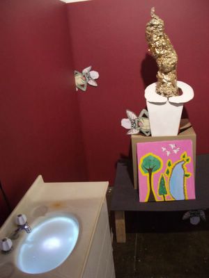
Papageorgeopoulos and Barclay’s installation in the big space is called Tough Nuggets and it’s a pile of shit. That’s a joke, by the way, and one we’ve been looking forward to using for years. Thanks to the artists! The show is an elaborate extended metaphor for laying an intellectual cable and is replete with toilet paper scattered on the floor, cardboard cut out Gremlins [from the movie Gremlins], DVD projections and wonky looking vanity unit set up on one wall. In our advanced state of crapulence, the installation was extremely demanding. Papageorgeopoulos’s piece Gold Rush was a huge mixed media installation with an actual turd made out of 24 carat gold. Surrounded by grinning gremlins, the work had a demented carnivalesque feel. Right next to it is Urgh by Barclay, a DVD projection onto an opaque surface in the off white surface of the ‘water’ in the vanity unit. There’s no sound, just a face looking down, as though into a toilet or a bowl of water, gurning and grimacing.

It would be wrong of us to say we understood what Tough Nuggets was about and extremely hard to guess. According to the press release Papageorgeopoulos says that “it’s all about vomit and turds in the end”. We’re not sure what ‘end’ is supposed to mean in that context, but if by ‘end’ she means the absolute end, then yes, we agree. The installation delights in its own perversity and lo fi production values and challenges the viewer to come up with a formula to explain it. Perhaps we’re trying too hard here, straining and sweating too much over the minutiae of the works. The show was very funny, and that’s more than enough.

In comparison MFD is a group show with a very clear intention – all the works engage with the mechanics of image making, the reflexive processes of creating art and do so in a variety of ways. The show is also a very didactic demonstration of how dangerous it can be to be so self consciously aware of your own processes – carrying this kind of thing off is extremely hard. Not only has it been done before, better and a hell of a lot of times, conceptualism long ago headed off into the dark waters of a highly self regarding mannerism. Let’s call it Conceptual Mannerism and get on with it.

Adam Norton paints a very nice monkey in a painting called Rhesus Monkey which is part of a series of four works that includes a portrait of another guy named Adam Norton, one of Benito Mussolini’s profile and one of an alien. When the penny drops, you can actually feel it, like the coin is going into a slot in the top of your head and down your back. We had that feeling in front of this series and it was kerrrching straight away. Yes. Portraits! Of different things! Hoorah! Next to Norton was a piece by Kyle Jenkins called Monocut #6 which was a small square canvas with the top left hand section of the canvas razored and lifted back to reveal the stretcher behind. It wasn’t for sale, which was a shame, because we would have liked to have put it next to our see-through Mark Titmarsh painting that reveals the stretcher behind. It doesn’t matter that these works blew their conceptual seed so quickly because we still enjoyed the intellectual intercourse.

It’s kind of funny in a way that artists making this type of art are so didactically obvious. It’s like saying, yes I know I’m being obvious, but that’s part of the deal. I have to acknowledge the obviousness because it’s not the object per se that is the subject of the work, but the idea that created it. Obfuscating the process would just short circuit the work. This kind of intellectual formalism makes Tough Nuggets look like pure anarchy. Ron Adams’s works are three canvasses that incorporate their titles into text that’s painted on the canvas – not in an obvious way – but all mixed up so you have to turn you head around to read it. You look at the room sheet, then at the painting. Oh right, you think, and then move on to the next one. It’d be great if all the works made a sentence. In this case it’d be There’s Two/We Think, We Think Not/Looks Like An Ear. Does that make sense?

Manya Ginori work is elegant and simple and totally old school. We know 70 year old artists who taught at Alexander Mackie who’d just go bananas for this work. There are four square canvases in a row on the wall. On the right is a wooden sculpture called Spiral Construction [that looks a bit like Malevitch’s Monument to The Third International] stuck to the wall. The shadows cast by the sculpture are the source for the drawings on canvas. And that’s all you’re getting, as plain and simple and as forceful as cheap vodka on a freezing night. Suprematism, da! Anna Peters’s work, by comparison, is a lot looser, cartoony drawings on paper plates, paper, acrylic on canvas are jokey one shot reflexive gags. We thought them kind of crappy but had charm.

The most interesting work in MFD is the most complex in terms of its allusions but also the most confusing. Bibliography of a Painting (It’s Your Move Comrades!) by Reuben Keehan is just one canvas stuck to a wall with an accompanying reading list provided on a plinth nearby. “The above works were consulted in the development of this painting. A condensed reader will be available shortly. Please Contact MOP Projects to register interest.” And there is a reading list: Carl von Clausewitz’s On War, Malcom Lowry’s Under The Volcano, Nietzsche’s Ecce Homo and Karl Marx’s Early Writings among them. The work itself is entirely white except for the text Vous De Jour Camarades! painted on it at the bottom and rough and textured with clumps of paint in the style of Yves Klein’s textured monochromes. We pondered the work for a long while until we decided that the artist had taken pages from these books, chewed them up in his mouth and then stuck them to the canvas. We’re not sure if he really did it, but in a way, he did. And that’s something to think about. The end.

Show Us Your Reg Grundies

Monday, September 05, 2005
Sometimes it feels like the wheels just go round and round. Gitte Weise is shutting up shop and heading to Berlin. Patricia Piccinini has a five year old video work playing in the Contemporary Project Space at the Art Gallery of NSW and John McDonald has a go at the MCA. It’s a good thing that we like repetition – it feels good – but it still makes you stop and wonder, haven’t we been here before?

We heard last week that Weise was shutting her Sydney galleryand was on the blower trying to stop the rumour mill from grinding. We can only assume that when the news made the Sun Herald’s S section [the place to read all the latest art news] last weekend that it’s all now common knowledge and official. You could probably make the argument that Weise was a brave gallerist, exhibiting artists and art that other galleries were too fraidy cat to exhibit themselves, but then again maybe not. As was said to us recently, Berlin is a great place in which to be an artist, but a terrible place to run a gallery. We wish Weise all the best.

The S article that mentioned Weiss was about a recent Contemporary Benefactors get together, a meeting of dedicated art world philanthropists who support the AGNSW and its efforts to build up their contemporary art collection. A ticket to a CB function will also give you the opportunity to donate further cash [via a hand held credit card machine] to the purchase of particular art works the gallery wishes to acquire. One such piece is Patricia Piccinini’s Swell, a three screen DVD work from 2000 that the AGNSW wants to buy from Roslyn Oxley for $16,000. The benefactors have reportedly managed to trump up $8000 including a donation of around $2000 from Oxley herself. Did you ever see that Daily Show news report read by John Stewart where it was reported that Iraq was importing oil? Our reaction was just like that – whhhhhhaaaaaaaat!!!? When we calmed down, it all became clear and the god like genius of it explains why Weise is going to Berlin and why Oxley reigns supreme. The AGNSW gets its Piccinini piece, the gallery and the artist sell another work into the collection while the dealer gets a percentage of the sale plus a nice little tax deduction as well. Did you know that Oxley has a show by Piccinini in her gallery at the moment? It must have just been a coincidence.


A billionaire, yesterday.

Walking around the AGNSW it’s strange to find that there's an exhibition next to the downstairs coffee shop by Reg Grundy. Yes, the very same Reg Grundy who brought us countless hours of TV fun in the form of game shows such as The Price is Right and soaps The Young Doctors, The Restless Years, Neighbours and perhaps his greatest creation of all, Prisoner. It turns out that Grundy has a secret life, but instead of being a covert operative for the CIA, he goes out and takes wildlife pictures. A billionaire from his TV shows and the sale of Grundy Television to Fremantle Media in 1995, the would-be photographer is 82 and has only been shooting wildlife for six years. Frank Devine in The Australian described the works as having a “startling intimacy” but they are in reality extremely average and are displayed in back lit cases and wall mountings with accompanying text and multimedia sound and lights. It’s rather odd but the AGNSW - which has the ‘show’ until Saturday - doesn’t mention the exhibition anywhere on its web site or publicity. How do you suppose it came to be that the AGNSW came to host this show instead of say, the Australian Museum where it would have made a lot more sense? Grundy is a billionaire who takes photographs and the AGNSW is an art gallery that shows photography. It all goes together.

In a final act of ignominy, we were reading Steve Meacham’s flattering profile of Liz Ann Macgregor in The Sydney Morning Herald’s Spectrum. The piece, The Accidental Australian, described the personal sacrifices Macgregor had made to take up the directorship of the MCA, the end of her marriage and the difficulties she had in realising that most Australians don’t go into the office on Sundays. The article also made mention of the fact that under Macgregor’s stewardship, the gallery now has an extra large gallery Fourth Floor space to display items from the permanent collection and that the building has been saved from ‘development’ [i.e. complete destruction, a plan courtesy of Frank Sartor]. More importantly, the gallery is back in the black financially and visitor numbers courtesy of the free entry [thanks Telstra!] has made shows such as Tracey Moffatt, Ron Mueck, William Kentridge and Bridget Riley huge successes. The disappointment came when Meacham felt it necessary to spoil the fun by quoting The Esteemed Critic John McDonald and his party-pooper, kill joy anti-MCA stance. To wit:

The MCA and Macgregor have their detractors, most vociferously John McDonald, the Herald’s art critic. McDonald says he was even more critical of her predecessors, but he accuses Macgregor of presiding over “an institution with an intellectual complacency."


Aside from the fact that McDonald’s statement doesn’t actually mean anything, it’s far too predictable, perhaps the Herald likes to flatter itself that their critic is ‘controversial’ and we want to hear this oft voiced opinion yet again, or perhaps that the story needed ‘balance’, but whatever the reason, we just thought, you utter bastards.

There was a moment of levity, however, in The Esteemed Critic’s review in the same edition called Emotion In Slow Motion where he popped down to Canberra to review Bill Viola’s The Passions and the National Sculpture Prize and Exhibition. Spending the better half of the review lamenting the fact that the ‘emotion’ in Viola’s piece looked fake [yes, it’s all fake!], he roused himself to like most of the Sculpture prize while adding the caveat that:

"For someone like me, who often feels that he’s seen it all before…"


…there were a few good things. For once we agreed.