<body><script type="text/javascript"> function setAttributeOnload(object, attribute, val) { if(window.addEventListener) { window.addEventListener('load', function(){ object[attribute] = val; }, false); } else { window.attachEvent('onload', function(){ object[attribute] = val; }); } } </script> <div id="navbar-iframe-container"></div> <script type="text/javascript" src="https://apis.google.com/js/platform.js"></script> <script type="text/javascript"> gapi.load("gapi.iframes:gapi.iframes.style.bubble", function() { if (gapi.iframes && gapi.iframes.getContext) { gapi.iframes.getContext().openChild({ url: 'https://www.blogger.com/navbar/6466083?origin\x3dhttp://artlife.blogspot.com', where: document.getElementById("navbar-iframe-container"), id: "navbar-iframe" }); } }); </script>

the art life

"...it's just like saying 'the good life'".

Making Movies

Monday, May 30, 2005
One of our favourite pastimes is watching movies that feature artists in their plots. We love the depiction of artists and their bohemian lifestyle, the making of art, the cruel art market and the discovery by artists of their own tortured creativity. From Kirk Douglas as Vincent Van Gogh in Lust For Life to Nick Nolte as Lionel Dobie in New York Stories, from Six Feet Under to Ghost World, Great Expectations, The Doors and The Horse’s Mouth we’re suckers for every last cliché of the cinematic art life.

Until now we have been struggling along, building up our own personal selection of movies that feature art and artists without much help. That is until we discovered two excellent sites. Art History In The Movies is a collection of film titles and DVD jackets describing films about art or artists with a couple of lines on each. It’s pretty straight forward but it’s as exhaustive a list as you’re going to find outside the Internet Movie Database.

Of a much higher order of detail is The Art Historians Guide to The Movies a reader compiled compendium, not just of movies about art, but also movies that coincidentally include art as décor. You’ll find all the usual art films listed (Lust For Life etc) but also reader submissions about some unlikely art related content such as this posting regarding art found in Ferris Buellers Day Off:

Thought I'd mention though there are many more artworks shown in the movie Ferris Bueller's Day Off than Seurat's Sunday on La Grand Jatte. There's a long sequence at the Art Institute of Chicago, starting with Ferris, his friend & girlfriend holding hands with a lot of kids walking past Gustave Caillebotte's large Paris Street; Rainy Day (1877),then a still shot of Edward Hopper's Nighthawks (1942), still of two Kandinskys, (Improvisation 30 (Cannons) (1913) and Painting with Green Center), five Picassos (Nude under Pine tree, Old Guitarist, The Red Armchair, Portrait of Sylvette David, Seated Woman), also shows Jacques and Bethe Lipchitz by Modigliani and Day of the Gods (Mahana No Atua) by Gauguin, Greyed Rainbow by Jackson Pollack, Bathers by a River by Matisse, and in the shot of the three of them lined up you can see In the Circus Fernando: The Ringmaster by Toulouse-Lautrec in the background, also shots with Rodin and Moore sculptures, Matthew Broderick & his girlfriend kiss in front of the blue America Windows by Chagall, before it finally ends with the sequence of the large Seurat.


The site doesn’t as yet contain anything about what has become one of our most favourite recent artist films, Max. The film's depiction of the early art career of Adolf Hitler (Noah Taylor) and his relationship with his Jewish art dealer Max Rothman (John Cusack) and meetings with artists such as Georg Grosz (Kevin McKidd) - not to mention one of the single worst depictions of performance art this side of Legal Eagles – makes Max a must see if you’re into heavy handed symbolism and you enjoy a romp through the early days of Fascism.

A subgenre of the artist film is the film made by an actual artist. We don’t mean “artist film” in the tradition of artists getting a hold of a camera and making a movie or experimenting with “film as art”, we’re talking about artists actually directing Hollywood style movies with cast, crew and high end production values. Among the most conspicuous of artists making films over the last decade has been New York painter-turned-director Julian Schnabel and his two bio-pics, the first of which, Basquiat, is a spiritually if not factually accurate recreation of the NYC 80s art scene and its most famous deceased son.

Robert Longo, another almost forgotten American 80s artist, directed his first and only feature film Johnny Mnemonic in 1995. Attempting to create a science fiction film based on the unfilmable work of William Gibson and starring Keanu “I can shout!” Reeves, it’s little wonder that Longo returned to making art after this stinker was released. Now available on DVD for under $10, it’s worth watching if only to see a supremely untalented director waste the talents of both Takeshi Kitano and Ice T.


From David Salle's Search & Destroy, 1995.


Another artist film is Search & Destroy directed by David Salle that’s readily available in bargain bins for less than $8. Also released in 1995, but unlike Longo and other unfortunate artists-turned-directors, Salle’s film is actually an overlooked low budget masterpiece. Starring Dennis Hopper, Illeana Douglas, Griffin Dunne, Martin Scorsese, Rosanna Arquette, John Turturro, Ethan Hawke and the incomparable Christopher Walken, the film artfully combines Salle’s trademark visual stylings with a biting satire on the mid-90s mania for Iron John style male bonding. If you’ve ever wanted to see Walken try on some Rodney Dangerfield one liners before a tap dance number in a Japanese restaurant, or see Hopper as a televangelist, this is the movie for you.

There haven’t of course been as many Australian artists who have made feature films. There was Davida Allen’s eye watering confessional short film Feeling Sexy but we’re struggling to think of any others. That was until we read Antonella Gambotto’s piece Words In Motion in The Australian’s Forum section in Review on May 21.

Gambotto is one of Australia’s leading self publicists who forged an early career interviewing pop stars in the UK for Australian street press before graduating to the grown up world of novels, newspaper columns and her own self aggrandising web site. Although officially “a babe” and a member of MENSA, Gambotto’s writing goes a long way to prove that just because you’re a genius and very sensitive, it doesn’t then follow that you can write.

Gambotto is the author of some duff novels, short stories and a non fiction account of her brother’s suicide. By some quirk of fate, it now turns out that Adelaide based artist David Bromley is turning some of Gambotto’s stories into a feature film, as the author recounted in her piece for The Australian:

It was as if Alexander and I had been hit. On screen, Hugo Weaving -- haltingly, and with such elegance -- read from a sheet. (I have never met Weaving. Some years ago, our glance briefly interarched in Sydney's Ariel Bookshop. His eyes were lamps. He was taller than I had imagined, and his fingers formed a loose love-weave with those of his young daughter.) There he suddenly was, forever captured in the act of reading my words of love to my fiancé, Alexander. The pressure on my heart as I watched was unexpected. Alexander, too, said he could barely breathe. I had first read this poem to him on the telephone from the bed that would soon be ours; now the poem was part of a film I Could Be Me, made by the artist David Bromley. The film, based on a series of stories that I wrote, does not conform to traditional cinematographic formulas. Instead it flows seamlessly from image to original image, with words and music delicately superimposed. It is the most beautiful film I have ever seen, not because of my own involvement in it but because the spirit in which it was created defies the sterile modern gods of market research, profit margins, brand reinforcement and demographic merchandising.


Our heads are swimming in the detail, coming a' cropper on the big rock that is the word “interarched” before being swept away in another mixed metaphor.

We have confessed here before that we had a thing against David Bromley based on the fact that we had him mixed up with West Australian critic David Bromfield and we apologise to both for the ongoing embarrassment. Of course, how a flat cap wearing Yorkshireman with a penchant for Imants Tillers and Mike Parr could ever have painted the bare breasted beauties of David Bromley’s canvases, we don’t know, but we live in shame at our mistake. Bromley is a successful artist with a very nice house that’s been featured many times in life style magazines and his illustrative painting style has proven very attractive to many buyers. As to how he will fare as a film director, especially one who does not bow to the wishes of the market place and the dreaded demographic merchandisers, we don’t know, but Gambotto has this to say on the process of turning words into images:

Words are my means. I wrote: ``Her words had changed the shape of me ... I breathed her skin. And all I wanted was a boat and an afternoon like this to sail her away in.'' This year I'm 40 and I have yet to understand how my love can indirectly work a stranger's jaw. How did Weaving became a vessel of my love for Alexander? How did Bromley summon from me words? And how is it that Alexander inspires in me this sea? Are writers and artists alchemists or the alchemical process itself?

Consider this. In 2001, my brother Gianluca committed suicide and in his memory I wrote The Eclipse; through Gianluca's death, I met Alexander and the man who introduced me to Bromley's work; on my first date with Alexander, we attended the opening night of Bromley's exhibition; my stories about Alexander helped shape I Could Be Me; Bromley is now painting Gianluca's portrait, and shots of me with Alexander are in the newly published book of Bromley's film.

When Bromley and I were in discussion about the film, he emailed me this jumpcut of opinion of my stories: ``I find them to be beautifully multi-dimensional ... they are at once straightforward & complex ... I adore the poetic scenarios & would love to use those as echoes & dialogue throughout the film to reinforce the short stories ... I hope when you see/hear/feel your words in the film you'll get goosebumps ... a film can be great but the energy surrounding its entry into the world can make such a difference to its momentum ... I'm now off to the studio to hopefully turn my pumpkin into a paintbrush & easel ... much love.''

Into The Sun

Thursday, May 26, 2005
It used to be just a question of chance. You could calculate the likelihood of the tail falling off or an encounter with clear air turbulence or a lightening strike or seagull going into an engine. It was all in the numbers and the numbers were good. Now there’s the random factor of a fellow passenger, someone who looks completely normal, suddenly jumping up, screaming ‘death to the infidels’ and blowing up their shoe. Or perhaps you’re idly looking out the window, dozing, when you notice a flash on the ground that isn’t a reflection off a car windscreen but the telltale back blast of a shoulder mounted missile that’s headed straight at the soft belly of the 737…

We swirl the ice in our plastic cup of Scotch and Coke and look at the people sitting near us.

The man in the next seat, the aging businessman with halitosis and a battered brown briefcase that’s balanced on his knees, is flipping through documents from the ATO. He holds the sheaf of papers with one hand while adding up his tax bill with the other. $50,000 owing. His wife grimly reads an airport novel behind gold jewellery and long dirty blonde hair. When she takes off her sunglasses we see that her eyes look sunken and her lips are slightly extended. A flight attendant walks past with a Crown Lager. It’s another beer for the man two rows in front, the guy with the head of bountiful white hair, a rubbery face and who’s wearing cheap wrap around Cancer Council sunglasses. He takes the beer, maybe his tenth in three hours, and starts talking to himself while gesturing out the window. Inside his head he’s winning the debate.

Perth is still another two hours away.

Land of Plenty

We came to Perth for the Hatched 05 show and the accompanying symposium. Our job was to look at art and deliver our paper.

Perth is a fine city that was built in 1997 by a consortium led by Freedom Furniture, Lego and KFC. All the buildings are new, there’s plenty of head room and lots of light. People walk around the city’s malls and happily patronise the local franchise outlets of those familiar brand name shops that make up a generic Australian city - A&R there, KFC here, David Jones, Meyer, Crazy Charlie's. It’s like being anywhere.

People tell you that Perth is very flat and that it’s the world’s most geographically isolated city. While these statements are true what they don’t tell you is more revealing. Perth, for example, is one of the cleanest cities in Australia, perhaps even as clean as Singapore, but the price for such cleanliness is high: a mandatory death penalty for littering. Perth is patrolled by 10 year old police officers who have been selected from local primary schools for their lack of compassion and their eagerness to impose the full weight of the law. The West Australian ran a front page story about the more than 1,000 speeding tickets that had been handed out in less than a week and it was all down to the eagerness of the police. The front page was shared by another story about a farmer named Peter Dean who had a 50s ducktail hairdo and a beer gut and who was pictured slumped against a farm gate. Dean confessed to the newspaper that he was very pleased about the lack of drought in the West and that he was looking forward to the best season since the mid 90s. If you were ever looking for a place that embodied the saying “you’ve never had it so good”, Perth is that place.

In Perth alcohol is given away for free to visitors. This makes for a convivial atmosphere at openings. The Perth Institute of Contemporary Arts – which is marked on tourist maps as PICA Arts Center – is a palace compared to its dark and gloomy cousins on the East coast. It is two storeys high with gothic towers, high ceilings and polished floors and is staff by attractive people who do everything from sweeping the floors to serving drinks to curating shows. Hatched is the annual get together where graduate students from around the country converge on the city to toast each other’s genius and beauty and display their art and PICA is the host.

In your mind you would imagine that Hatchedwould be put together by a curator whose brief was simple: go forth and find the best of the best from Australia’s art schools. In reality the way the works are selected varies from school to school. In some art schools it was simply a matter of who scored the highest marks, for others it was a casual invitation to be in the show while for some it was an actual competition. We thought that Hatched would also be a selection of recent undergrad work but the exhibition also included MA and PhD work as well. The person or people making the selection of art and artists for Hatched weren’t required to select art that was particularly representative of anything other than a range of work, so in practice schools tended to select some painting, some video and something else, usually photography. It would be tempting to say that Hatched was representative of various tendencies among young artists but since its organisation is so ad hoc, the only thing you can say about the show as a whole is that there are a lot of works and they’re all kind of similar.

One consistent aspect of the show is how disappointing many of the works were. Where artists had control of their chosen mediums, they were let down by some dodgy conceptual frame work that wasn’t properly resolved, was too wooly or was so overstated that it defused whatever effect the work had. In some cases it seemed like the artists weren’t completely in control of their medium, or failed to make you believe they were being crap on purpose. Either way, you were left shaking your head, thinking ‘this is meant to be the best?’


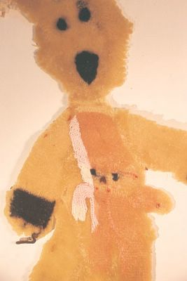
Liz Deckers, Bear and child from the series Apples and bears.
Found object, wax, 55 x 30 cm. Image courtesy PICA.


Seeing the works isolated form the rest of the artist’s practice didn’t help either. It may have been the case in some instances that the work was part of a bigger project and maybe seeing it in context would have made a lot more sense. Then again, if the works can’t stand on their own, what’s the point? One work we saw in the show that attracted our attention immediately was a work by Tony Cran from the Victorian College of Arts. The work was a painting of an owl done on some pine board and from the other side of the room it appeared that the owl was painted directly on to the board and the orange and white pattern of its feathers locked directly into the swirling wood grain of the base board. However, when we got up close, it was disappointing to discover that Cran had painted the owl onto a piece of canvas that was stuck on to the board. Aside from the fact that the apparently bravura execution of the piece was an illusion, it was a let down to discover how nasty the matching of materials seemed. Pine board is such a rich texture it should be respected. When we saw that the work was called To Lose Surprise we nearly broke down in tears. Looking at the catalogue we saw that Cran had used a completely different work from the same series. Maybe seeing To Lose Surprise in context would make more sense, but who knows?

Finding something in Hatched05 with some idiosyncratic individuality was also difficult. The exhibition was ruled by a default contemporary art aesthetic that tended to make the works meld together and, combined with some half arsed theorization in the catalogue notes, was rather timid and dull. There were some stand outs. Visitors to PICA with a sensitive nature should avoid the work of Liz Deckers, from Southern Cross University, in which there is extensive bear abuse of a kind that we find appalling and horrifying. If you are such a person, please skip this paragraph. Deckers has gone to Salvation Army stores, bought pre-loved teddies, gutted them and dipped them in boiling wax. Using an iron she has flattened them out and then, once dried, stuck them on the wall. Hung next to the 2D teddies are some apple slices on which the artist has printed pictures of samurai and princes and maybe some kind of Goldilocks figures. What does it mean? The works are called Apples and Bears and the artist describes her methodology in the form of a poem:

Apples and Bears.

I found these three bears in a local Salvation Army store.
I took them teddies home.
Cut them in half.
Removed their fillings.
Dipped them in hot wax.
Flattened them out with my printing press.

This gave me distorted, woolen, but soft nor cuddly objects that no longer could be understood as trusted comforting toys.

As a hysterical parody, my bears comically evoke the carnivalesque. The Carnival, or in this case, a teddy bear parade, invites mirth. Laughter can be considered as a radical form of hysteria. Laughter asserts the refusal to be controlled and the feminist exploitation of laughter has stimulated many critiques of authoritarian structures.

My prints on dried apple slices probe issues of the body, its learning patterns and memories.

I found these apples in the kitchen.


Please, mummy, why did the nasty lady kill the teddy bears? Well, dear, she’s from Belgium so that should explain a lot but it won’t stop us calling BARE (Bear Abuse Rescue Experts).

Gettin' Sloppy


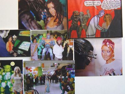
Drew Horsfall, Untitled.
Mixed media on MDF and pine, 3 components: 150 x 240 cm. Photo by the artist.


Drew Horsfall from VCA had a big work called Untitled and we have to confess when we saw it at the opening we thought it was rubbish. But we went back several times and looked at it again and eventually we began to love its rough-as-guts aesthetic. Horsfall’s work is a collage of images of Britney Spears, Paris Hilton, Christina Aguleria, the alien from Alien, He Man dolls and crudely executed drawings of the artist playing arcade games, arranged on MDF and pine with some bits raised from the surface, others just stuck on and dog eared. There’s a certain knowingness to being crappy that can undermine the effect just as surely trying to be perfect and failing underscores an artist’s inexperience, but Horsfall caries it off somehow and after sustained viewing Untitled is little bit like drinking too much spumante, all heady and queasy. It’s cheap, but it gets the job done.

Horse/People


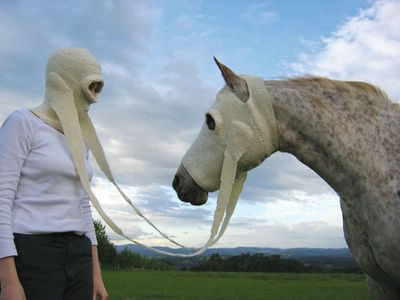
Kate James, The world is a dangerous place (detail).
Knitted wool, Pegasus digital print, installation dimensions variable. Photo by Clare James.


As far as idiosyncrasy is concerned Kate James from RMIT is in a place all of her own in Hatched05. Her work The World Is A Dangerous Place is explained in her catalogue notes as being inspired by the experience of worry and anxiety and empathy for the anxious animals. We certainly know what she means. Every time we see a disaster movie like The Day After Tomorrow we feel the worst for the animals who can’t escape or don’t know what’s coming (aside from the birds, that is, who always fly away at the last second) and we don’t care about the people who just sit around saying things like “I don’t care if that volcano is gonna blow, this is my home” and then get covered in lava. Stupid, stupid humans. There’s no pathos like pathos in the animal kingdom. James’s knitted wool balaclava and horse-mounted equivalent allows for human animal interaction on an intimate scale. How the horse feels about the deal, we don’t know, or what would happen when it went off fleeing the lava, but for the moment the photograph was taken, it was a rare moment of inter-species empathy.

Video Man

As you might expect, there was a lot of video and photography in Hatched05 and not much of it very interesting. Most of the works obeyed the rules of video production and stuck to well known and well worn modes of presentation. Rhys Turner from Sydney College of The Arts deserves a special medial then for breaking with all the conventions of interactive video, the most impressive of which was that it was working throughout the time we spent at the show. Aren’t these things meant to break on opening night? T

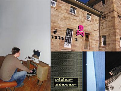
he work is called Video Stereo and consists of a turntable with a pink plastic record on it and a video monitor both mounted in an old stereo set up. Visitors are invited to “scratch” the video like a DJ by moving the record back and forth as the arm of the player tracks over the vinyl. As you push backwards, the image and sound goes backward. If you go forward it goes forward, if you go back and forth, the image and sound stutters in the DJ style. It appears at first that the video and sound information is on the record and that the artist has somehow managed to create a hybrid analogue/digital interface using two different kinds of technology, but playing around with the work reveals that there’s some sort of software behind the scenes simulating the experience. The work is masterful in its ability to set up what feels like play for the viewer and then extrapolate that experience into something where you try to figure out what is happening and how it is done.


Rhys Turner, Video stereo (installation views).
Wood veneer stereo cabinet, turntable, computer monitor, speakers, 80 x 120 x 50 cm. Photos by the artist.


Queensland College of Arts’s Genevieve Staines has a work called 21st Architectural Gothic that invites viewers to experience a similar set of interactive controls in her video installation. With five pressure mats facing a screen at the end of a dark hallway, the viewer sees the skyline of Brisbane appear and disappear in stages until only a single building remains, then just nature. The act of erasing a city back to some form of semi-natural environment is a richly evocative experience, even if the technology the artist uses seems a little clunky. Speaking on her work at the Hatched05 symposium, Staines showed a number of other pieces where she did similar things to other views of Brisbane and it the effect was stunning.

Single channel videos at Hatched 05 weren’t much chop but one that stood out for the simplicity of the artist’s vision was a work called Unlossless Format by Tom Halliday of the Charles Darwin University. The piece was a single frame made up of four rows of four images which were crudely drawn images of random porn, TV snippets and atomic explosions. The soundtrack was an overlapping collage of spoken voices, all American, saying very anonymous things. Reading the catalogue we discovered that the artist had sourced all the images from the web and created rotoscoped drawings of the sequences by following a set of rules that he had set down for himself such as how each frame had to be completed under two minutes, each frame had to be of the same dimension and that each be completed without reference to the last image. Sometimes artists lose sight of the borders of their projects taking in more and more things until the focus is lost and the work is too loose. Halliday, by creating a tightly structured experiment where the end result is only constrained by the simplicity if the idea, stood out as an artist who was clearly in control of both the form and content of his work. If you were looking for art to put in a show, that’s exactly what you’d be looking for.

This Is The Voice of The Art Life

The Art Life are a group of artists and writers who got together in 2004 to start a blog. A blog is like an online diary but with higher production values. We publish once or twice a week and we do reviews of exhibitions, news, art world politics, galleries and publications. Since we began, the number of hits has grown steadily from a couple of hundred a week to close to 3000. We have visitors from all over Australia - which is kind of odd, as the blog is about the Sydney art scene – and we have readers overseas and even get hits from computers registered to the US army.

The question we will discuss today is “why write about art?”

Certainly there are the philosophical implications of proposing such a question of ‘why’. Why prooses that one thing might make or cause another thing to happen – the concept of causality, why one thing, in this case art, causes another thing, writing, to happen. For example, the cue ball causes the eight ball to roll into a pocket, or heat causes water to boil or the Moon’s gravity causes the Earth’s tides. But can we therefore say with any certainty that it’s the art that causes the writing to happen, or is it the writing that conjures the art into existence?

Then there is the vexing notion of what constitutes “about” – as a measure the word ‘about’ is imprecise, an approximation of the thing, and denotes a notional condition of subjectivity, that is when we say “we write about art” it is neither the thing nor a particularly faithful rendition of the thing. These are complicated ontological questions.

Yes, you’re thinking, that’s all very well and good, but will writing about art make me rich? Yes, yes, it will. How rich you ask? Well, let’s put it this way. When we first started to benefit financially from our art writing we were, in comparison to most people, very well off. We went out and bought new cars and clothes and pretty things to decorate our architect designed cliff top mansions. But then we entered an altogether new realm of wealth where money began to lose its meaning and although we could buy anything our hearts desired, we began to lose our zest for life. The fine wines we sipped and the exquisite foods we ate tasted like bitter ashes from the bonfire of our talent. Life in the art world is there for the taking, but once its glistening fruits have been plucked they begin to sour. The bounty of our imaginations was a desolate wasteland of neglected promise and compromised values.

Hey, you’re no doubt saying, I can handle the money – but will writing about art make me famous? Arts writers can expect to be vaulted to the very top of the social ladder, their influence and glamour outstripping the very artists they write about, the clamouring callow gallerists who vie for your attention and favour, the social butterflies that come to rest upon your bejewelled fingers and who flatter with their silken wings. Everyone wants to know what you think. They ask for your opinion. They love to see you at parties.

But it’s a shallow kind of fame, a Paris Hilton sort notoriety instead of a Bertrand Russell type of seriousness. When the artists’ start grabbing at you coat tails asking for an article in a learned journal, and you are forced look into the hungry eyes of their children, it takes a very hard heart not to realise that, as Cicero said, glory follows virtue as if it were its shadow.

Midway on our life’s journey, we found ourselves in dark woods, the right road lost.

We decided that we must act to save our souls. We launched into the Australian art world our twice-weekly blog called The Art Life and we have been feeling better. Still richer than Croesus, yes, but our consciousnesses are assuaged like an oil tycoon who has decided to drive an electric car – it’s the same kind of sin, only a lesser one.

The art world and its magazines and books and essays and room notes and catalogues have become very similar. Even different is similar, so similar that difference is now only measured in relation to something not very different to itself, just slightly, imperceptibly different to the thing measured. It is niche marketing in the art world – voices are catered for, and can even prosper on the notion that difference does in fact equal difference.

Let us put that another way. Every time you hear the words “expect the unexpected” or “anything can happen” you know that whatever is to be expected, or what will happen, will fall within a very restricted measure of possibility. In the art world the same expectation and outcome applies – the available means and methods of expression and discussion have meant that we are a people who live on an island so culturally small that homogeneity rules at every level.

We have come to expect less to avoid disappointment. It may be that like Prospero, we know of another world other than this, but we are happy in our exile, or, like rats, once we have the cheese, we sit back to admire the maze mistaking it for our homes.

To create something viable in a world of homogeneity is look to the self for the texture and weft of subjectivity, the thing that drives emotional and psychological reactions to the external world. It’s something of a paradox but it’s that individuality that creates both an admission of similarity and recognition of real difference. Radical subjectivity can be entertaining for a while but something between the specific and the general is the place where real change is made.

You look out at the world and the things that interest you – art and birds, boxing and astronomy, music and movies – and reflect on the experience. It can sound kind of corny or solipsistic, but writing is a form of thinking about yourself. It’s for that reason that writing about art seems like a natural meeting of two related disciplines. Art is a way of thinking about the world, remodelled and presented in a different form, and so is writing.

It is often the case in arts writing that it is seen as subservient to the art, that it’s role can only be one of an obvious and didactic explicator of hidden meanings or that it should act as an interpreter of the artist’s intentions. Writing has to be liberated from the rule of subject – we have often wondered why writing about art is defined by the subject, when the real meeting of disciplines is in a treatment of theme.


The blog, is in our view, the first truly democratic means of communication. It can be free or as expensive as you want, its content and style is not restricted by anything except your imagination and if you have the ability to create within the confines of a generic package, its possibilities are huge. That may seem like a contradiction - how can you be original within something that’s generic? But it’s just packaging and a handy means of delivery, just like a book, like a magazine, a TV show, a 90-minute movie.

It has been pointed out to us many times that if you’re poor and you don’t have a computer, blogs aren’t the revolution we think they are. And that’s true. We all have to live in the shadow of someone else’s misfortune.

There are tens of thousands of blogs on the web at the moment. We cannot tell you how many times we have clicked through the blogs hosted by Blogger and read the mundane details of people’s lives. There is a lot of online writing, most of it untutored and not very interesting, but the ones that stand out are those that assume that there is another reader, or at least a potential reader, aside from the person who wrote it. Being aware that there is an audience for what you are doing and speaking to them lifts a blog to somewhere near the top 5 per cent of the hundreds of thousands of pages of writing. There are a number of celebrated examples of blogs that have attracted a lot of interest such as the Dear Raed blog by a gay man living in Baghdad before and after the wars, Reverse Cowgirl a New York woman’s sex diary (which no longer exists, but read about it here ) and various right wing political blogs. We recently discovered a blog called The Last Nail by a guy who is documenting his efforts in building his own home between jobs as a construction site worker. As unlikely as it sounds, it is one of the funniest and most well written things on the web.

The thing that these blogs have in common, and what we try to achieve with The Art Life, is to take the job of writing and the subject we choose to cover with a degree of seriousness. That’s not say of course that you shouldn’t attempt humour or irony but a knowledge of the subject, or at least an account of how you are discovering your subject, also serves to distinguish between a good blog and a million others. The result of taking it seriously also means that your readers take you seriously, so although there is an incredible number of blogs and web sites, there is the ability to cut through the noise and find an audience. In essence, a blog is a serious as you make it and people will respond.

There is a school of thought that says the rules of print journalism should apply to blogs. Certainly accuracy of information and fairness of comment should apply, but on the other hand, blogs are still developing and growing. It’s too soon to start fencing off the prairie lands, we just got here. But in terms of accountability, to have a credible voice you have to be in possession of the facts, at least make an attempt to find the facts and be ready to make an admission of guilt if mistaken. And we should add, if you’re going to use irony and satire and crack a few jokes, be ready to apologise.

Blogs are a hybrid form, somewhere between a magazine and a book, but perhaps more like a magazine or a book in the future where you can listen to music in an article about the music, see a clip from a movie, hear the voice of the person who wrote the article or spin off to entirely different sites from a link. We know the theories of hypertextuality and what’s possible on the web but to be frank, as practitioners, the theory doesn’t excite us that much because the reality has already outstripped it.

One question that we are often asked is why the ‘we’ – why the plural pronoun? We’ve been accused of being cowards and backstabbers and that we fail to step up to our opinions. The reason we are a ‘we’ is for a number of reasons. We’re speaking for a collective view, both for us and people like us. ‘We’ is literally inclusive, it welcomes the reader into the thoughts, is much easier than the shotgun blast of ‘I’ and isn’t as scary as the freaky ‘you’. Speaking as we, ‘we’ underlines the level of uncertainty inherent as to who ‘we’ is, the voice speaking and thinking about art. Art is a series of postulations and conjectures. Not only is the experiment an ongoing unanswered theory or question, the methodology is constantly changing. ‘We’ encapsulates this uncertainty but also underlines the collective nature of the project.

Why write about art? It’s a difficult question to answer. It’s not as though there aren’t already enough Australian art magazines or enough imported magazines or newspaper critics. Somehow all these magazines get bought and right wing conservative critics get jobs, so someone out there must value all those words and all those opinions, someone must agree with the you-beaut-ridgy-didge safety net of consensus opinion. But unaccountably is seems we’re not happy, something is wrong and we still don’t know what it is. The answer to the question is that writing about art is about act of empowerment, about creating rather than simply consuming other people’s opinions, ideas and thoughts.

The thing that surprised us most when we started the blog was not just how seriously people took it, but how passionate readers were in voicing their own ideas and opinions. Along with that came something else that blew us away. It was the generosity of artists towards whatever comment we made. The overwhelming response has been positive and we have received e-mails and letters of thanks, gifts and some very flattering mentions and reviews in other media. Our quest to salvage whatever was left of our souls seemed to be working and although we never set out asking to be thanked, we acknowledge the amazing support we’ve received from people we’ve never even met. Cicero’s words are true.

Well that’s just great, you’re thinking, but what of the future for The Art Life? We’re looking around for people to perhaps contribute from other states from time to time and have considered expanding to add a bulletin board and other similar and obvious ways to expand our empire and grind in The Art Life as the brand du jour .

A top secret development is the new Art Life TV show. We had been thinking of a new magazine style arts show on the ABC that could run during a slot programmed into TV’s dead zone, say on a Sunday morning before 10am. But in this age of baroque marketing we realised we need some sort of lifestyle hook and so we’re currently making a pilot for a TV show that will go out live on Friday nights on Channel Ten and feature a panel of art world experts such as an art market analyst, a gallery owner, an arts writer and each week subject the work of known and emerging artist to the scrutiny of the final judge – a blue cattle dog who will decide if the artist’s work is up to scratch. A Tim Maguire flower painting? Grrrr.Grrrr. A Susan Norrie video – woooooooo! A John Olsen award winning self portrait? Pant, pant, pant! Good boy!

Springtime, Ja Gut!

Tuesday, May 24, 2005
The Museum of Contemporary Art have announced the artists to be showcased in their annual Primavera exhibition. This year’s curator is the redoubtable Felicity Fenner who has brought together nine artists for the showcase of new talent: Monika Behrens and Fiona Lowry from NSW, Madeleine Kelly and Jemima Wyman from Queensland, Daniel Mellor from the ACT, Michelle Ussher from Victoria, Pedro Wonaeamirri from the Northern Territory and Tom Müller and Yukultji Napangati from Western Australia.

The MCA is boasting two firsts. Their first claim is that the artists come from both urban and remote areas. The second claim is that the show is thematically linked:

In another first, Primavera 2005 will have two central, linked themes. All works use painting as their primary medium and share a conceptual theme of land and landscape. Referencing synergies between the history of documenting the landscape and contemporary approaches to the land and landscape painting, the exhibition is themed The Lie of the Land by guest curator Felicity Fenner.

“With this year’s Primavera show, we’re listening for the responses of younger artists to the land – Australia - at a time when issues of global conflict, land rights and environment are at the political forefront”, says Ms Fenner. “We are very excited that this exploration includes the voices of young Aboriginal artists from remote areas in Western Australia and the Northern Territory”


It’s about time someone put together a show themed around painting and the landscape. These two linked ideas seem so naturally related that it boggles the mind that no one has thought to put them together before. It’s also good to see artists from remote places get a free ticket to the opening. We just got back from Western Australia and we can tell you it’s a bloody long way away and even if Müller and Napangati started walking now, they may not make it for the opening on September 7. Also of note is that the MCA has secured Deutsche Bank as a supporter of Primavera so instead of being forced to say “thanks Telstra” (while thinking, ‘yeah right, they can’t even install an ADSL line no matter how many times you make the booking, yeah, right, thanks Telstra…’) we can all join together and say “Danke shoen Deutsche Bank!”

Speculatin’ on a Hypothesis

The sale last night of the Fosters collection by Sotheby’s does little to disprove the notion that if you’re after sentimental Australiana, you’d better be prepared to fork out the big bucks. With a brace of works by blue chip investment artists including Conrad Martens, John Glover, Eugene von Guerard, Arthur Streeton, Tom Roberts, Frederick McCubbin, Sidney Nolan, Arthur Boyd and Russell Drysdale, everyone but the most cashed up and determined bidders were locked out. Most of the media attention has gone to the sale of Streeton’s 1890 painting, Sunlight Sweet Coogee which went for $2,038,300. Although falling short of the record for McCubbin’s Bush Idyll that fetched $2.3 million it was still a pretty amazing result.

Record prices were paid last night for the works of 14 artists, including an artist record of nearly $2.04 million for an 1890 painting by Arthur Streeton of a coastal cliff scene Sunlight Sweet, Coogee in Sydney. The highest price for any Australian painting at auction is $2.3 million for Fred McCubbin's Bush Idyll, which sold in 1998.

Two McCubbins fetched high prices last night: the artist's 1917 painting of the Yarra River from Kensington Road, South Yarra, raised $1.03 million, while his 1911 painting Evening in the Bush sold for $875,000.


As was pointed out to us (see below), the Sotheby’s sale of the Fosters collection had what would be considered by some to be the more “significant” items in this round of auctions rather than the offerings at Christie’s contemporary sale. The prices paid for the Streeton and other well worn names of the auction scene would seem to back up that view, but it is an opinion that’s very short sighted.

While you may consider the sort of contemporary art being offered at Christie’s and elsewhere as somehow lacking in comparison to Colonial and Modernist masterpieces, the auction scene is a constantly narrowing market of diminishing availability. As the more desirable items get locked up for generations in private collections and corporate holdings, these kinds of sales become a rarity and so the market to what is available – art being made by artists now.

If there is any benefit to be had from auctions for living and practicing artists, then it is whatever flow on effect there may be from auction sales to gallery sales. While such a connection is dubious and hard to prove, it has been an argument made both by auction house people and gallerists. If resale royalty ever gets off the ground – and it’s certainly more of a pressing cause to be fought for than a standardised fee for exhibition – then the flow on effect would be real and beneficial.

We Are Historical

Dear Sir/Madam

Request for permission to archive The Art Life blog

The National Library of Australia aims to build a comprehensive collection of Australian publications to ensure that Australians have access to their documentary heritage now and in the future. The Library has traditionally collected items in print, but it is also committed to preserving electronic publications of lasting cultural value.

PANDORA, Australia's Web Archive, was set up by the Library in 1996 to enable the archiving and provision of long-term access to online Australian publications. Since then we have been identifying online publications and archiving those that we consider have national significance. Additional information about PANDORA can be found on the Library's server at: http://pandora.nla.gov.au/index.html

We would like to include The Art Life blog in the PANDORA Archive […] We would like to re-archive your publication periodically to record significant additions and changes.

There are some benefits to you as a publisher in having your publication archived by the Library. If you grant us a copyright licence, the Library will take the necessary preservation action to keep your publication accessible as hardware and software changes over time. The Library will catalogue your publication and add the record to the National Bibliographic Database (a database of catalogue records shared by over 1,100 Australian libraries), as well as to our own online catalogue. This will increase awareness of your publication among researchers using libraries.

Caught, Can We Get A Witness?

Monday, May 23, 2005
Sometimes we have to take our knocks. A reader took us to task for our short piece last week on the latest Christie’s Contemporary sale:

Since when does Art Life fall for the laziest trick in the journalistic lexicon and print directly and uncritically from an auction houses press release? You should be ashamed of that first paragraph. These are neither seminal nor important works. If you are going to cover anything of quality coming up for sale at the moment look at the Foster's Collection Auction to be held in Melbourne on Monday, full of stunning and truly important pictures- [signed] Less Talk


We’d like to apologise to our readers from printing directly from the Christie’s press release, particularly the bit where we said that the sale had an “absence of show stoppers”. Anyone reading that would have twigged instantly that we had lifted it from the auction house’s press bumpf since they are well known for expressing doubt about their own offerings. We should have also realised that our opinion was just that, an unfounded opinion, and that clearly it is Sotheby’s that had all the good stuff.

What's with the heading F*** Matisse? Is the use of an expletive really appropriate here? I thought this was a classy web page! - [signed]Kenny


We’re all grown ups here Kenny and we apologise for any offence caused, but since the word ‘fuck’ is on TV at teatime nowadays we thought it would be OK for us to express our feelings about the knee jerk pro-Matisse sentiment that rules the world. Yeah Matisse, great guy, classy dresser, knew a thing or two about using the colour blue and he’s made some great Christmas cards, but for fuck sake can we please just get off our knees every time a new book on the master gets published?

There has been a bit of talk about our description of The Cross Arts Project as an “artist run gallery”. Some readers have pointed out that XAP honcho Jo Holder isn’t an artist, it’s privately run and therefore what we said was blatantly incorrect. Holder wrote to us and said as much herself:

I'd just like to point out that The Cross Art Projects is not an artist run space, rather a curator run space. (Although I did once study photography at Sydney Tech College.) However, our structure is based on the initial First Draft model (Abercrombie Street days).


What we meant was that XAP has an artist run space kind of vibe. (We’re also glad that they have a model, but it’s a shame it’s not the First Draft (West) model when the gallery was on Parramatta Road and they had their own wine label). And by ‘vibe’ we mean the egalitarian feel of XAP and the white walls and pleasant people in the book shop. So in summing up, it's the Constitution, it's Mabo, it's justice, it's law, it's the vibe and - no, that's it. It's the vibe!

We get a bit of email from readers making smart or funny comments but recently someone who signed their name Art Admin thought it a good idea to send us the this:

Wham
bang
mon chat "Splash" gite sur mon lit a bouffe
Sa langue en buvant trop mon whysky
Quand a moi peu dormi
vide
brime
J'ai du dormir dans la goutiere
Oil j'ai un flash
ouh
ouh
ouh.
En 4 couleurs
allez op
un matin
Une louloute est v'nue chez moi
Poupee de cellophane
cheveux chinois

Sparadrap
une gueule de bois
A bu ma biere dans un grand verre en caoutchouc
(Ouh
ouh
ouh) comme un indien dans son igloo


It took us ages to work it out but finally twigged that it was the first two verses from Plastic Bertrand's classic Ca Plane Pour Moi . We don't know why, but thanks!

Fuck Matisse

Monday, May 16, 2005
The Art Life is taking a short break as we fly to Perth this week to take part in PICA’s HATCHED05 Symposium. We’ll be joining Un Magazine’s Lily Hibberd to speak on the topic Why Write About Art? The next Art Life post will be on Thursday May 26. In meantime…

This Is The End

Someone last year asked us what we thought was good art writing. We’re always mouthing off about what we think is bad but, come on, if you’re all so goddamn smart, what’s good?

Well, what we want is an art writing that’s relevant to our experience as people who love art, but which also acknowledges that there are other things in the world besides what goes in a gallery. You can probably tell from our own art writing that we like to bring in experiences and anecdotes about our lives to give some context to our reactions to the form and content of the art experience. We also value writing that is self deprecating and has an honesty to its opinions and, if it can also contain some sense of excitement and engagement with what it loves, all the better.

In April Kings ARI in Melbourne staged the group show End that included the work of Kathy Bossinakis, MutluCerkez, Charlotte Hallows, Fiona Lowry, Sharon Muir and Clare Parish. The handsome four page catalogue to that show made its way to us and we eyed it with the usual combination of envy and disdain we hold for most things that happen in Melbourne. Sitting in the Art Life office eating a sandwich, we glanced over the catalogue and unexpectedly found ourselves reading the accompanying essay with intense interest. Written by Robert Cook, an arts writer who lives in Perth, the essay was everything we liked in art writing. It smartly engaged the reader in the theme of the show, explained some cogent and relevant ideas and left the reader wanting more.

After a brief round of emails, Cook has very kindly allowed us to reproduce the catalogue essay here in its entirety. Thanks to the author and Kings ARI.


“If you leave, don’t look back, please don’t take my heart away”
[1].

In December 1987 I emotionally blackmailed a girlfriend not to leave me. She had this big chance to be a nurse or student/trainee-type nurse or something. Her dream. The gig was in Queensland. I said, “sure, okay, if that’s what you want, congratulations”. I then motioned to my mother’s shape hovering near my closed door and said, “maybe we should put on a record, keep things private”. I put on Changes by Black Sabbath. It was a master-stroke. Ozzy sang “We’re going through changes, bup-ba-ba”. Tony Iommi was restrained on the axe. Plaintive keyboards dominated the song’s foreground. It was too much for my girlfriend. She cried, rocking back and forth on my bed. I cried. We hugged. She announced: “I’m staying, I can’t go, I can’t leave here, leave us.” “Well, we got the real deal right?” I replied.

The flip-side of Technical Ecstasy [2] later we got bored and more bored and fucked and fucked and sweated and went down the beach. On the way she said she knew what I’d done. “You put on ‘Changes’ to make me too sad to go”. I said “sure”. And that decision to stay, to force things – and, worse, how we both knew it - highlighted how shit everything was between us. We were born of weakness. We hated each other, had done for six months, and should have let it all go.

But (blackmail tactfully aside) what happened in December 1987 was that we couldn’t admit a certain moment was over. It was the moment when we met at Saturday night free skating at Mirrabooka Ice Rink. It was the moment when I was funny for a change and not so gloomy. And she was whatever she was - not so uptight and dead to the world, which is mean, though true. We stayed together, after it was all over, after it was so stupid it beggared belief, out of nostalgia for the people we were at that time. People that only existed for, maybe only a matter of days, but that were so much bigger and better than we ever thought we could be.

It’s not it’s unusual. The unwillingness to let go of a moment, to leave it with a crisp manly definiteness, is central to the immature, romantic sensibility. You see it everywhere, but F. Scott Fitzgerald is the one I’m thinking about mostly now, for pretty random reasons. I’m feeling these days that my template for existence is defined by someone like Nick Carraway. As is well known, in The Great Gatsby the refusal to get over a moment is articulated via a form of doubleness. Narrator Nick looks back on what was, for him, a swirlingly social (though impersonal) golden period where he was enfolded in something bigger than himself. And his own looking back is centred around Jay Gatsby who was, himself, looking back, trying to recapture the love of his life. Everyone was trying to get something back. That’s the little novel’s tragic beauty - its retro-amplification.

For what it’s worth, it was the same in the slow burn of Tender is the Night where we witness the glimmering fade out of Dick Diver from ladies man and man-of-the-world to GP in a small, shit-hole, American town. In both - in all of Fitzgerald’s work - the inability, the unwillingness to say goodbye, to move on, is key. It’s all about keeping the moment open and active for as long as possible. Especially when it’s hopeless and damaging.

Now this is not just a personal peculiarity of me and Scottie - it’s generational. It is also imaginatively generative of a particular type of culture. See, our mums and dads worked with the legacy of minimalism and conceptualism, their hold on the “presentness” of the work, we are, by distinction, children of “the moment”. Our elders lived through the dying embers of an avant-garde that was movement after movement after movement. But somehow, for them, it was permanent. Each movement was the Final Solution, a cleansing. (Yes, I caricature them as fascistic, because, like a child, I still hate them.) And the point is that movements weren’t moments. Movements were robust and bombastic and full of screaming bullshit. Moments are fragile. Japanese. And we, as people, are more fragile because of it. When we feel that we’re in the midst of something, we know it will end and leave us bereft.

Yet it’s not just a simple awareness of the tragedy of the temporal that’s at work. No, somehow we tend to make each moment false as we extend it even when we are enjoying its apogee. We are into cultural resuscitation. Our very consciousnesses are radically historicizing. It’s part of our sensibility. And, as the cliché goes, our moments are close to seasons: the first season of The Fresh Prince of Bel Air, the third series of Buffy. Etc. As we watch, or “engage” with culture, we already see it going away, leaving us behind.

We exist like the end-tracks on movies that take over the entire substance of what went before. We’re always looking at the credits and searching for traces of what was. And we’ll stoop to anything to hang on to it. Whether we admit it or not, we all have our Black Sabbath albums, or their equivalents, at the ready. We’re always ready to play dirty and mock vulnerable to keep the moment going.

It’s why OMD’s track in Pretty in Pink felt so apt to us: “if you leave don’t look back”. They knew what they were saying. They knew its irony. That we all look back, that we cannot help it.

Not just Andrew and Molly.

So fuck, I’m not sorry old girlfriend. I’m just a symptom of a generation born to live life and make culture as if it’s all an act of resuscitation.

We are medics of nostalgia.

Flatline heroes.

Fade out.


Robert Cook

[1] Orchestral Manoeuvres in the Dark. (1988). If you leave on The Best of OMD, A&M Records.

[2] I checked that this was the right album on Amazon. Changes isn’t listed on Technical Ecstasy, but I swear it was on my version.

Run, Run, Runway

The latest issue of First Draft’s magazine Runway is out and it’s themed “escape”. At six dollars it’s cheaper than a round of drinks après opening and just as fun. Among the contributors is a very fine piece by Ella Barclay called Teen Flee in which she reproduces a letter she wrote to herself when she was 14 and which was not meant to be opened until she was 24. Inspired by an episode of Northern Exposure, Barclay wrote to her future self reminding her of her favourite TV shows, CDs and who her best friends were in 1995, then got down to some demands:

So, where are you? I hope by now that now you are a thin, well accomplished actress. Please don’t let me down on this one, PLEASE. I’ve wanted this since I was 8. I may seem very naïve and foolish when I say this but I have wanted nothing more tan anything. Since I was eight. It is my life, and it will be, I’m not going to screw this one up (have I?). Please say no. I hope you’re living the good life in new york, indulging in art, theatre, classical music, movies, food and punk/grunge concerts. Have you met Stephen Dorff? (He’s probably an arsehole, I know…)


It would be interesting to see the return letter Barclay writes to her 14 year old self to explain what happened and that Stephen Dorff is, by all accounts, an arsehole.


In another part of the magazine Iakovos Amperidis writes on his Afterlife Art Manifesto project.Using parodies of Australian Art Collector covers, Amperidis offers a deconstruction of AAC issue 30 and the cover which featured Shaun Gladwell standing waist deep in water, arms folded, beady eyes on the viewer. Speaking in the voice of Gladwell and TV Moore, Amperidis offers the following:

Becoming Gladmoore

In Australian Art Collector issue 30, I appear on the glossy front cover standing submerged in clear blue shallow water, and according to the title preceding my name I'm apparently "at the wavefront". Given these few key visual metaphors one can imply a number of things:

1. I have risen from the depths of emerging art obscurity and anonymity into mainstream professional success.

2. The perfect wave has come round to catch me, guaranteeing me direct and up front commercial appeal.

3. The reference to waves and ocean water act as an extended promotional tool for my “dangerously sublime situations".

4. This is just another nationalistic campaign of an Australian cultural identity in its most accessible form

5. I am the current fad, the token young new-media artist hotly pursued by key commercial galleries.

A combination of all the above readings is possible, though the desired interpretation is that I'm at the forefront of a collective movement in Australian art and that this natural force hitting the shores of the market is the sublime new-media force of I, who is readily available for consumption. This transparent sales promotion comes as no surprise considering Australian Art Collector is tailored to the art market. What happens when I'm represented in a high-end commercial art magazine and the Australia Council Support for the Arts Handbook? My presence produces a captivating facade capable of luring artists into a false sense of hope in so far as they see fit to mimic and position themselves within the narrative of an emerging artist going from rags to riches, from OZCO to Australian Art Collector, from a state of dependency to a state of autonomy and, more importantly, overnight. Clearly this is bullshit, but it is the language of hierarchy, the language of my industry, a language I am now all too familiar with. So be it, if I weren't getting co-opted to promote this fairytale, it would've been someone else.

The Smart Money

Christie’s Contemporary Art sale on May 24 is the latest in the company’s on going efforts to foster a market for Australian contemporary art. With a modest 135 lots, the selection of works goes for quality over quantity. Also notable is the absence of show stoppers. There are of course works by Bill Henson including one of the immensely popular Paris Opera series, Tracy Moffatt’s inescapable self portrait and a minimalist series of Robert McPherson’s from 1975. There’s also a Rosalie Gascoigne with an estimate of $200,000 to $300,000 and since it’s one of the artist’s Schweppes works in orange timber, we could well see a new record. Aside from these few names, there’s not a lot of star power.


Christie's, May 24, 2005


Of interest is a work by Adam Cullen which may well be the first work ever of his to be offered at auction alongside pieces by equally unlikely artists such as Tim Silver, Sangeeta Sandrasegar, David Jolly and HJ Wedge.

But perhaps the more alarming aspect of this sale is just how fast some of these works have come on to the secondary market. A peruse through the catalogue and you’ll find some startling attempts to offload work. For example, the Cullen, a work called The Best Person To Keep An Eye On Your Symptoms Is You was painted in 2002. The Silver crayon sculptures 1965 Shelby Cobra Daytona Coupe, Untitled (What If I Drive?) and Untitled (Baby I Wrote You A Song) were sold in 2002 and 2003, while a Cherry Hood called Tree with Couple was sold in 2004 and an Ildiko Kovacs called Dubbin that was shown at Martin Browne Fine Art in May 2004 – and which we reviewed here - is up for sale with an estimate of $18,000 to $25,000. Now that’s fast.

Capricorn, December 22 to January 19

Wednesday, May 11, 2005
Gary Carsley, artist, is a Capricorn. The light side of the typical Capricorn personality is manifested by a well developed sense of humour, a will to create a sense of order out of the world and the wise management of resources. Capricorns are also unique members of the Zodiac as they the only ones who can abide long term repetitive tasks thanks to their perseverance, reliability and self discipline. These personality traits are in abundance at Carsley’s latest show at the Cross Art Projects.

Better known in Australia for the shows he’s curated like the Take A Bowery exhibition at the MCA and various other projects around town, it’s easy to forget his pedigree as an artist in own right. An upstart painter of the 1980s post modest generation, he upped roots and went to Europe for the intellectually sunnier and more hospitable climes of Amsterdam. Working through his painting with a conga line of figures and decorative elements derived from a range of unlikely sources – [anyone remember the VD posters that used to hang in Sydney’s train stations?] – Carsley eventually gave up the brush for hours of paper cut outs.

Leaving town for more than a decade is not exactly the way to go to build a career in Sydney. Not only are you out of sight and out of mind, when you come back, people get all resentful about your high falutin’ ideas and funny Euro attitudes. We really hate people coming back to the gated community of the Australian art world with something like a worldly wise experience and knowledge of things that are being done, you know, over there… Not only that, but your absent minded dealer might actually forget that they represent you and when it’s time to come and look at the new work, they just don’t have a gap in their diary to fit you in.


Gary Carsley, Japanese Garden, Leyden I, 2005.
Courtesy of the Artist.


We’ve been looking at Carsley’s work for a long time now and to be honest, we’ve been at times a bit confused by it. We could see and really love the intense decorative qualities of the work but our problem has been the density of the framing theory that Carsley had constructed around his projects. It all fitted and it all made sense, but the pleasure part of our brains were getting short circuited by the meaning part. We found it incredibly difficult to articulate a response to his writings on, for example, the relationship between Australia and Holland and the way the landscape here and there echo one another in our colonial architecture.

His last show at Roslyn Oxley Gallery was one step short of greatness. The paper cut outs that he was making at the time – a paper mirroring of Dutch lace and Paddington wrought iron - were fantastic but the coloured pebbles and stones he arranged around the room seemed a little superfluous. We kept getting the sense that Carsley’s natural ability to create beautiful things was being overly complicated by his framing ideas and concepts. Then something unexpected happened. Using a computer version of his paper cut method, Carsley began creating a series of large scale photographic works that conflate Australian and European landscapes with a sophisticated versioning of their representation. For example, a park in Sydney that was planted with European trees was neither entirely Australian nor European but rather an admixture of both. Carsley’s big step was to formulate a way of representing that idea and he’s done it by photographing these types of environments and then creating a computer aided collage of the images using generic wood grains to substitute for trees and space.

The most persuasive argument for Carsley’s recent work is made simply by looking at them – no matter what goes into these works, no matter how they are made - they look stunning and the effect is a sublimation of a complex idea into a work that creates a series of ghost meanings, a shadow of these fecund landscapes. It’s all there if you want to see it, and more if you want to engage with them. Pity then the dozing art dealer who has passed on Carsley’s latest offerings which have recently exhibited in the Netherlands alongside the work of Thomas Ruff and Vik Muñiz. The Sydney show at the Cross has already sold two pieces, one for $20,000 to a US collector and that has to be some sort of record for an artist run space.

It's said that revenge is a dish best served cold. The weather is getting mighty chilly indeed.

Todd, On Bass

When we went to see the latest show by Todd Hunter at GrantPirrie, we had to remind ourselves once more that he did not play bass with 70s Oz rock legends Dragon. That was a different Todd Hunter and while there may be an April Sun in Cuba, we’ll never see it. This Todd Hunter is a painter whose work we first saw about five years ago and he’s got a new show on at GrantPirrie.

His work has been a little bit Francis Bacon, a little bit Willem De Kooning, a little bit figurative and abstract too. He’s a painter who knows how to do something so very few know how to do - push paint around a canvas. With a solid education in the hard luck boot camp of Julian Ashton and a degree from Griffith University, he knows how to work oils. You find in his large canvases gestural elements sitting next to subtle illusionist effects like light and volume. His landscapes from a couple of years ago combined skyscapes above roiling brown masses of paint that conjured up the idea of the landscape without actually describing one in too much detail. Although that series was attractive, the paintings seemed to be testament to the artist’s uncertainty of how to resolve the idea of combing abstraction with illusionistic space.


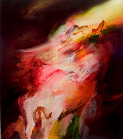
Todd Hunter, Waiting For The Sun, Oil on canvas, 2005.
Copyright the artist. Courtesy GrantPirrie


The effect of combining these two types of approaches in one painting is slightly disturbing. When you look at an abstract painting – or at least when we do – we don’t try to figure out what is background and what is foreground. Although paint gets put on in layers, classical abstract painting is more about surface effects and gesture, colour and form without resorting to three point perspective.

In the GP catalogue essay, Clare Lewis says that for Hunter, painting “is not a circumstantial past-time, it is an endevour essential to his being.” You can tell by looking at the new works that Hunter has developed a keen painter’s intelligence, something to add to his living and breathing oil paint 24/7. In his latest series of there’s something more finished and refined in his use of depth and colour. Nearly all the works stick to a formula of tilting the paint so it seems to flow from top right to bottom left. This repeated approach gets messed up with the layering of gestural elements and, surprisingly, areas that looks like they could be a tiny skyscapes or a shadow of the amorphous forms floating over the black backgrounds.

We were recently told that no artist paints a masterpiece before they are 40. Give ‘em time to cogitate in the studio, work out their approach, a philosophy, and then come back into the art world fully formed. Unfortunately, it doesn’t work that way and we have to suffer through innumerable inadequate careers bolstered by the whisper of a promise. For Todd Hunter, although he’s been growing up in public, he’s got nothing to worry about. When he turns 40, we’re going to buy him a great big cake.

Peel & Stick

Tuesday, May 10, 2005


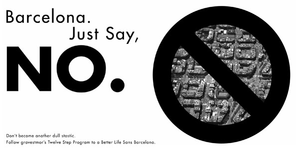
The above is a bumper sticker you can peel from your computer screen and attach to your car, briefcase or t-shirt. It appears on the website of our friends at Gravestmor, the web site that does for architecture what we try to do for art.

“Every year thousands of young aspiring architects travel through Spain and as sure as the diagonal meets the sea (finally) they wind up in Barcelona. They get lost in the Gothic Quarter, they marvel at Cerda’s grid, they navigate the city efficiently and easily. Then the rest of us hear about it for The-Rest-Of-Our-Goddamn-Lives.”


Although describing a situation plaguing young and impressionable architects, the Australia Council’s Barcelona studio is producing artists who go all weak at the sight of late night tapas bars and the works of Antonio Tapies and Miro. Luckily, Gravestmor are offering a twelve step program that'll help Barcelona-afflicted artists.

We received an email from Lionel Bawden who tipped us off to an artist’s web site that’s a little different:

Neil Roberts was a bloody good artist and awesome sculptor, based in Queenbeyan, who unfortunately died a few years back. His partner- the performance artist Barbara Campbell - worked on making this site in the last few years and it is really inspiring with loads of work some incredibly poetic, some whimsical, some very emotive and sublime work. I’m sure people would find Neil's site/work inspiring. Barbara and co. worked bloody hard on it so more eyes connecting to it would be great. I enjoy visiting it repeatedly.


The web site can be visited here and we’ve added it tour permanent list of sites. As ever, we're looking for web sites of Australian artists, well known or unknown, working in any medium for inclusion on the list. Leave suggestions in the Comments section below or email us.

If you will indulge us for a moment, we discovered that The Art Life is now the number one return on Google if you search “The Art Life”. Thanks to all our friends who’ve linked to us - and all the readers who’ve visited us - we’ve skyrocketed from the obscurity of page sixteen to number one. If you search for us without the quotes, we’re fourth after the Chicano Art Life , but that’s still some pretty shit, esse!

No Comment

Sunday, May 08, 2005
How popular is the Archibald Prize? According to London's The Art Newspaper (March 2005), Australia's best-loved portrait prize came ninth in a listing of contemporary art exhibitions around the globe for 2004. With 116,501 visitors, the Archibald Prize found itself in the company of Gerhard Richter and Rachel Whiteread at the Bilbao Guggenheim, James Rosenquist at the New York Guggenheim, and Chuck Close at the Metropolitan Museum of Art. How will it do this year?

Peter Hill, Portrait of a winner, The Age

"I saw the image on the website," said young artist Ben Quilty, whose portrait of Beryl Whiteley was hot favourite among the shortlisted entries, "and I thought, I don't know why he's done it, I didn't like the reproduction of it at all. But when you see it in the gallery, the way he builds up the layers, with him fading into the landscape, it's a cracker."

Archibald winner is one to see to believe, The Courier Mail

It was a classic “prodigal son” story at this year’s awarding of the Archibald Prize. Australia’s most recognisable and, many would argue, most important art prize has always had its fair share of controversy. Indeed, for many years, angry young artists derided it as tired, traditionalist, elitist and a “chook raffle”. One of those angry young artists was John Olsen, who would go on to become one of this country’s most respected artists.

Full Circle, The Blurb

Currently also the main photo on the front website relates to the archibald prize. Click on that and see the 36 archibald finalists. There is a nude man and a nude woman pictured plainly on theage.com.au It’s an outrage to blatantly show porn like that - its frickin ridiculous. The hypocrisy is also so thick, you can carve it.

Whirpool Forums

From the quick preview I had last week, I would say it is one of the strongest fields ever, and for that reason one of the hardest to pick, notwithstanding a few shockers that somehow made it past the selection committee.[…] John Beard, who my money is on, gives us an intense portrait of abstract artist Hilarie Mais, one of the few paintings that works both figuratively and formally and shares a rare moment of artistic seriousness with Olsen.”

Peter Hill, Portrait of a winner, The Age

“It took a little bit of work, but Sydney painter Paul Jackson, runner-up last year for his Self Portrait with the Last Huia, convinced her to sit for him.

"She felt very exposed by it," Jackson told Confidential. "She was very reluctant at first ... she felt challenged by it," he said.

The painting of Gretel Killeen in a black strappy dress "shows a more serious side" of the host. Jackson's favourite bit wasn't working on Gretel's face, but another body part. "She has very interesting hands," he said

Gretel In The Picture, The Daily Telegraph

Unlike his winning portrait, which is dark and complex, Olsen was bright and jovial at Friday's announcement of the award, grinning beneath a red beret and waving a rabbit-headed walking stick.

Olsen delighted with Archibald art win, Seven.com

Admirers of Olsen's Self-Portrait Janus-Faced were hard to find. Many gallerygoers said outright that the judges had got it wrong and more realistic works, such as portraits of actors Alex Dimitriades and Bill Hunter, should have taken out Australia's most prestigious art prize.

"This is a portrait of people [prize] and that doesn't look like a person to me, like him or anybody else," Anne Chalkers, of Balmain, said of Olsen's two-faced, myth-inspired image. "I think it's an artistic/political decision because the gentleman's a wonderful painter and he's old . . . and he's never won an Archibald."

Jim Hall, a teacher from Gosford, said he liked Michael Zavros's portrait of Dimitriades and the Olsen portrait had left him scratching his head. "I'm not sure I understood it," he said. "I suspect that this Janus face has something to do with the Roman myth but that's about as much as I got. For a bloke who looks at art every six months, it was a bit much."

Julia Stevenson
, of Cronulla, was more blunt about the Olsen portrait, saying she felt uncomfortable around it. "I didn't like it at all," she said. "It's grotesque. It's deformed."

And the winner is ...'obscure, grotesque, deformed, awful', The Sun Herald

“This is the second year that Michael Zavros has entered the Archibald Prize – and the second year his painting has been hung among the finalists. “The first year I entered just as a bit of fun," the Brisbane-based artist says. "I'm not really interested in portraits, but this year I decided to go with something more formal. The Archibald is such a big institution, it's hard to ignore."

It’s All Greek, The Courier Mail

Unlike his winning portrait, which is dark and complex, Olsen was bright and jovial at yesterday’s announcement of the award, grinning beneath a red beret and waving a rabbit-headed walking stick.

Former critic pleased to win, The Border Mail

The winner is ironically a departure from the kind of traditional portraiture that Olsen and his colleagues protested all those years ago. Some would argue that the painting isn’t a portrait at all, but rather an allegory.

Full Circle, The Blurb

"About bloody time," said painter and Herald Sun art reviewer Jeff Makin. "The Archibald has a long history of funny decisions and Sydney-centric self-interest.

"Now, at last, the trustees of the Art Gallery of New South Wales have come to their senses and given the prize to a great painting."

Artist Rick Amor, another Archibald finalist this year, said: "I had my money on the Olsen from the start. It was the best painting. He just gets better with age, old John."

Artist looked to the gods for inspiration, Herald Sun

It would be great to see the Archibald winner, it looked fantastic from what you could see on TV.

Essential Baby Forum

Archibald Prize - Snake Eyes

Wednesday, May 04, 2005
Back in 2000 when Adam Cullen won the Archibald Prize for his portrait of David Wenham there was talk in certain quarters that “things had changed”, that somehow this was going to become a prize for contemporary art. Although Cullen’s painting well deserved to win, the truth of the matter was that the prize was a consolation for the fact that a better painting, his portrait of his cousin Max Cullen, was overlooked in 1999 for the histrionic awfulness of Euan McLeod’s Self Portrait/Head Like A Hole. Although the rather dull, traditionalist and faux-serious painting John Bell as King Lear by Nicholas Harding took the prize in 2001 Cherry Hood won in 2002 for Simon Tedeschi Unplugged and it seemed like a course correction back towards progress. Since then, however, we’ve had Geoffrey Dyer’s utterly forgettable portrait of Richard Flannigan and Craig Ruddy’s Whiteley-redux David Gulpilil. And now we have John Olsen winning after all those years of trying.

Perhaps it was just wishful thinking that the old and creaky prize could connect to what’s happening in the art world. But it has happened before, and the prize has been in danger of becoming "contemporary" a few times. Looking back to Brett Whiteley’s self portrait wins from 1976 and 1978, Nigel Thomson’s painting of Chandler Coventry in 1983 and William Robinson’s 1987 Equestrian Self Portrait proved that with the right painting, the prize can actually represent some sort of progressive, forward thinking notion of art.

Olsen’s win this year has in, the minds of many, simply reinforced a deeply held prejudice that the prize is an out-and-out reactionary holdover from the days before cameras. The proof of its irrelevancy is a year of entrants that are about as uninspiring and average as you could imagine. It is so woeful, it is argued, that the Trustees should be asked - why did they feel it necessary to award a prize at all? In 1964 and 1980 the Trustees did the principled thing and didn’t award a prize because nothing was good enough. In that context you could say that Olsen won it this year because he was the last man standing. The flipside of this argument is that the Archibald is an excuse unto itself. It is what it is and although there’s $35,000 and year’s worth of free publicity attached, we shouldn’t get all bent out of shape just because it’s kind of crap this year.

The truth is somewhere in the middle. The exhibition and prize giving is a garish sideshow but it’s also a barometer of who is entering the prize. We seriously doubt there are any masterpieces and missed opportunities hanging in the Salon Des Refuses, so the question to be asked is this – if people want this prize to be relevant why aren’t artists entering the prize? It doesn’t matter that a portrait is outside most artists’ painting practice, it’s simply a matter of artists applying themselves to a new problem and seeing what happens. In lieu of any other sort of relevant prize, it’s literally the only show in town. Roll the dice and see what happens.

Wall of Confusion

Say you had a whole lot of pictures and you had to hang them in three rooms. How would you go about ordering or sequencing them? It must be a big question for the poor bastards whose unenviable job it must be organise the Archibald finalists. Some might say the best thing to do is to just put them in alphabetical order or arrange them in size from big to little, or just mix them up completely and have fun with the anarchy. Obviously, the winner has to be in the biggest room so the media can get their positions right next to it for the award giving, but everything after that is up for grabs. This year’s show is hung in a thematic way which has its own pleasures. Some themes are obvious and some are subtle. Let’s look at the obvious ones first.

The Wall of Flatness (a.k.a. The Wall of Photographic Studies) features, from left to right, Jason Benjamin’s Staring Down The Past, Martin Ball’s John Pule and Michael Zavros’s Portrait of Alex Dimitriades. This kind of portrait painting looks very nice in reproduction and Zavros, the only one of the three who can actually handle that flatness with any kind of inventiveness, is done no favours next to the other two. We didn’t seriously suggest Benjamin could win did we? We must have been on drugs.

The Wall of Drawing is a celebration of pencil on paper and canvas. Abdul Karim Rahimi’s John McDonald and Raymond Kenyon’s The Architect at Home are lovely little things that remind us of all those hours of toiling over home work exercise books and careful shading to get special effects on Humphrey B. Bear’s eyes. That both can achieve such stunning likenesses with nothing more than a box of Derwents is a tribute to the power of tracing. Hung next to this unlovely pair is Jenny Sages Gloria Tamere Petyarre and it’s just too much of everything – a little bit of drawing, a little bit of painting, some text, a picture of the Indigenous painter looking as though it were taken from photo, all thrown together on a heavily scumbled canvas. Luckily for Sages, a win in the Wynne drew all attention away from this over egged pudding.

The Wall of Surprise is kicked off with Kerrie Lester’s Rebel, a portrait of Rebel Penfold Russell. As Lester paintings go, this is a good one, and that’s surprising, but she must be getting the message by now that no matter what she paints, it has no chance of winning. None. No matter how good she is, the Trustees always think someone is better. Next to Lester’s oversized, two dimensional postcard is Ben Quilty’s portrait of Beryl Whiteley. We admit, we got Quilty and Craig Waddell mixed up last week and not just because we’re on drugs – they both use a ton of paint, they like skulls and they both make eye watering canvases that do that precarious dance between rubbish and brilliance. Quilty’s work is really very, very good and no wonder smart people were mentioning his name as the winner of The Archibald in the alternative universe where the prize is judged solely on artistic merit. His painting is a miraculous thing that surfs the shores of bad taste. The rendering of the old bird’s eyes and her bloody mouth is dazzling and we’re totally in awe of how all of this hangs together. Go de Kooning! Jon Campbell’s portrait of Darren Knight Double Darren – is a portrait of the gallerist done in the style of Andy Warhol and that’s kind of surprising too, but not very interesting.

Around the corner is The Laying Down Wall. Mathew Lynn’s Wendy Drawing has Wendy Sharpe lying down on the floor and right next to it is Avril Thomas’s The Minister from Down Under, that depicts Alexander “the things that batter” Downer dozing off. In Australia, we take it lying down.

On the other side of the room is a long stretch we called The Wall of Boredom that broke for a little subset called The Corner of Suspicion. Lewis Miller’s dentist in a fur coat, Peter Churcher’s portrait of Jeffrey Smart, Paul Jackson’s Gretel Killeen and Robert Hannaford – taking a break from painting himself in t-shirts – did a portrait of Bob Brown. There are lows and there are lows – the Killeen picture being an unmitigated horror. And there are highs; stranded among the mediocrity was Bruce Armstrong’s Self Portrait which gave us a moment of pause as we wondered what type of eagle that is sitting on his arm?

Then there’s The Corner of Suspicion. Adam Chang’s portrait of Gene Sherman depicts the redoubtable gallerist looking to her left, perhaps a little embarrassed, a little shy, to an empty room seen through a doorway. Hanging on the next wall is John Beard’s portrait of Hilarie Mais done in his famous 50/50 style of half in focus, half out of focus. Her eyes are staring out at indeterminate point somewhere to the viewer’s left, sort of towards the picture of Gene Sherman. To anyone just wandering through the gallery this collision of two pictures really wouldn’t mean anything, but if you knew that Hilarie Mais’s husband was Bill Wright, until recently the curatorial advisor at Sherman Galleries who left after 16 years amid a wild fire of rumours, you’d start to wonder if there wasn’t some sort of hidden message in the hang.

James Guppy’s Chagrin is a self portrait where the artist has painted his head just that little bit too big for his body. It’s weird and unsettling, but not as disturbing as the fact the artist has painted himself naked in profile, his left to the viewer, one foot slightly raised as though we’ve caught him in mid step. The look on Guppy’s face is one of awkward friendliness and he looks rather like that man you run into who is stark naked in the change rooms of Wylie’s Baths as you wander between the toilets and the door. Eye contact is not advisable.

The other side of the room is called The Wall of Disappointment. Rodney Pople’s Kerrie Lester – After Goya is the best thing there, the sketchy brushstrokes, the little dog at her feet and the word ‘Archibald’ written in the dust, it’s a winning picture even if it didn’t win. Then there’s the Olsen, but we’ll come back to that in a minute. On the other side of Olsen is yet another Lester-related picture, a work by Paul Ryan called Archibald, Archibald, wherefore art thou Archibald? which we’re assuming is a joke. It’s an awful picture of gratuitous brush strokes and absurd amounts of paint that build up to nothing much at all. Making the subject look like a cross between Frankenstein’s monster and the Michelin Man does nothing to negate the nonsense of the title. Next to it is the beginning on The Wall of Impasto Acreswith Nicholas Harding’s portrait of Robert Dickerson taking a swim. There’s nothing particularly wrong with this painting, but there’s nothing really interesting here either, High Commendation or not.


John Olsen, Self Portrait Janus Faced, Oil on canvas.
Courtesy Art Gallery of NSW.


Olsen’s winning Self Portrait Janus Faced is the sentimental favourite and remarkable for the fact it looks a lot like modern art. There’s really no telling when this painting was done and could well be the best painting of 1968. Olsen’s facility with a brush is outstanding and the lucid, loose lines of the figure are wonderful, as is the fact that the figure isn’t quite contained by the edges of the canvas. Other aspects of this painting are less convincing – the head doubling as the setting sun and the two faces looking backwards and forwards are clichés that aren’t softened by the lugubrious nature of their placement and execution. What so depressing about this picture is how unsubtle it is - there’s no dinner, no dancing, no tour of the battleship - it’s just straight up the poop hole.

The final room of the Archibald doesn’t have any theme walls at all, it’s just a bunch of unsightly leftovers daring you to care. The pairing of Xu Wang’s Jiawei Shen and Jiawei Shen’s John So, Lord Mayor of Melbourne proves two things. One is how tokenistic the hang is by putting these two guys together and how crap their paintings are. Annette Bezor’s self portrait looks great with its poster reds and skin tones but how could she possibly expect to win with a warped stretcher? Deborah Trusson’s mammoth Naked is a painting of a big fat chick done in the style of Jenny Saville and Rick Amor’s Shane Maloney is a better Jeffrey Smart than Jeffrey Smart.

Did we ever tell you the story about how, years ago, we got up one morning with a terrible hangover and walked into the lounge room to discover Adam Elliot unconscious on the floor? Although he proved to be a charming house guest, we had never met him before and random unconscious people in your house are a surprise. How could we have known then that he would go on to win the Academy Award for Best Animated Short, cause a ‘controversy’ by thanking his boyfriend in his acceptance speech, then go on to save some tourists from a hotel fire and some puppies from a burning house? We couldn’t of course, but every time we see Harvie Krumpet in JB Hi Fi or see, for example, a portrait of him by David Ralph, we become unaccountably melancholy.